Every scroll is a choice, and most users make that choice in less than a second.
In today’s Facebook and Instagram ad landscape, attention isn’t just hard to get, it’s expensive. You can have the perfect audience targeting and the right budget, but if your creative doesn’t stop the scroll, none of that matters. Your ad disappears before it ever gets a chance.
So how do you actually earn attention in a world where everyone’s thumb is faster than your message? This guide goes beyond surface-level tips and explores specific creative strategies to help your ads perform in real feed environments with real users, real behaviors, and real noise.
1. Master the First 3 Seconds: Design for Pattern Disruption
You’ve heard “hook early” a hundred times. But what does that mean in practice?
Most people scroll through social feeds in a semi-hypnotic state. Your job is to disrupt their pattern — visually, emotionally, or narratively. A strong first three seconds should feel like a tap on the shoulder: “Hey — this might be worth a look.”

Here’s how to break the scroll pattern:
-
Use unexpected imagery: Start with something visually jarring or unusual in your category. A fitness brand might open with someone in office clothes working out at their desk. A skincare ad could begin with a man applying cream to a tomato — strange enough to stop, then explain why.
-
Start mid-action: Skip the setup. Cut directly into the moment of transformation, pain, or payoff. For example, open with a screen capture of a chaotic inbox, followed by someone hitting “Inbox Zero” with one click. The mind craves resolution.
-
Animate stills creatively: If you’re using static images or carousel ads, create micro-animation with text movement, background shifts, or hand-drawn overlays. These low-friction motions stand out in otherwise still feeds.
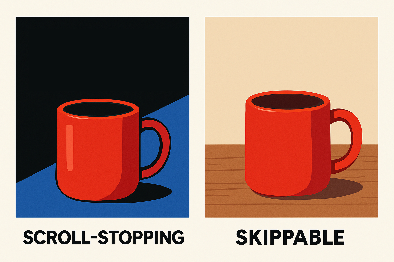
Pro tip: avoid logos or intros in the first frame. They don’t add value — they signal “ad” and invite users to skip. Start with content; logo comes later.
2. Write for the Eye, Not the Brain
When users scroll, they don’t read — they glance. This means your copy must be scannable, structured, and visually guided. Effective creative copy doesn’t just inform — it leads the eye.
Advanced tactics for scroll-friendly messaging:
-
Front-load the benefit: Reword headlines to show value in the first few words. For example:
-
Instead of: “Our skincare cream is dermatologist tested and lightweight...”
-
Try: “Bye, breakouts. Fast results in 48 hours.”
-
-
Use line breaks like a rhythm: Short paragraphs with breaks create momentum. Think like a songwriter — one thought per line. Keep the eye moving.
-
Incorporate soft calls-to-curiosity: Instead of hard CTAs like “Buy Now,” use phrases like:
-
“See how this works.”
-
“Here’s the weird part...”
-
“This might surprise you.”
-
These tease without pushing, building micro-investment in the scroll.
If you're not sure how to write copy that actually converts, take a look at our tips for crafting compelling Facebook ads copy.
3. Build for Sound-Off Environments (But Reward Sound-On Users)
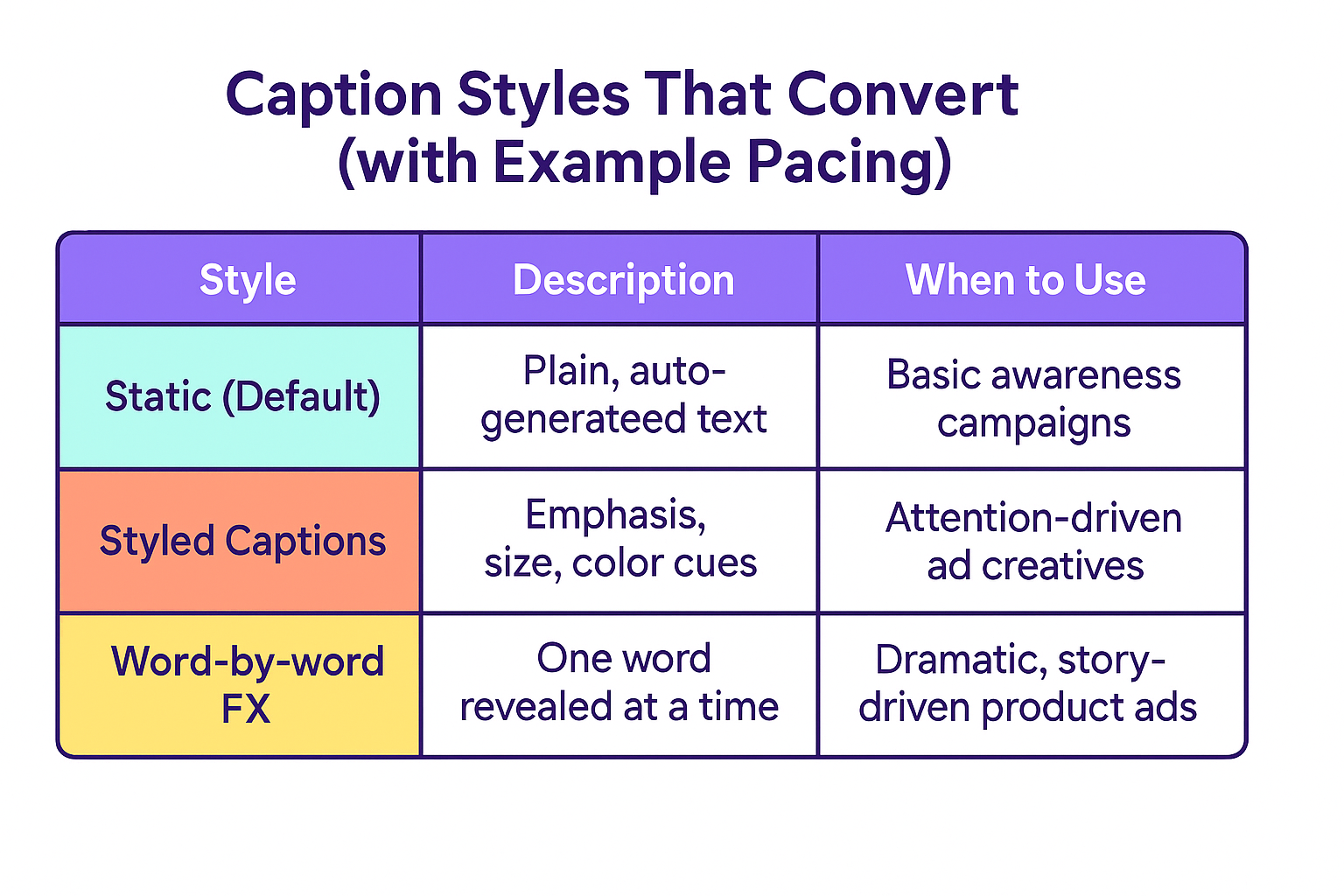
More than 80% of Meta users watch videos with the sound off — but that doesn’t mean you can ignore audio. Great sound-off ads perform well with captions — but the best ones offer something extra for those who choose to listen.
Creative strategies that work:
-
Design “caption-first” videos: Don’t just transcribe your voiceover. Write for the screen. Use stylized subtitles with dynamic formatting (bolding, timing, emphasis). Let them feel like part of the story, not a secondary element.
-
Use rhythmic editing: Even with sound off, a good visual rhythm keeps people watching. Cut to the beat of invisible music. Align animations or transitions to an implied pace. This creates internal momentum.
-
Add audio easter eggs: For users who do turn on the sound, reward them. That could mean clever narration, humorous SFX, or a punchy original sound clip. Make the experience richer — but never dependent.
And if you want more ideas for balancing visuals and audio to boost ad engagement, check out our tips on how to use animation and motion graphics to boost Facebook ad engagement.
4. Use UGC-Style Ads With Editorial Control
User-generated content (UGC) works — but only when it’s executed with structure. A raw, testimonial-style ad can outperform a studio shoot, but only if it maintains a tight narrative flow.
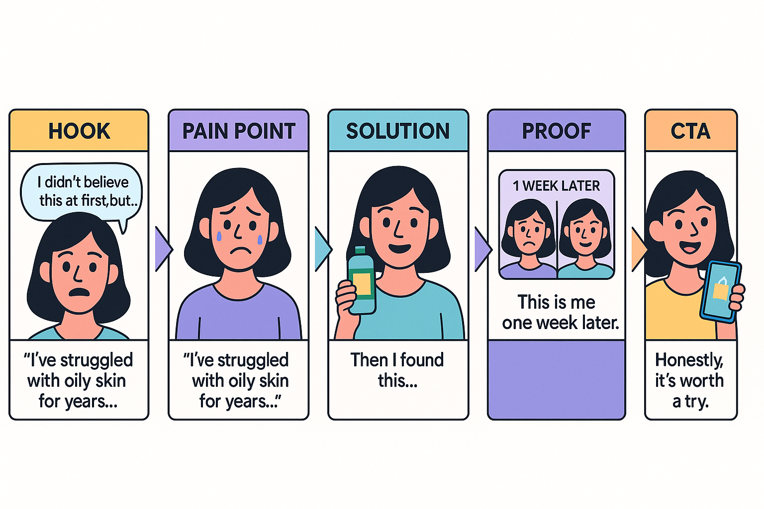
Here’s a proven UGC script structure:
-
Hook — “I didn’t believe this at first, but...”
-
Pain Point — “I’ve struggled with oily skin for years...”
-
Solution — “Then I found this...”
-
Proof — “This is me one week later.”
-
CTA — “Honestly, it’s worth a try.”
What makes this format strong isn’t the authenticity alone — it’s the storytelling arc. If you’re working with creators or filming in-house UGC, script it loosely, but know exactly what beats you need to hit.
Bonus tip: overlay clean, branded text to guide the viewer and reinforce key moments.
This breakdown on how to use user-generated content in your Facebook ads offers actionable tips on how to blend authenticity with performance.
5. Optimize for Watch Time, Not Just Clicks
Meta's algorithm rewards engagement and retention, not just CTR. That means your goal isn’t only to get the click — it’s to keep people watching longer.
To increase watch time and post-view engagement:
-
Use visual pacing: Switch camera angles every 3–4 seconds. Add zooms, crop-ins, or motion graphics to keep the frame fresh without overwhelming.
-
Layer value progressively: Tease new information every few seconds. “Oh, and there’s one more thing...” encourages continued viewing.
-
Add mini payoffs: Don’t save your best material for the end. Instead, offer bite-sized rewards throughout — transformations, insights, jokes, benefits. These keep attention high and encourage replays.
Watch time isn’t a vanity metric. It feeds the algorithm, signals quality, and increases overall ad delivery efficiency.
6. Build Creatives as a System, Not a Single Shot
Most advertisers treat each ad as a standalone asset. But top-performing brands treat creative as a modular system. They build multiple variations — with different intros, bodies, hooks, CTAs — and assemble them like LEGO blocks.
This systemized creative strategy lets you:
-
Test faster and smarter,
-
Discover which message works best for each audience segment,
-
Scale winning elements across formats (Reels, Feed, Stories).
Start with 2–3 core concepts, then remix:
-
Change the first 3 seconds only.
-
Test a voiceover version vs. on-screen text only.
-
Swap out product demonstrations for social proof or FAQs.
This approach saves production time, reduces creative fatigue, and gives Meta’s delivery system more room to optimize performance.
For more on which elements to test first, we break it all down in this Facebook campaign testing guide.
Final Thoughts
Before someone clicks, they pause. Before they pause, they notice. Scroll-stopping creative lives in that critical top layer of attention — the moment where indifference becomes interest.
And here’s the truth: Scroll-stopping is not about being louder. It’s about being more relevant, more human, and more intentional.
You don’t need a massive budget to win in the feed. You need:
-
Fast, curiosity-driven openers,
-
Emotion-led messaging,
-
Native, platform-fit design,
-
Modular testing frameworks,
-
Performance-driven structure — not just aesthetics.
So next time you launch a campaign, don’t just ask, “Does this look good?” Ask: “Will this stop someone from scrolling and get them to think, feel, or act?”
That’s the question that leads to better creative, better engagement, and better results.