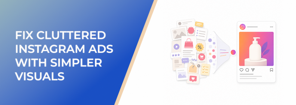
A cluttered Instagram ad can look impressive in a design preview and still fail in the feed.
The image may include a product, headline, discount badge, logo, testimonial, background pattern, icons, CTA, and several supporting claims. Internally, every element may feel useful. But to a fast-scrolling user, the ad can feel like visual noise.
This affects performance marketers, agencies, ecommerce teams, B2B lead-generation teams, affiliate marketers, and small businesses that rely on Instagram ads to create fast understanding. When the image is too crowded, the campaign may spend money before the audience understands what is being offered.
The fix is not to make the ad plain. The fix is to make the visual easier to process.
The Problem
The problem is that cluttered Instagram ads ask users to understand too much at once.
Instead of one clear message, the ad presents multiple competing signals. The viewer has to decide what matters first: the product, the discount, the testimonial, the CTA, the logo, the background image, or the headline.
Most users will not do that work.
On Instagram, the image usually carries the first impression. If the visual does not communicate one clear idea quickly, the user may scroll before reading the caption, clicking the CTA, or forming any real intent.
Clutter often hides inside well-meaning creative decisions. A marketer adds another feature because the offer feels underexplained. A designer adds icons to make the layout feel more complete. A client asks for the logo to be larger. A founder wants the ad to show every benefit. Each decision may make sense alone, but together they weaken clarity.
Why This Problem Hurts Performance
Clutter hurts campaign performance because it delays understanding.
When users cannot identify the main point quickly, CTR can fall. Lower CTR often increases CPC because the campaign needs more impressions to generate meaningful clicks. CPA and CAC can rise because fewer users arrive with clear intent. ROAS can weaken because the ad creates attention without enough purchase or lead intent.
Clutter also creates misleading test results.
A campaign may look like it has a targeting problem when the real issue is visual overload. A good offer may look weak because users never understood it. A relevant audience may appear unresponsive because the creative did not give them a clear reason to act.
For lead generation, clutter is especially expensive. If users click without understanding the promise, they are less likely to complete the form or become qualified leads. That can make CPL look acceptable while lead quality drops.
Common Scenarios Where This Happens
Ecommerce Ads With Too Many Product Details
An ecommerce brand wants to show the product, size options, feature icons, discount, customer rating, free shipping, and urgency message in one image. The ad contains useful information, but the product no longer feels dominant.
B2B Lead Magnet Ads
A B2B team promotes a checklist, report, webinar, or demo. The ad includes a dashboard screenshot, report cover, client logos, three bullet points, and a CTA. The result is visually dense, so the offer is harder to understand.
Agency Campaigns With Client Feedback
An agency presents a clean ad concept. The client requests more brand elements, more proof, and more service details. The final creative satisfies stakeholders but becomes harder for cold audiences to process.
Local Business Promotions
A local business wants to show the service, address, phone number, offer, staff photo, logo, and review in one image. The ad becomes a mini flyer instead of a mobile-first Instagram creative.
Affiliate Campaigns
An affiliate marketer tries to communicate product benefits, urgency, bonus details, and comparison points at the same time. The ad may look persuasive on desktop but overloaded on mobile.
Why the Problem Happens
Clutter usually happens because marketers confuse more information with more persuasion.
In paid social, more information often creates more decision load. Users need a simple reason to stop first. Details can come later in the caption, carousel, landing page, product page, demo, or retargeting sequence.
Another root cause is designing at the wrong size. Creative teams often review ads on large monitors. At that size, a crowded layout may look acceptable. On a phone, the same image can become cramped and difficult to read.
Clutter also happens when the campaign lacks message priority. If the team has not decided whether the ad should lead with the product, problem, outcome, proof, offer, or CTA, the design tries to show all of them.
That is not a design issue alone. It is a strategy issue.
The Solution
The solution is to simplify the visual around one primary message.
A simpler Instagram ad does not need to be boring. It needs to make the viewer’s first decision easy: “This is relevant to me.”
Start by choosing the one thing the user must notice first. That should be the visual anchor. For ecommerce, it may be the product or use case. For B2B lead generation, it may be the business problem or lead magnet outcome. For local services, it may be the result, location, or booking offer. For affiliate campaigns, it may be the product benefit or comparison angle.
Once the visual anchor is chosen, remove or reduce anything that competes with it.
Use a simple review process:
- Identify the main subject.
- Identify the one message the ad must communicate.
- Remove duplicate claims.
- Cut decorative icons that do not explain the offer.
- Reduce badge stacking.
- Move secondary details into the caption or landing page.
- Check the ad at actual mobile size.
- Ask what the viewer notices first.
If the first thing noticed is not the product, offer, outcome, problem, or CTA, the visual hierarchy needs work.
A good simplified ad usually has one dominant element, one supporting message, and one clear next step. It may still use brand colors, a logo, proof, and text, but those elements should support the main idea rather than compete with it.
Risks and Considerations
Simpler visuals are not automatically better. A simple ad can still fail if the offer is weak, the audience is wrong, or the landing page does not match the promise.
Avoid stripping away information that the user genuinely needs to trust the offer. For example, a high-ticket B2B consultation may need proof. A regulated or sensitive category may need careful wording. A new product may need context.
Also avoid making the ad so minimal that it becomes vague. Simplicity should improve understanding, not remove meaning.
Evaluate whether the simplified version improves downstream behavior. A cleaner ad that increases clicks but lowers lead quality is not a win. Review CTR, CPC, landing page views, form starts, qualified leads, purchases, CPA, CAC, and ROAS together.
Prerequisites and Dependencies
To simplify Instagram ads effectively, you need:
- A clear campaign objective.
- A defined ICP or buyer segment.
- One primary offer or message.
- Mobile-first creative review.
- Brand guidelines flexible enough for performance creative.
- Reliable conversion tracking.
- Enough budget to compare creative variations.
- A landing page that continues the same message.
- A process for isolating creative changes from audience or budget changes.
Without these, simplification can become subjective. The goal is not just to make the ad look cleaner. The goal is to create a clearer test.
Practical Recommendations
Start with your highest-spend or lowest-CTR Instagram image ads. Review them at mobile size and ask what the viewer sees first.
Then create a simplified variation. Keep the audience, offer, copy, CTA, budget, and landing page as stable as possible. Change only the visual structure.
Prioritize these changes first:
- Make the main subject larger.
- Remove decorative elements.
- Reduce text overlays.
- Use more spacing around the focal point.
- Move secondary proof into the caption or landing page.
- Keep one dominant benefit instead of several small claims.
- Make the image and headline support the same idea.
Judge the test by business-quality metrics, not just surface engagement. A simpler ad should help the right users understand the offer faster and click with stronger intent.
Final Takeaway
Cluttered Instagram ads underperform because they make users work too hard before they understand the offer.
The solution is not less strategy. It is sharper strategy. Choose one main idea, make it visually obvious, and remove anything that slows comprehension. When the ad becomes easier to read at feed speed, marketers get cleaner performance signals and users get a clearer reason to act.
Related LeadEnforce Articles
- How To Stop Cluttered Instagram Ads From Losing Fast-Scrolling Users — Directly relevant to reducing visual overload in fast-scroll Instagram placements.
- How To Remove Visual Distractions That Hurt Instagram Ad Performance — Useful for identifying which creative elements are stealing attention from the offer.
- Why Overdesigned Instagram Ads Still Fail To Stop the Scroll — Explains why visual density can hurt performance even when the ad looks polished.
- The Most Common Design Mistakes in Instagram Ads (And How to Avoid Them) — Broader design checklist that includes overcrowding, weak focal points, and layout problems.