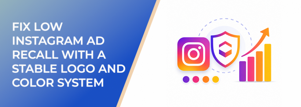
Low Instagram ad recall often comes from unstable brand basics.
A brand may have a logo and color palette, but the ads use them inconsistently. The logo appears in different places, at different sizes, or not at all. The colors shift from ad to ad. Some creatives look premium, while others look promotional or generic.
Users may see the ads, but they do not remember the brand.
A stable logo and color system gives Instagram ads a stronger memory structure. It helps users connect impressions across placements, formats, and funnel stages.
The Problem
The problem is inconsistent logo and color usage.
This sounds simple, but it creates major recognition issues.
If the logo appears only at the end of a Reel, many users will never see it.
If colors change with every ad, users cannot build a visual association.
If discount ads use one design style and educational ads use another, the campaign feels fragmented.
If creators produce videos without any brand color or logo cue, the content may feel authentic but anonymous.
Low recall is not always caused by weak creative. Sometimes the creative is good, but the brand system is too unstable to be remembered.
Why This Problem Hurts Performance
A stable logo and color system helps impressions compound.
Without it, each ad must create attention and recognition from scratch.
That can raise acquisition costs because the campaign does not build familiarity over time.
It can weaken retargeting because users do not remember the brand from earlier impressions.
It can reduce conversion confidence because the brand feels less established.
It can make creative analysis harder because every test includes uncontrolled brand variables.
It can also waste creative production because teams keep redesigning assets instead of scaling a recognizable system.
For advertisers focused on CPA, CAC, ROAS, and lead quality, low recall is not just a branding issue. It is a media efficiency issue.
Common Scenarios Where This Happens
An ecommerce brand changes its ad background colors based on each promotion. The campaign feels energetic but inconsistent.
A SaaS company uses the logo on static ads but not in product demo videos.
A local business uses different designers for different campaigns, resulting in inconsistent color treatment and logo placement.
A B2B team uses dark corporate graphics for lead magnets and bright casual graphics for Instagram Reels. The assets do not feel connected.
A startup updates its brand style frequently, causing active campaigns to look like they belong to different versions of the company.
Why the Problem Happens
This problem usually happens because logo and color rules are too vague.
A brand guide may say which colors are approved, but not how to use them in Instagram ads.
It may include logo files, but not placement rules for Reels, Stories, Feed, and carousels.
Another cause is treating each campaign as a fresh creative concept. That can produce variety, but it often breaks memory.
A third cause is overreacting to performance tests. If one ad wins with a different color or layout, teams may abandon the system instead of testing carefully.
Finally, many advertisers prioritize message testing without controlling brand variables. That makes it harder to learn what actually improved performance.
The Solution
The solution is to create a stable logo and color system specifically for Instagram ads.
Define Logo Placement by Format
For Feed statics, choose one or two approved placements.
For carousels, decide whether the logo appears on every slide, only the first slide, or the final CTA slide.
For Stories, place the logo where it does not interfere with UI elements or CTA stickers.
For Reels, include a brand cue early: logo, product mark, color frame, branded caption style, or recognizable opening card.
The goal is early and consistent recognition.
Define Logo Size Rules
The logo should be visible on mobile without dominating the ad.
Create minimum and maximum size guidance for each placement.
A consistent small logo is usually better than a random large logo.
Define Primary Color Usage
Choose one color that should become the main memory cue.
Use it consistently as an accent, background, frame, headline highlight, CTA treatment, or graphic element.
Do not rotate through the full palette randomly.
Define Supporting Color Roles
Secondary colors should have clear jobs.
One may support proof sections. Another may support discount messaging. Another may support educational content.
This keeps variation organized rather than chaotic.
Build Templates
Create templates for your main ad types: product ad, proof ad, educational carousel, offer ad, Reel cover, and Story frame.
Templates should speed production while preserving recall.
Risks and Considerations
Do not make the system too rigid. Different campaigns may need different emotional tones.
Do not use colors that hurt readability on mobile.
Do not place logos where Instagram UI elements may cover them.
Do not assume users will wait for the end card. Put brand cues early.
Do not let the logo and color system replace strong messaging. Recognition helps, but the ad still needs a clear reason to act.
Also, avoid constant rebrands during active campaigns unless necessary. Frequent visual changes can interrupt learning and memory.
Prerequisites and Dependencies
You need approved logo assets.
You need defined brand colors with primary and secondary roles.
You need placement-specific templates.
You need a creative production process that follows the system.
You need a review checklist before launch.
You need clear campaign metrics to evaluate whether recall improvements support better engagement, conversion rate, CPA, and lead quality.
You also need profile and landing page alignment. Logo and color cues should continue after the user clicks or taps through.
Practical Recommendations
Choose one primary brand color to repeat across most Instagram ads.
Standardize logo placement for each format.
Use early brand cues in video ads, not only end cards.
Create a carousel cover template that is instantly recognizable.
Use color accents consistently for CTAs, proof, and product highlights.
Test new hooks and offers without changing logo and color rules unnecessarily.
Review active ads as a grid. If they do not look like one brand, simplify the system.
Document the rules in a one-page paid social brand guide.
Final Takeaway
Low Instagram ad recall often starts with unstable logo and color usage.
When those elements change constantly, users struggle to connect impressions to the same brand. When logo placement and color cues are stable, ads become easier to recognize and remember.
A stable logo and color system does not limit performance creative. It gives every test a stronger brand foundation.
Related LeadEnforce Articles
- Stand Out and Stay On-Brand with Stunning Facebook Ad Creatives — Helps refine logo, color, and layout consistency for paid social ads.
- Creative Consistency vs Variety: Finding Balance — Explains how stable brand cues can coexist with creative variation.
- How to Make Your Ads Look Native Without Losing Brand Identity — Useful for applying logos and colors without overbranding.
- Why People Ignore Ads From Brands They Don’t Recognize — Shows why recognition matters for trust and ad response.