People scroll fast on Facebook. On average, users spend just 1.7 seconds looking at each post in their feed. That means your ad has to stand out immediately. If your design blends into the background or uses low-contrast colors, users simply skip over it.
Meta’s internal studies have shown that ads with high-contrast creatives can boost CTR by up to 32% compared to ads with muted or poorly matched palettes. Color isn’t just decoration — it’s one of the strongest tools for drawing attention and guiding the eye.
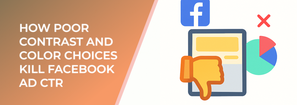
Common Mistakes That Kill CTR
1. Low Contrast Between Text and Background
If your headline or CTA text blends into the background, users won’t read it. White text on a pale background or black text on a dark photo are classic examples.
2. Overuse of Brand Colors
Consistency is important, but relying only on your brand’s colors can limit your palette. If your brand colors don’t provide strong contrast, your ads risk becoming invisible.
3. Clashing Colors
Bright colors can work — but too many competing tones overwhelm the viewer. Instead of attention, you get confusion and skipped ads.
4. Ignoring Accessibility
Poor color contrast doesn’t just lower CTR, it also reduces accessibility. Roughly 8% of men and 0.5% of women have some form of color vision deficiency. If they can’t distinguish your text or buttons, they won’t click.
How to Fix Contrast and Color Issues
Use High-Contrast Text and Backgrounds
Pair light text with dark backgrounds or dark text with light backgrounds. Simple combinations outperform complicated gradients.
Add Contrast Through Shapes and Overlays
If your product photo has a busy background, add a solid color overlay behind your text to keep it readable.
Limit Your Palette
Stick to 2–3 main colors per creative. This ensures clarity and focus.
Test Multiple Variations
Run A/B tests with different background and text color combos. Even small adjustments can yield big CTR improvements.
Statistic to note: In A/B tests, advertisers who adjusted contrast and simplified color palettes achieved up to 21% lower cost-per-click (CPC) on Facebook.
Example in Action
A beauty brand ran ads with soft pastel backgrounds and white text. CTR stayed low. After switching to a darker background with bold, contrasting text and a single accent color, their CTR jumped by 29% in just two weeks.
Related Reading from LeadEnforce
To improve your ad visuals and overall performance, check out these articles:
-
Creative Clutter: How Too Many Variations Hurt Facebook Ad Performance
-
Why Image Cropping Breaks Your Facebook Ads (and How to Fix It)
-
Ad Copy Fatigue: Why Facebook Ads Stop Working After a Few Weeks
Final Thoughts
Poor color choices and weak contrast silently kill your Facebook ad performance. By designing with clarity, testing variations, and prioritizing visibility, you’ll make your ads stand out in crowded feeds. Strong visuals not only attract attention but also drive more clicks — and ultimately, more conversions.