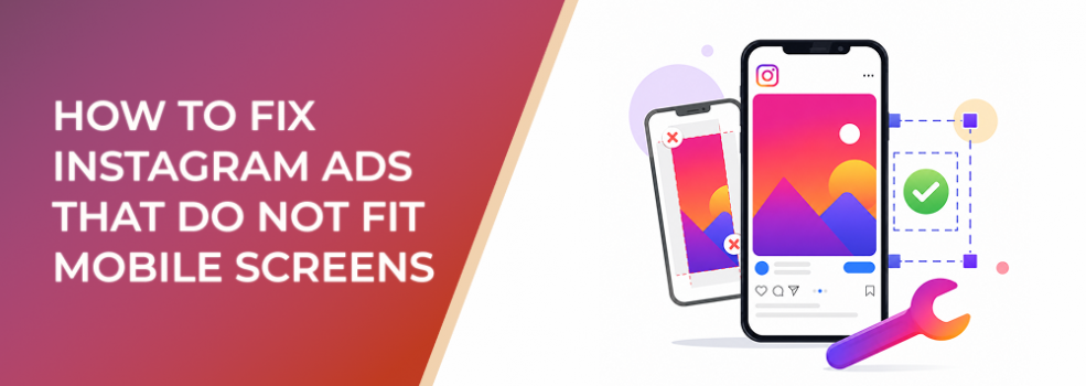
Instagram ads often fail before the offer gets a fair chance.
The creative may look polished in Canva, Figma, Photoshop, or a desktop preview. The product is visible. The headline feels clear. The CTA looks balanced. But once the ad appears inside Instagram’s mobile placements, the layout breaks down.
Text becomes too small. The product gets cropped. A square asset feels awkward in Stories. A horizontal video leaves wasted space. A CTA sits too close to the bottom interface. The ad technically runs, but it does not feel built for the screen where people actually see it.
This problem affects performance marketers, agencies, SMB owners, startup marketers, ecommerce teams, B2B lead-generation teams, and freelance advertisers promoting Instagram content. Meta’s promoted-post lesson explains that promoted Instagram content can appear across surfaces such as Feed, Stories, and Explore, which means a single creative can be forced into multiple mobile contexts if advertisers do not prepare for placement fit.
The Problem
The problem is not simply that the ad is “bad design.”
The problem is that the ad does not fit the mobile screen where it is delivered.
That can mean several things:
- The asset is the wrong shape for the placement.
- The important visual information is too small.
- The text is unreadable on a phone.
- The CTA is blocked or visually crowded.
- The product or person is cropped awkwardly.
- The ad leaves empty space that weakens attention.
- The same asset is pushed into Feed, Stories, Reels, and Explore without adaptation.
An Instagram ad can be technically eligible and still perform poorly because it feels visually mismatched. Meta may accept the upload, but acceptance does not mean the asset is optimized for mobile attention.
For advertisers, this creates a dangerous blind spot. The campaign spends normally, but the creative is quietly underperforming because users cannot process it fast enough.
Why This Problem Hurts Performance
Mobile-screen fit affects performance because it controls the first impression.
When an ad does not fit the screen, users need more effort to understand it. That extra friction can reduce thumb-stop behavior, CTR, video retention, profile visits, saves, landing page clicks, and qualified lead volume.
Poor mobile fit can also raise costs indirectly.
If fewer users engage meaningfully, early delivery signals weaken. CPC can rise because the ad is not earning enough useful interaction. CPA and CAC can rise because the users who do click may not fully understand the offer. ROAS can suffer because the campaign is paying for impressions that never had a strong visual chance.
This is especially damaging in lead-generation campaigns. A B2B report ad with tiny text may attract accidental clicks but not qualified form submissions. A local service ad with cropped contact details may generate impressions without calls. An ecommerce ad with a product too small on screen may lose purchase intent before the landing page.
Creative fit is not a cosmetic detail. It affects budget efficiency.
Common Scenarios Where This Happens
This problem appears often when advertisers promote organic Instagram posts without adapting them for paid placements.
A square product image may look fine in the feed but feel small and awkward in Stories. A horizontal testimonial video may work on a website but waste most of the vertical mobile screen in Reels. A webinar graphic may include too many details, making the date, topic, and CTA unreadable on a phone.
Agencies also run into this issue when clients provide brand assets designed for email, landing pages, or desktop banners. The files look professional, but they are not built for fast mobile scanning.
Startup marketers often reuse one creative across every placement to save production time. That may speed up launch, but it usually creates mixed delivery quality. Feed, Stories, Reels, and Explore do not give users the same amount of attention or screen space.
Affiliate marketers and SMB owners face another version of the problem: they may boost a post directly from Instagram because it already has engagement. But organic engagement does not guarantee the post will fit paid delivery environments.
Why the Problem Happens
Instagram formatting problems usually happen because advertisers review creative in the wrong context.
They approve the ad on a laptop. They zoom in during review. They inspect the design slowly. They already know the offer, the product, and the intended message.
The audience sees the ad differently.
They see it quickly, vertically, and surrounded by competing content. They may be walking, multitasking, watching without sound, or skipping through Stories. If the ad does not communicate instantly on a phone screen, the campaign loses attention.
Another cause is over-reliance on one asset size. Advertisers often assume one square or vertical creative can cover everything. But Feed, Stories, Reels, Explore, and carousel placements behave differently. Meta’s guidance shows that Feed placements support square and vertical formats, while Stories and Reels use vertical full-screen formats such as 9:16.
The issue is not that advertisers are careless. It is that the platform makes it easy to launch before creative fit has been checked properly.
The Solution
The solution is to build and review Instagram ads around mobile placement fit before launch.
Start by separating creative into placement groups. At minimum, most advertisers should prepare:
- Feed-focused creative.
- Stories and Reels creative.
- Carousel creative, if using carousel ads.
- Explore-friendly creative, if Explore is part of delivery.
For Feed, prioritize mobile-readable layouts with a clear focal point. Square can work, but vertical Feed formats often use more screen space. For Stories and Reels, design natively for a vertical full-screen environment. Do not simply place a square image in the middle of a 9:16 canvas and call it finished.
Next, review the ad at actual phone size. This step is simple but often skipped.
Ask:
- Can the product be recognized in under one second?
- Is the main text readable without zooming?
- Does the CTA remain visible and uncluttered?
- Is the focal point still obvious?
- Are important elements away from interface-heavy areas?
- Does the ad feel native to the placement?
If the answer is no, do not fix it by adding more text. Fix it by improving hierarchy, cropping, spacing, and placement-specific layout.
A strong mobile-fit workflow should include three checks:
1. Shape Check
Confirm that the asset shape matches the placement. Full-screen placements need vertical creative. Feed placements need formats that use enough screen space without awkward cropping.
2. Readability Check
Review the ad on a real phone or at mobile preview size. Headlines, captions, product labels, and CTA overlays must be readable quickly.
3. Focal Point Check
Identify what the viewer should notice first. If the product, offer, or outcome is not immediately clear, the ad is not ready.
Risks and Considerations
Fixing mobile fit will not solve every performance issue.
An ad can fit the screen perfectly and still fail if the offer is weak, the audience is wrong, the landing page is slow, or the campaign objective does not match the funnel stage.
There is also a risk of overcorrecting. Some advertisers make the creative bigger and simpler but remove too much context. A large product image without a reason to care may look clean but fail to generate qualified clicks.
Another risk is ignoring placement-level performance. If all placements are grouped together, a strong Feed result may hide weak Stories performance, or the reverse. Review breakdowns where possible so formatting decisions are based on delivery context, not only campaign-level averages.
Compliance still matters as well. Do not use formatting tricks that mislead users, obscure important terms, or create a mismatch between the ad and the landing page.
Prerequisites and Dependencies
To fix Instagram ads that do not fit mobile screens, you need a few basics in place.
You need a clear campaign objective, because a mobile lead-generation ad may need different formatting than an awareness Reel or ecommerce product ad.
You need a defined primary message. If the creative team does not know what users should understand first, the layout will become crowded.
You need access to placement previews or real-device checks. Desktop review alone is not enough.
You also need enough creative production capacity to make separate versions. This does not mean every ad needs ten variations. But it does mean advertisers should stop expecting one asset to work equally well everywhere.
Finally, you need success metrics beyond surface engagement. Track CTR, CPC, outbound clicks, conversion rate, CPA, lead quality, and post-click behavior.
Practical Recommendations
Start by auditing your highest-spend Instagram ads.
Look for assets that are being delivered across multiple placements but were clearly designed for only one. Check whether Feed creatives are being forced into Stories or whether vertical creatives are being cropped in Feed.
Then rebuild the worst offenders first. Prioritize ads with high spend, weak CTR, rising CPC, poor conversion rate, or strong impressions but low action.
Create a simple production system:
- One Feed version with a clear focal point.
- One 9:16 version for Stories and Reels.
- One square or placement-safe version if needed for carousels or fallback use.
- One mobile preview step before launch.
- One placement breakdown review after launch.
Do not change everything at once. If you want to know whether mobile fit improved performance, keep the offer, audience, objective, and landing page as stable as possible while testing the formatted creative.
Final Takeaway
Instagram ads that do not fit mobile screens waste attention before they waste budget.
The fix is not just resizing the file. The fix is designing for the placement, reviewing at mobile size, protecting the focal point, and making the message readable in the real environment where users see the ad.
When creative fits the screen, the campaign gets a fairer test. Users understand the offer faster, engagement becomes cleaner, and performance data becomes easier to trust.
Related LeadEnforce Articles
- Meta Ad Aspect Ratios by Placement: How to Stop Creative Fit From Hurting CPA — Useful for planning creative versions around Feed, Stories, Reels, and other placement groups.
- Facebook & Instagram Ad Sizes: The Ultimate Guide for Designers — Helps creative teams understand common size and format expectations before launch.
- How Poor Vertical Framing Causes Instagram Video Ads to Lose Mobile Attention — Explains why mobile framing affects attention and engagement.
- How to Adapt One Ad Concept for Reels, Stories, Feed, and Explore — Shows how to keep one campaign idea consistent while adapting it for different placements.