Instagram users make fast trust decisions.
They see an ad, judge whether it feels relevant, and decide whether the brand deserves attention. If the visual branding feels inconsistent, unfamiliar, or poorly aligned, trust can break before the user reads the full caption.
This is a common problem for advertisers who focus heavily on hooks and offers but treat visual consistency as secondary.
Low trust does not always show up as low CTR. Sometimes users click, inspect the profile, hesitate, and leave. Sometimes they visit the landing page but do not convert. Sometimes they engage with the content but never become leads or customers.
Consistent visual branding helps reduce that friction.
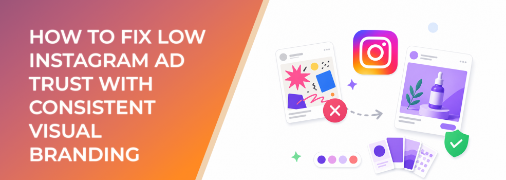
The Problem
Low Instagram ad trust happens when the brand presentation feels unstable.
The ad may look different from the Instagram profile. The profile may look different from the landing page. A carousel may feel premium while the Story ad feels cheap. A creator video may feel authentic but not connected to the business.
These inconsistencies create uncertainty.
Users may wonder whether the brand is legitimate, whether the offer is real, or whether the company can deliver what it promises.
Trust is especially important for ecommerce purchases, lead forms, consultations, high-ticket offers, local services, B2B demos, and affiliate campaigns where users need confidence before taking action.
Why This Problem Hurts Performance
Low trust increases conversion friction.
A user who does not trust the brand is less likely to click with strong intent. If they do click, they may bounce quickly. If they submit a lead form, the lead may be lower quality because the decision was casual rather than confident.
This affects core paid social metrics.
CTR can weaken if the ad feels suspicious or generic.
CPA can rise because fewer users convert after the click.
CAC can increase because the campaign needs more impressions and retargeting touches to overcome doubt.
ROAS can suffer when users hesitate at checkout.
Lead quality can drop if the ad attracts curiosity but not confidence.
In short, weak visual trust makes every stage of the funnel work harder.
Common Scenarios Where This Happens
A DTC brand runs polished ads but has an inconsistent Instagram profile with random posts, outdated highlights, and mismatched visual styles.
A B2B startup runs professional lead-generation ads but sends users to a landing page that looks visually unrelated to the ad.
A local clinic uses different templates for every promotion, making the business feel less established than it actually is.
An agency runs UGC-style ads for a client but removes too many brand cues. The ads feel real, but users do not know who is behind them.
An affiliate marketer promotes multiple offers with similar stock visuals, making the ads look generic and reducing user confidence.
Why the Problem Happens
Low visual trust often comes from inconsistent creative ownership.
Different teams manage ads, organic content, landing pages, and brand assets. Each team optimizes for its own channel, but the user experiences everything as one journey.
Another cause is over-prioritizing direct response tactics. Urgency badges, discount claims, bold hooks, and aggressive CTAs may drive attention, but if the brand identity is weak, users may feel pressured rather than reassured.
A third cause is underdeveloped brand identity. Some businesses have a logo and colors but no rules for photography, layout, typography, iconography, or proof presentation.
A final cause is copying competitors. When brands imitate popular ad formats without adapting them to their own identity, the creative can feel borrowed rather than trustworthy.
The Solution
The solution is to build visual trust through continuity.
Start by aligning the ad, Instagram profile, and destination experience.
The user should feel that the same brand exists across every touchpoint.
Use consistent visual branding in five areas:
1. Logo and Brand Mark
Use the logo consistently, but not aggressively. A small, stable placement often works better than a large disruptive logo.
2. Color System
Use brand colors as signals of familiarity. This can be a background, border, text highlight, product frame, CTA accent, or recurring graphic element.
3. Typography and Text Style
Keep headline and overlay text consistent. Fonts should be readable on mobile and aligned with the brand tone.
4. Proof Presentation
Testimonials, review snippets, ratings, stats, and results should follow a consistent design system. Proof looks more credible when it feels intentionally presented.
5. Visual Tone
Photography, video lighting, creator style, product framing, and graphic treatment should feel like they belong to the same brand.
Then review the full user path.
The ad should match the profile. The profile should match the landing page. The landing page should match the promise.
This does not mean every asset must look identical. It means users should never feel like they have moved from one brand to another.
Risks and Considerations
Do not use visual consistency to hide weak proof. Trust also depends on the quality of the offer, the credibility of claims, and the user experience after the click.
Do not over-polish every ad. On Instagram, overly corporate creative can feel less trustworthy than native, human, clear creative.
Do not make unsupported claims. Visual polish cannot compensate for vague, exaggerated, or non-compliant messaging.
Do not ignore comments and profile quality. Users may inspect recent posts, highlights, comments, tagged content, and bio information before acting.
Also, do not assume one trust signal works for every audience. B2B buyers may need authority and clarity. Ecommerce buyers may need product confidence and social proof. Local service customers may need location, availability, and credibility cues.
Prerequisites and Dependencies
You need a clear positioning statement.
You need a visual identity that reflects the business accurately.
You need proof assets, such as reviews, testimonials, product demos, case examples, creator content, or customer questions.
You need a profile that supports the ad message.
You need a landing page or conversion destination that visually matches the campaign.
You need reliable conversion tracking and lead-quality feedback so you can measure whether trust improvements affect business outcomes.
Practical Recommendations
Review your ad and profile side by side before launch.
Use the same logo treatment across all active ads.
Create a consistent proof template for testimonials, reviews, and credibility claims.
Use the same color system across ads and landing pages.
Pin Instagram posts that support the current campaign message.
Update highlights so they reinforce trust: FAQs, proof, reviews, product details, process, or results.
Keep creator-led content connected to the brand with subtle but visible brand cues.
Audit the path from impression to conversion. Any visual mismatch can create doubt.
Final Takeaway
Low Instagram ad trust is often a visual continuity problem.
When ads, profiles, and destinations feel disconnected, users hesitate. When visual branding is consistent, the brand feels more stable, credible, and familiar.
Trust is not created by design alone, but consistent visual branding makes every proof point, offer, and CTA easier to believe.
Related LeadEnforce Articles
- Why People Ignore Ads From Brands They Don’t Recognize — Explains why unfamiliar brands face more resistance in paid social.
- Why Inconsistent Instagram Profiles Hurt Ad Performance — Shows why profile continuity matters after users tap through from ads.
- Make Your Facebook Ads a Trust-Building Machine — Covers trust-building elements across paid social creative.
- How to Make Your Ads Look Native Without Losing Brand Identity — Helps make ads feel natural without losing brand credibility.