You’ve done the hard work: launched ads, fine-tuned targeting, even survived the learning phase. But clicks aren’t conversions — and the difference often lies in the landing page.
A great ad might earn the click. A great landing page seals the deal.
This guide breaks down how to optimize your landing pages for better conversions — using smart strategy, behavioral psychology, and performance-tested techniques.
1. Start with Clarity, Not Cleverness
Your landing page isn’t the place to be vague or mysterious. Visitors need to know exactly what they’re looking at — fast. The faster you make your value clear, the better your odds of keeping them engaged.
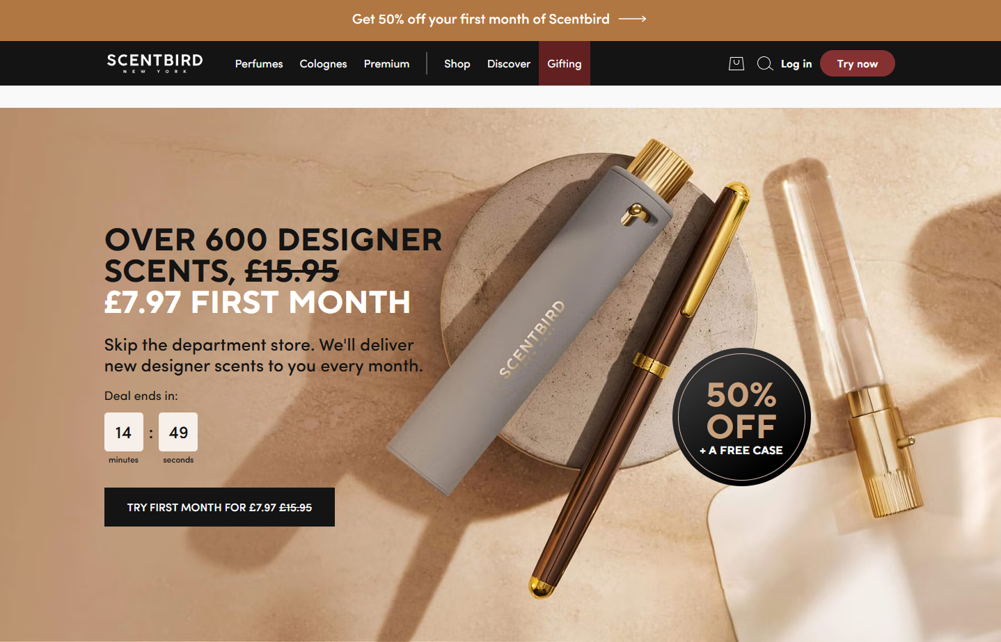 Bold headline, discounted price, and countdown timer clearly highlight the offer and urgency — all without scrolling.
Your headline should:
-
Clearly state the offer or product. Avoid buzzwords and be direct about what the user is getting.
-
Match the promise in the ad. If your ad promotes a discount or free trial, the landing page should mention it immediately.
-
Instantly answer: “What’s in it for me?” Users should feel the benefit right away, not after scrolling or guessing.
If you’re running campaigns with tightly targeted audiences and you’re seeing bounces, this is often the first place to look. For broader campaign strategy tips, explore Facebook Ads Funnel Strategy: From Audience Identification to Conversion.
2. Strong CTAs Win. Weak CTAs Waste Clicks.
The CTA (call to action) is the bridge between intent and action. It should guide users confidently toward their next step — not leave them guessing.
The CTA button is simple, prominent, and supported by instant sign-up options — minimizing friction and nudging action fast.
Instead of generic buttons like:
-
“Submit.” Cold and vague; gives no context or benefit.
-
“Click Here.” Technically clear, but emotionally flat.
-
“Learn More.” Passive, and often too low-commitment for action-focused campaigns.
Use action-driven, benefit-oriented text like:
-
“Get My Free Quote.” Emphasizes personal benefit and immediacy.
-
“Start Your 7-Day Trial.” Clearly tells the user what they’ll get and when.
-
“Grab My Spot Now.” Uses urgency and ownership to encourage action.
CTA placement also matters. Spread your CTAs along the journey — not just at the top or bottom. Match them with content milestones and intent signals.
3. Speed, Responsiveness, and Mobile Optimization
Today’s landing pages have to load fast, look good, and work well — especially on mobile. Google penalizes slow sites. Users do too.
Speed optimization tips:
-
Compress and lazy-load large images. This reduces page weight while preserving design quality.
-
Use CDN and caching tools. These help deliver content faster by storing local copies closer to the user.
-
Minify CSS and scripts. Smaller code loads faster — especially on mobile connections.
Mobile best practices:
-
Use larger fonts and touch-friendly buttons. Make it easy for users to tap and read without zooming.
-
Stack content vertically. Side-by-side layouts don’t translate well to mobile screens.
-
Avoid pop-ups that block the screen. They can frustrate users and increase bounce rate — especially on smaller devices.
If your page performs poorly here, your ad results will suffer. In fact, landing page experience is a hidden cause behind ad fatigue, as discussed in Ad Fatigue on Facebook: How to Spot It Early and Fix It Fast.
4. Make Social Proof Feel Real
You’ve built trust in your ad. Now your landing page needs to reinforce it — without sounding fake or over-polished.
Here’s how to do that:
-
Specific customer quotes — with real names or photos. These feel more authentic and relatable.
-
Industry badges, certifications, or trust seals. These provide third-party validation and authority.
-
Case studies with measurable results. People trust hard numbers more than vague claims.
-
Star ratings (only if you can back them up). If you show 4.8 stars out of 5, be ready to prove it.
Don’t overdo it. A few relevant testimonials or badges go further than a wall of logos.
5. Avoid the Clutter Trap
Landing pages should be focused. They’re not homepages. The goal is to reduce friction — not give users a dozen paths to wander off.
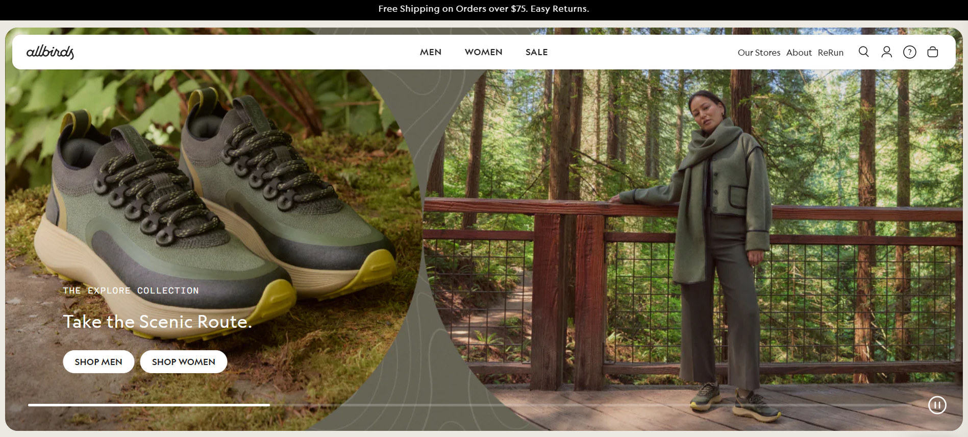
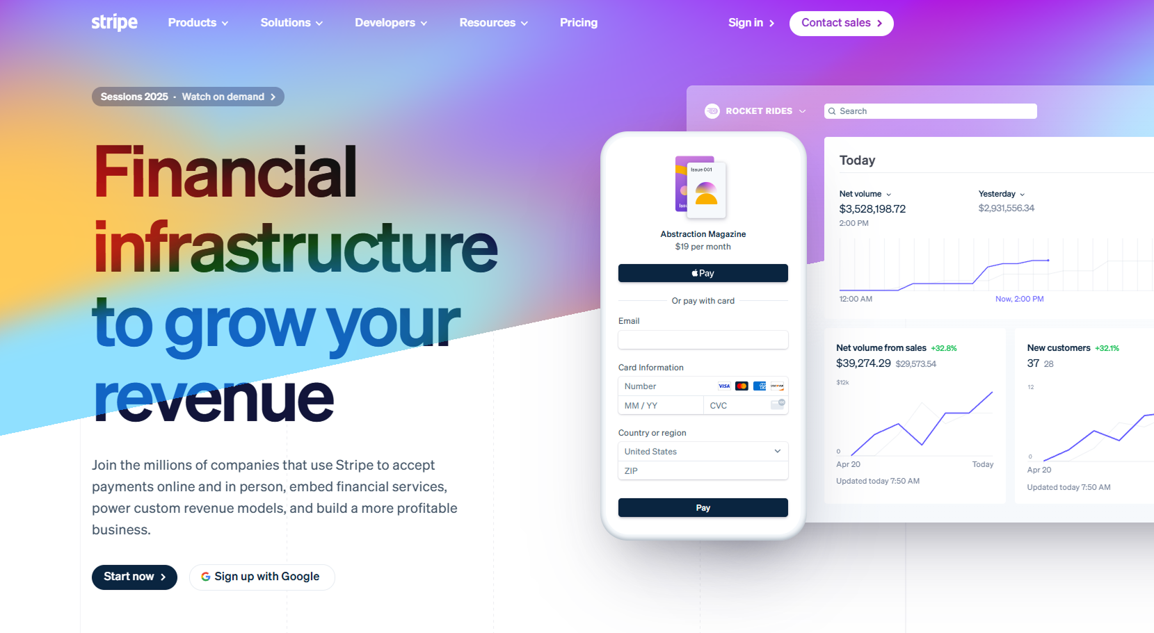
Visually clean and product-focused, this layout drives attention to one goal — exploring the new collection.
Trim your page with intention:
-
Remove top navigation menus. These invite users to leave the page.
-
Ditch unnecessary links. Everything should point toward the one conversion action.
-
Keep the focus on one goal (and one conversion path). Don’t ask users to choose between a download, webinar, free trial, and ebook — pick one.
Even a high-performing campaign can underdeliver if users are overwhelmed post-click. Want to drive even higher results? Pair a focused landing page with sharp campaign objectives — here’s how to choose the right one.
6. Personalize When You Can
Personalization increases relevance. And relevance increases conversions.
Some effective personalization tactics:
-
Match the ad headline based on UTM parameters. Create a seamless connection between ad and landing page.
-
Show location-specific info. Use geolocation to insert city or region names for relevance.
-
Highlight industry-specific testimonials. If you're targeting accountants, show quotes from other accountants — not generic users.
These small touches help the user feel seen. And they encourage them to take the next step.
7. A/B Test More Than Just Headlines
Landing pages are living systems. The only way to improve them long-term is to test consistently.
Focus your experiments on high-impact areas:
-
Layout structure — single-column vs. two-column. The visual flow impacts how people consume content.
-
Long-form copy vs. minimal copy. Some audiences want detail, others skim — you’ll never know unless you test.
-
Image style — human photos vs. product visuals. Visual cues change trust and relatability.
-
Value framing — features vs. outcomes. Highlighting the result (“Save time”) may outperform the technical benefit (“Automated dashboard”).
Looking to test quickly? AI tools can help generate variants faster — see our round-up of AI Text and Image Generators to accelerate your creative process.
8. Match the Message — Ad to Page
This is a silent killer. You run a great ad, generate a click… and then confuse the visitor with an off-message page.
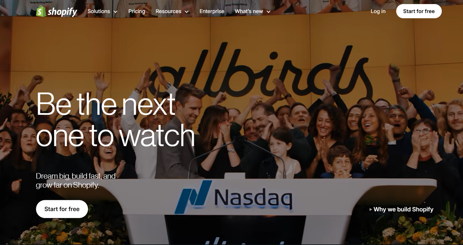
Emotional copy and visual storytelling align perfectly with Shopify’s brand and broader campaign tone.
Fix that disconnect:
-
Use the same language and keywords. Consistency builds trust and reduces confusion.
-
Repeat key benefits or pain points. Reinforce the motivation that got them to click.
-
Match the design feel and emotional tone. An ad that feels fun shouldn’t lead to a serious, corporate-looking page.
Every pixel should feel like the next step in the same experience.
If you're unsure whether you're attracting the right audience in the first place, read our guide to defining your marketing audience.
Final Word: Treat the Page Like a Funnel
Your landing page is a mini funnel.
It takes a visitor from interest to action, one step at a time. Headlines attract. Copy informs. Proof reassures. CTA converts.
So audit your page with fresh eyes. Ask: Is anything slowing down the path to "yes"? Then fix it.
Because when your landing page performs, everything downstream gets easier — from ad spend to scaling your growth.