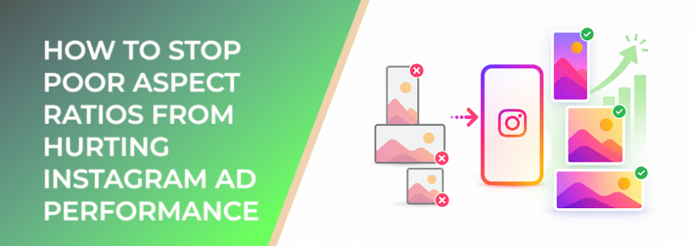
Aspect ratios look like a design detail until they start wasting media spend.
An Instagram ad can have a strong hook, relevant offer, good audience, and clear CTA — but still underperform because the creative shape does not match the placement.
A square asset may lose impact in a full-screen vertical placement. A vertical video may crop poorly in Feed. A horizontal image may leave too much unused mobile space. A carousel may feel inconsistent because cards were not planned together.
The campaign still spends. The ad still delivers. But the visual experience is weaker than it should be.
For performance marketers, aspect ratio is not just about making ads look neat. It affects attention, clarity, engagement, CPC, CPA, CAC, ROAS, and the reliability of creative testing.
The Problem
The problem is poor aspect-ratio planning.
Many advertisers upload whatever asset is available and rely on Meta to place it across Instagram surfaces. That may be fast, but it often creates “compatible but not optimized” creative.
The ad may be accepted by the platform, but it may not use the screen well.
Poor aspect ratios can cause:
- Cropped products or faces.
- Tiny text.
- Awkward empty space.
- Letterboxed or boxed-in video.
- Weak full-screen immersion.
- Reduced Feed visibility.
- CTA placement problems.
- Misleading creative test results.
This is especially common when teams promote Instagram posts directly or repurpose organic content for paid campaigns. Organic content may have been built for a specific context, but paid delivery can expand across multiple placements.
Why This Problem Hurts Performance
Aspect-ratio problems hurt performance because they reduce the quality of the impression.
The user sees the ad, but the ad does not occupy the screen in the strongest possible way. It may feel smaller, less native, harder to read, or less visually urgent than competing content.
That can reduce CTR because users do not understand the offer quickly. It can increase CPC because the ad earns weaker engagement signals. It can increase CPA because fewer qualified users make it through the funnel. It can hurt ROAS because paid impressions are not being converted into enough meaningful action.
Aspect-ratio issues also make scaling harder.
If the campaign works in one placement but fails in another, blended performance may look unstable. The team may pause a strong concept because the wrong version was shown in the wrong environment.
Aspect ratios also affect testing quality. If one creative variant is properly formatted and another is poorly cropped, the test is not really testing the hook or offer. It is testing formatting quality.
Common Scenarios Where This Happens
An ecommerce brand uses one square product image across Feed, Stories, and Reels. The product is visible in Feed but feels small in full-screen placements.
A B2B advertiser promotes a report using a horizontal banner. On mobile, the text becomes tiny and the visual does not command enough screen space.
A SaaS company records a horizontal product demo, crops it into vertical video, and accidentally cuts off key interface details.
A local business uses a portrait photo but places important service details near the edge of the frame. In some placements, the message is cropped or visually crowded.
An agency runs Advantage+ placements with one generic creative version. Some placements deliver impressions cheaply, but conversion quality varies because the asset is not equally strong everywhere.
An affiliate marketer tests three offers but uses different aspect-ratio quality for each. The winning offer may simply be the one with the best visual fit.
Why the Problem Happens
Aspect-ratio problems happen because advertisers confuse upload eligibility with performance readiness.
Meta may support several ratios across placements, but that does not mean every ratio is equally effective in every environment. Meta’s guidance indicates that Feed placements support both 1:1 and 4:5, with vertical 4:5 recommended for single-image Feed ads, while Stories and Reels are designed around 9:16 vertical creative.
Another cause is production convenience. Teams often create one master asset and resize it at the end. That is faster, but it usually creates weak placement versions.
Aspect-ratio issues also come from channel borrowing. Website banners, email graphics, YouTube videos, organic Instagram posts, and sales deck visuals are often pushed into Instagram ads without being rebuilt for the platform.
Finally, many teams do not inspect placement previews carefully. They see that the ad uploaded successfully and assume the creative is ready.
The Solution
The solution is to plan aspect ratios before production, not after upload.
Start by deciding which placements matter most to the campaign.
If the campaign depends on Feed, create a Feed-first version. If Stories and Reels are important, create a vertical full-screen version. If carousels are part of the strategy, plan every card as a consistent sequence.
A practical Instagram aspect-ratio workflow should include:
Feed Version
Use a Feed-friendly format that gives the product, message, or outcome enough mobile presence. Square can work, but vertical Feed formats often use more screen space and can improve visibility.
Keep the focal point large and readable. Do not assume users will zoom in mentally.
Stories and Reels Version
Build a true 9:16 version. Do not simply center a square ad on a vertical background.
The vertical version should have its own composition, text placement, and CTA spacing. The first frame or first second should communicate quickly.
Carousel Version
Keep card ratios consistent. Make sure each card can be understood on mobile and that the first card creates enough reason to swipe.
Do not use carousels as a dumping ground for every detail that did not fit in the main ad.
Placement Preview Check
Before launch, inspect how the ad appears in each placement.
Look for cropping, unreadable text, weak focal points, and blocked CTAs. If the creative looks compromised, create a separate version instead of accepting the default crop.
Performance Breakdown Review
After launch, review performance by placement when possible.
If one placement has poor CTR, weak retention, or high CPA, check whether the aspect ratio is part of the problem before changing the offer or audience.
Risks and Considerations
Better aspect ratios do not fix weak strategy.
A perfectly formatted ad can still underperform if the offer is not compelling, the audience is poorly matched, the landing page does not convert, or the campaign objective is misaligned.
There is also a production risk. Creating too many versions can slow teams down and make testing messy. The goal is not endless resizing. The goal is enough placement-specific creative to avoid obvious performance loss.
Another risk is chasing generic best practices without looking at account data. Some audiences may respond well to square Feed ads. Some creative concepts may perform better in vertical video. Use platform guidance as a starting point, then validate with your own results.
Advertisers should also avoid comparing ratios unfairly. If the 9:16 version has a different hook, offer, and CTA than the 4:5 version, the test is not only about aspect ratio.
Prerequisites and Dependencies
To stop aspect ratios from hurting Instagram ad performance, you need a clear placement strategy.
You need to know whether the campaign is prioritizing Feed, Stories, Reels, Explore, carousels, or broad delivery.
You need source assets with enough resolution and flexibility for multiple crops. Low-quality images or tightly framed videos can be difficult to adapt.
You need a creative brief that specifies ratio requirements before design starts.
You also need a consistent naming and review process. Label assets by placement and ratio so the wrong version is not uploaded accidentally.
Finally, you need enough performance data to judge the impact. Track CTR, CPC, CPM, video retention, outbound clicks, conversion rate, CPA, ROAS, and lead quality by creative version and placement where possible.
Practical Recommendations
Do not start with “What asset do we already have?”
Start with “Where will this ad run, and what shape does that placement need?”
Build a minimum viable ratio set for most Instagram campaigns:
- A Feed version.
- A 9:16 Stories/Reels version.
- A carousel-safe version if using carousel.
- A fallback version only where necessary.
For each version, preserve the same core message but adapt the layout. The product may need to be larger in vertical. The headline may need to move. The CTA may need more breathing room. The proof point may need to shift from overlay text to caption or landing page.
When testing, isolate the ratio variable where possible. Use the same offer, audience, landing page, and CTA. Then compare performance by placement.
If an ad is already spending and performance is weak, inspect aspect ratio before rebuilding the entire campaign. Sometimes the fastest improvement is not a new concept. It is a better-fitting version of the existing concept.
Final Takeaway
Poor aspect ratios hurt Instagram ad performance because they weaken the first visual experience.
The campaign may still run, but the ad gives up screen space, clarity, and native placement fit. That can reduce engagement, raise costs, and make creative tests harder to interpret.
The fix is to plan ratios by placement, build mobile-first versions before launch, preview every important placement, and evaluate performance with formatting in mind.
Good aspect-ratio planning gives the creative a fairer chance to win attention and gives advertisers cleaner data for scaling.
Related LeadEnforce Articles
- Meta Ad Aspect Ratios by Placement: How to Stop Creative Fit From Hurting CPA — Directly relevant to preventing ratio and placement mismatch from increasing acquisition costs.
- Facebook & Instagram Ad Sizes: The Ultimate Guide for Designers — Helps creative teams plan dimensions before production.
- Why Instagram Creative Fails Across Placements Even With Strong Engagement — Explains why creative needs more than resizing when moving across placements.
- Creative vs Context: Why the Same Ad Wins in One Placement and Loses in Another — Useful for understanding why placement environment changes creative performance.