Getting someone to notice your Facebook ad in a crowded feed is a creative challenge. Getting them to care — that’s a psychological one.
When it comes to designing high-performing Facebook and Instagram ads, visuals often speak louder than copy. And nothing influences perception faster than color. It grabs attention, triggers emotions, and sets expectations, all before a single word is read.
But here’s the real question: are you choosing your ad colors intentionally, or are you just going with what "looks good"?
In this guide, we’ll explore how color psychology can be strategically used to improve your Facebook ad design. You’ll learn how different colors influence behavior, how to match colors to your marketing goals, and how to test and optimize your creative for better performance.
Whether you're running lead gen campaigns, retargeting warm audiences, or launching a new product, understanding color psychology can give you a clear competitive edge.
Why color psychology matters for Facebook ads
Colors affect perception at lightning speed — far faster than text or logic. In the context of Facebook and Instagram ads, where attention is fleeting and competition is brutal, using the right colors can mean the difference between a scroll and a click.
Color psychology refers to how color influences human emotions and behavior. It’s been studied for decades in marketing, design, and branding. While it’s not a one-size-fits-all science, it can give you a powerful framework for communicating more effectively with your target audience.
Think about your goals: are you trying to spark curiosity? Build trust? Encourage urgency? The right color palette can amplify that intention.
For Facebook advertisers, this means color isn’t just an aesthetic choice — it’s a performance tool. The right tones can elevate your click-through rate (CTR), reduce ad fatigue, and improve campaign ROI. The wrong ones? They can quietly undercut your message and make your ad invisible.
In the fast-paced mobile environment of Meta platforms, you have milliseconds to create impact. Color helps you do it without saying a word.
The emotional triggers behind common colors
To use color effectively, you first need to understand how specific colors are generally perceived. Each hue evokes different psychological responses — responses that can directly impact how users engage with your Facebook ads.
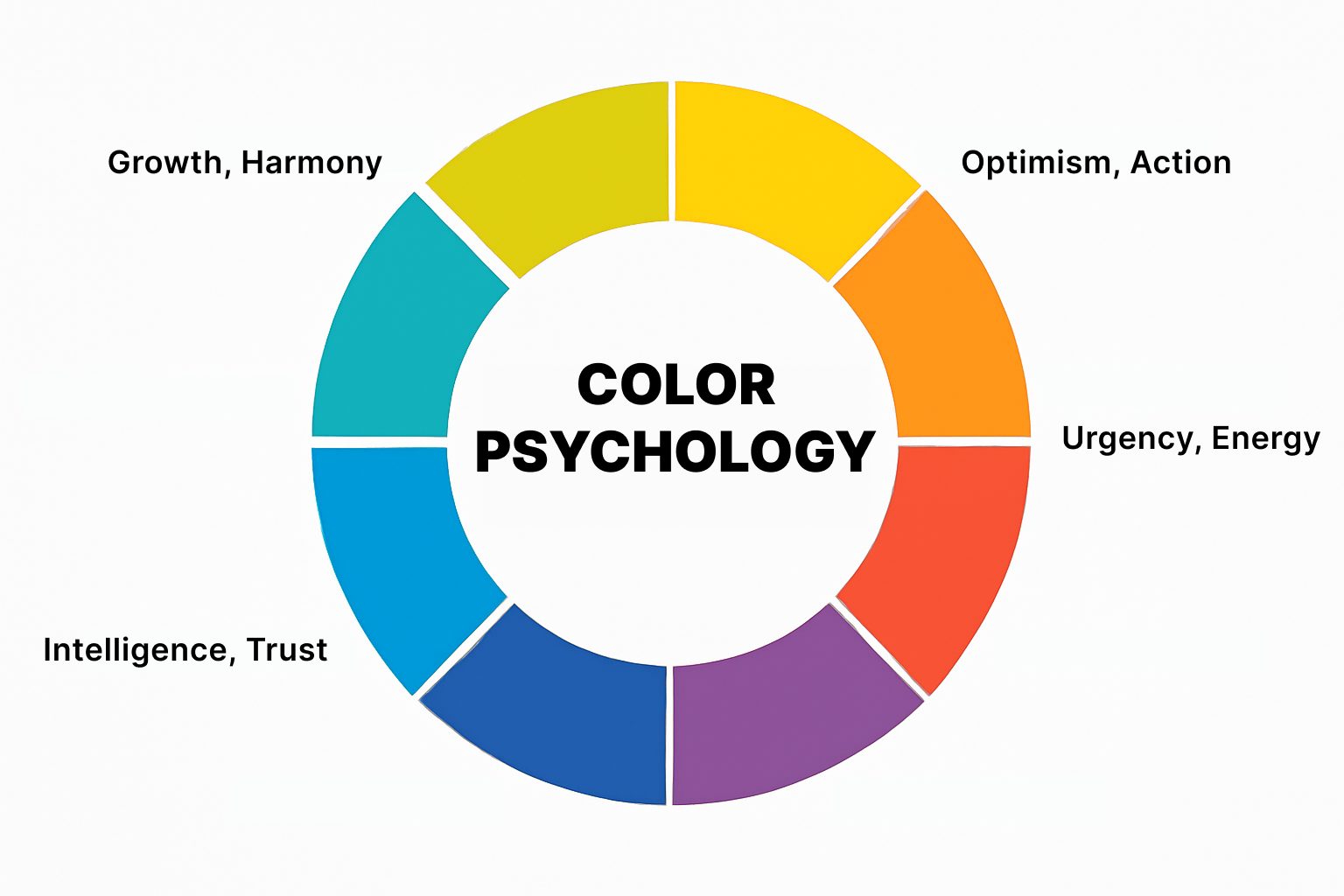
While these associations can vary slightly based on culture, gender, or context, there are widely accepted emotional triggers tied to common colors:
-
Red: urgency, energy, passion, appetite;
-
Blue: trust, calm, reliability, intelligence;
-
Yellow: optimism, youthfulness, friendliness, positivity;
-
Green: health, harmony, growth, sustainability;
-
Orange: enthusiasm, action, creativity, friendliness;
-
Purple: luxury, imagination, wisdom, uniqueness;
-
Black: elegance, power, sophistication, formality;
-
White: simplicity, clarity, cleanliness, honesty.
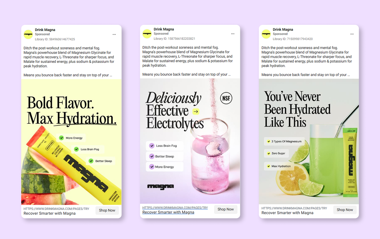
Imagine you're promoting a flash sale — red or orange can subtly create urgency and excitement. Want to build confidence in a new service? Blue can suggest professionalism and security. Launching a skincare line? Soft greens and whites might imply purity and natural benefits.
Understanding these associations lets you select colors that reinforce your ad’s core message. The key is alignment. The more your color palette supports your intent, the more cohesive and compelling your ad becomes.
Designing with purpose: aligning color with campaign goals
One of the most common design mistakes in Facebook ads is choosing color based on brand identity alone. While brand consistency matters, your ad creative should serve the specific goal of the campaign.
Every Facebook ad has an objective — a clear action you want someone to take. Whether it's clicking a link, signing up for a webinar, or adding a product to their cart, color can support that objective in subtle but meaningful ways.
-
For awareness campaigns, using bold, high-contrast colors can help your ad stand out in the feed and increase recall;
-
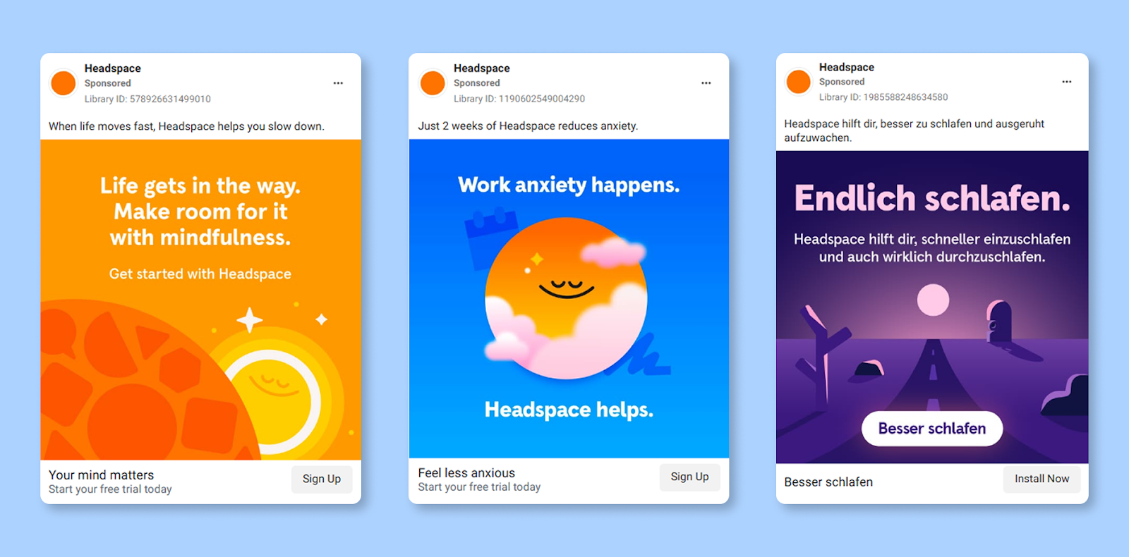
For lead generation ads, calming, trustworthy tones like blue or green may improve form-fill rates by signaling credibility;
-
For retargeting campaigns, using familiar brand colors can reinforce recognition and keep your brand top-of-mind;
-
For ecommerce product launches, vibrant colors like red or orange can drive action and create excitement.
When in doubt, ask yourself: “What do I want people to feel when they see this ad?” Then, choose your palette accordingly. Color isn’t just a visual element — it’s a strategic tool to move your audience emotionally and behaviorally.
Color contrast and visual hierarchy
A well-chosen color means little if your ad lacks clarity or contrast. That’s where visual hierarchy comes in.
High-performing Facebook ads use contrast to direct the eye. This means balancing dominant and secondary colors to guide attention toward your call-to-action (CTA) or value proposition.
Let’s say your CTA button is red — pairing it with a light, neutral background like white or gray will help it stand out. But if the entire ad is bright and saturated, your CTA might drown in visual noise.
Here’s how to make your colors work harder for you:
-
Use one dominant color to define the tone and emotional feel;
-
Choose one or two accent colors to highlight CTAs or specific elements;
-
Incorporate neutral tones (white, gray, beige) to create breathing room and reduce clutter.
This keeps the design clean, focused, and easy to digest — all critical factors for improving ad engagement on mobile.
Another consideration? Accessibility. Use online tools to test color contrast ratios. Ensuring that your text is legible and your buttons stand out is not just good design — it’s also smart UX.
Color psychology on mobile: adapting for the feed
More than 90% of Facebook users access the platform on mobile. That means your ad color choices need to be optimized for small screens, varying light conditions, and fast scrolling behavior.
Colors can behave differently depending on the device, brightness setting, or even the color calibration of a user’s phone. What looks vivid and sharp on your desktop might appear washed out or unreadable on mobile.
To adapt, you should:
-
Preview all creatives in Facebook Ads Manager’s mobile view before publishing;
-
Boost contrast between text and background slightly more than you would for desktop;
-
Avoid thin, light-colored fonts that may disappear in bright environments;
-
Test your ads in real-world conditions — not just in the design tool.
Additionally, consider how your colors will interact with Meta’s placement formats. For example, Stories and Reels autoplay, often with overlays and motion. Subtle gradients or soft pastels might get lost in the motion unless anchored with bold elements or clear text containers.
Your goal is to ensure your colors remain clear, effective, and emotionally relevant — wherever they appear.
Testing and optimizing color for better results
Even if your ad “feels right,” performance is what really matters. That’s why A/B testing different color schemes can be one of the most revealing experiments in your creative optimization process.
Let’s say your ad performs decently with a green CTA button. But what if a bright orange version converts 20% better? You won’t know unless you test.
When running color-based A/B tests:
-
Change only one variable at a time — for example, the background color or CTA button color;
-
Keep layout, copy, and targeting identical so results are clean and actionable;
-
Run tests for a statistically significant sample size to avoid jumping to false conclusions.
Try segmenting your audience as well. Younger users may respond better to energetic, unconventional colors, while older demographics may prefer subdued, traditional palettes.
Data-driven decisions around color can reduce guesswork, cut costs, and help you discover what actually drives conversions.
To learn more about optimizing your ad creatives and improving performance through strategic testing, read How to A/B Test Your Facebook Ad Creative for Better Results.
Staying on brand while exploring emotion
There’s no need to ditch your brand guidelines to embrace color psychology. But there is value in designing within your brand palette more dynamically.
For example, if your main color is navy blue, you might use it for backgrounds and headers. But to highlight limited-time offers or discounts, you can add accent colors like yellow or coral that stand out and signal urgency — all while staying visually consistent.
A good brand system includes:
-
Primary brand colors that are used for recognition and consistency;
-
Secondary colors for variety and emotional flexibility;
-
Neutral tones to support clarity and content legibility.
This gives you the freedom to adapt your creative without compromising brand integrity. In other words, let color psychology inform the how, without abandoning the who.
Color shouldn’t just reinforce your brand’s image — it should also push the emotional buttons of your target audience. If you're unsure how to balance this while maintaining a cohesive brand identity, the article Crafting Compelling Facebook Ads Copy That Converts provides strategies for creating a strong brand voice that complements your color choices in a way that boosts conversions.
Final thoughts
Color is one of the most underutilized levers in Facebook ad design. It’s fast, emotional, and incredibly persuasive — if you use it with intention.
So the next time you launch a campaign, don’t treat color as an afterthought. Use it as a core part of your strategy. Ask yourself:
-
What emotions am I trying to evoke?
-
What action do I want people to take?
-
Are my colors reinforcing or weakening that goal?
The more thought you put into color psychology, the more control you have over how your ad is seen, felt, and acted upon.
Your message matters. Make sure your colors help deliver it.