Facebook and Instagram feeds are competitive, fast-moving spaces. Your ad has just a moment to make an impression — and in that moment, the creative must both capture attention and communicate exactly what your brand stands for.
Many advertisers focus on visibility but lose consistency. Others stay “on-brand” but blend in with everything else. Strong creatives do both. They’re designed with purpose, visual clarity, and a clear connection to your brand’s personality.
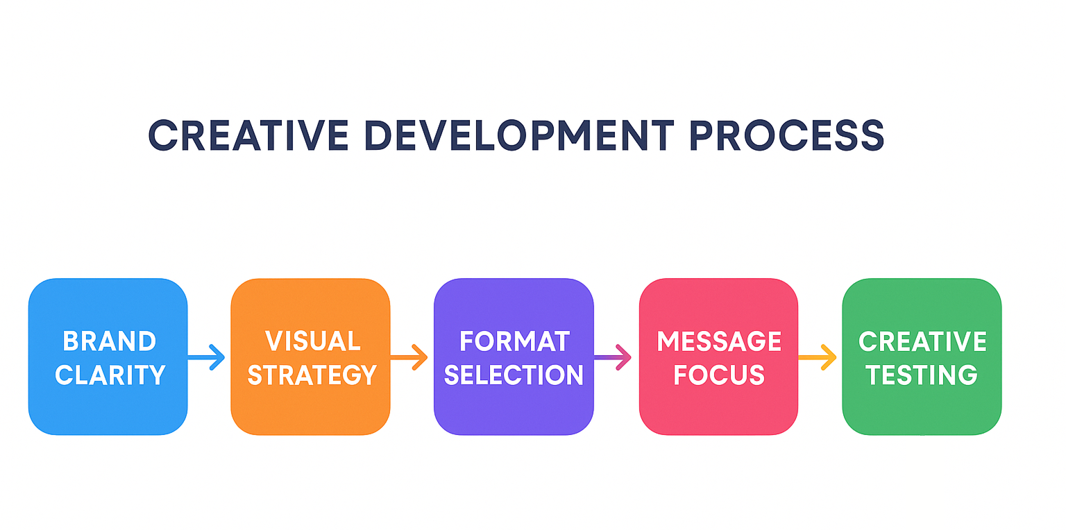
This article explores how to develop ad creatives that don’t just perform — they reinforce who you are as a brand every time they appear.
Before you design, get grounded in your brand
The first mistake many advertisers make is jumping straight into visuals without checking for alignment. Brand visuals are more than just colors and logos. They reflect your values, positioning, and how your audience perceives you.
Ask yourself:
-
What are the defining characteristics of our brand?
-
If our brand were a person, what would it look like, sound like, and care about?
-
Are our visuals currently consistent across ads, website, and organic content?
Design choices — from photography style to typeface to tone — should be deliberate extensions of these answers. This is what helps you build familiarity and trust over time.
Tip: build a lightweight brand reference for ads: 2–3 colors in use, consistent typography, examples of on-brand imagery, tone examples, and a few “dos and don’ts.” It’s not about rigid rules — it’s about recognizable identity.
Communicate visually, not just verbally
A mistake advertisers often make is relying on headlines or captions to do the heavy lifting. But on platforms like Facebook, people rarely stop to read unless the visual earns that pause first.
The creative should speak clearly without requiring additional explanation.
Instead of showing the product alone:
-
Show the context of use.
-
Show the outcome it delivers.
-
Or show the problem it solves.
Example: a delivery service ad doesn’t need to focus on a phone screen showing the order interface. Instead, a well-shot image of someone relaxing at home with food arriving at the door can speak volumes about convenience and time saved.
Keep asking: what do our customers care about most? How can we show that visually, in one frame or sequence?
Even the strongest visuals can fall flat without clear, relevant messaging. Here's how to craft ad copy that supports your creative without stealing focus.
Visual consistency builds recognition
Standing out doesn’t mean looking random. It means being distinct, in a way that’s consistent over time.
Even when experimenting with new creatives, your audience should still recognize your voice and style.
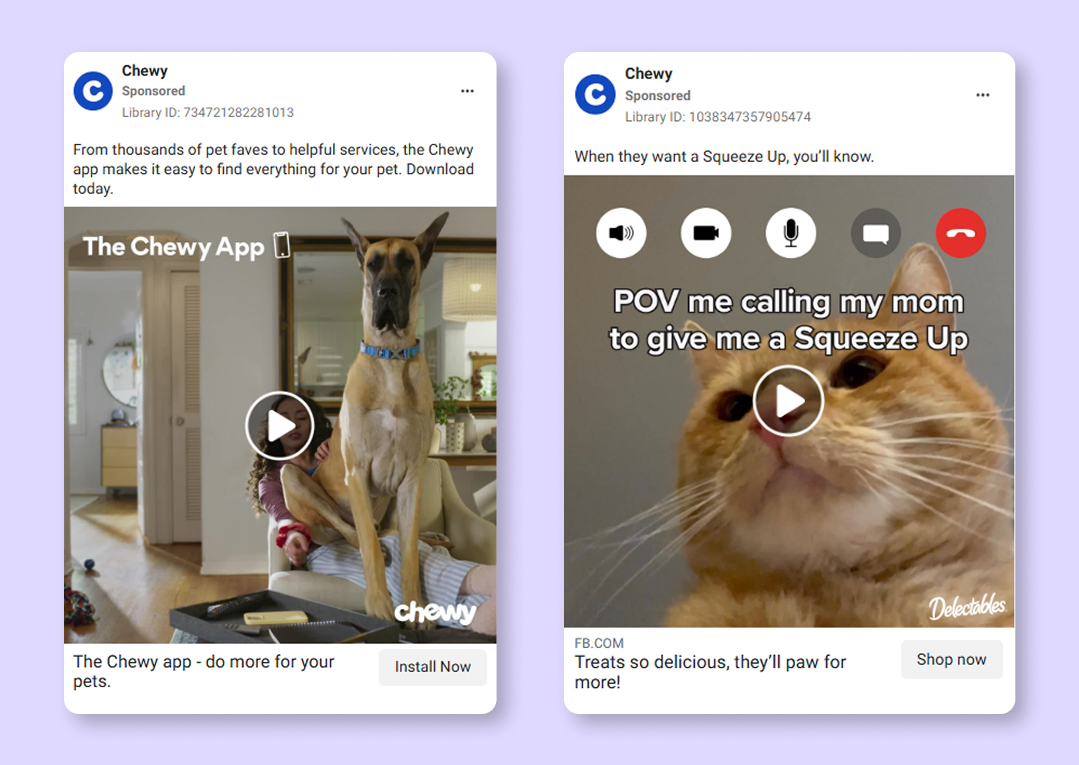
Chewy's Facebook ads are always recognizable thanks to the consistent tone of voice and the visual style they adopt no matter the product.
This means:
-
Avoiding stock images that don’t match your look and feel.
-
Using the same (or intentionally evolved) lighting, layout, or composition.
-
Keeping visual hierarchy consistent — headline placement, color emphasis, image framing.
Try this test: remove your logo from the ad. Would someone who follows your brand still recognize the ad as yours?
If the answer is no, revisit how you’re embedding identity into your visuals.
Choose formats that support the message
Every format has strengths — but not all of them will suit your message or branding equally well.
- Single Image ads: clean and simple. Great for clear messages with strong visuals. Works best with one main point and minimal text.
- Carousel ads: useful for showcasing variations, highlighting features, or explaining steps. Best when your brand has a story that can unfold across frames.
- Video ads: allow for more context and pacing, but need to be intentional. Short-form videos under 15 seconds tend to hold attention better. They should still work without sound.
- Stories and Reels: more immersive and often more casual. These are excellent for lifestyle-driven brands or those that rely heavily on emotion and relatability. If you’re also running creatives on Instagram, this guide to using Reels effectively in your ad strategy is a good place to expand your approach
Each format should not just be repurposed — it should be designed for. Don’t trim a longer video and hope it fits as a Story.
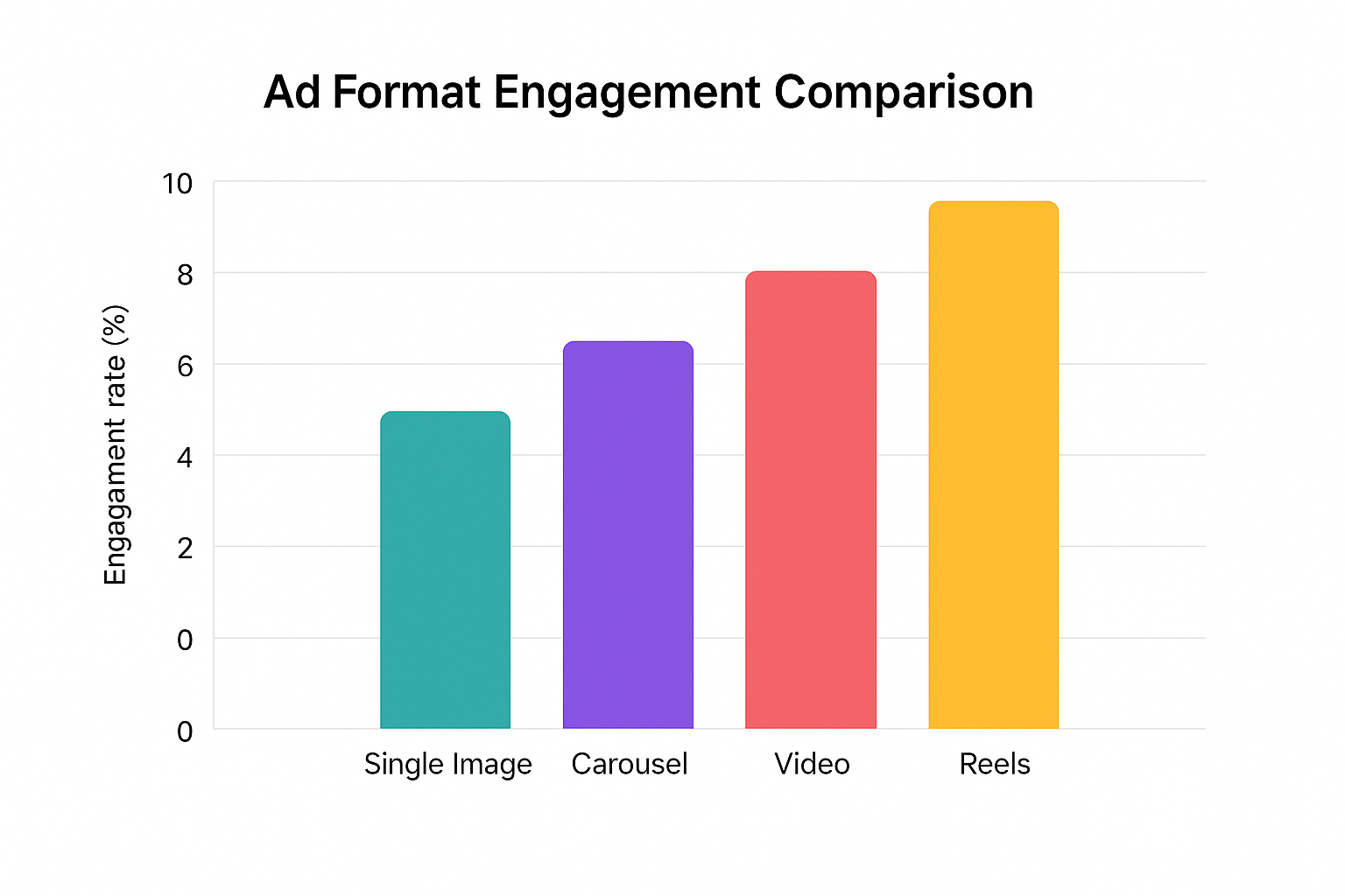
Ad format engagement comparison: Reels and video ads show higher average engagement on average, but actual results may vary by audience, niche, and creative quality.
Reconsider framing, pacing, and content based on where it will appear.
Still deciding which format best supports your message? Explore the pros and cons in our Ultimate Guide to Facebook Ad Formats.
Design for attention without losing your voice
It’s easy to confuse “attention-grabbing” with “loud.” Bright colors, bold type, or unusual animation might draw eyes — but if they clash with your brand, they confuse more than they convert.
Use contrast and focus, not gimmicks.
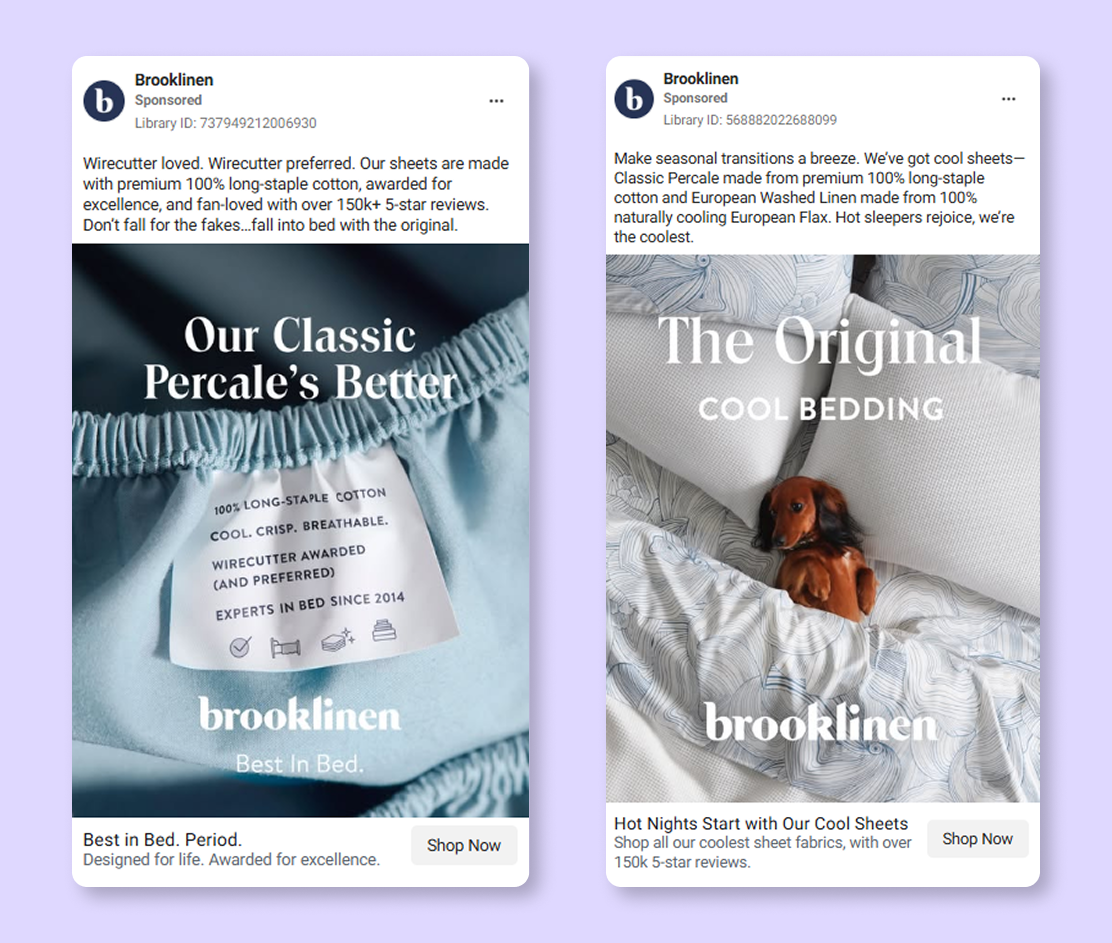
Brooklinen uses simple, minimalistic ad design that centers the products and perfectly matches its brand personality.
Here's how to do that:
Stick with your visual language, but find ways to make the key message or visual element pop.
-
Use whitespace strategically — cluttered designs are harder to process quickly.
-
If using animation or video, lead with a compelling visual or moment in the first two seconds. Don’t wait for the viewer to get interested.
Ask: what part of this creative earns attention? And is that part relevant to our message and audience?
Refresh creatives without starting from scratch
One of the biggest sources of creative waste is throwing out effective branding just to “keep it fresh.” The goal isn’t constant reinvention — it’s thoughtful variation.
Change the surface details:
-
Update the call to action.
-
Swap in new imagery with the same layout.
-
Highlight a seasonal or timely feature.
But keep the underlying structure familiar. That consistency creates a sense of stability and reliability, even as your campaigns evolve.
Tip: look at your top-performing creatives over the last 3–6 months. What elements were consistent? That’s your baseline for future iterations. For a structured approach to testing different visual concepts, use this step-by-step guide to A/B testing Facebook ad creatives.
Ask the right questions before you launch
Every ad creative should go through a final check — not for grammar or compliance, but for strategic alignment.
Ask:
-
Does this look like our brand — at a glance?
-
Is the main message visually clear without relying on text?
-
Will someone scrolling fast understand the relevance in under three seconds?
-
Is this creative consistent with our other touchpoints, or does it feel disconnected?
-
If this ad performs well, would we be proud to scale it — not just for clicks, but for brand perception?
If your answer to any of these is uncertain, revise.
Final thoughts
An effective Facebook ad creative isn’t just something people notice. It’s something they recognize. It communicates not just what you sell — but who you are, and why it matters.
In a platform built on movement and noise, brands that remain clear, visually coherent, and confident in their identity will always have the edge.
Make every ad a small reinforcement of your brand. Stay distinct. Stay relevant. And most importantly, stay consistent.