
Instagram users decide where to look before they read a single word. If the text in your ad has no visual anchor, the brain treats it like background noise.
This problem appears often in image ads with floating headlines, disconnected callouts, or text placed randomly around the creative. The message technically exists, but users never process it properly because nothing tells the eye where to start.
That hurts more than engagement metrics. Weak visual anchoring usually lowers click intent. People scroll past because the ad feels harder to decode.
What a visual anchor actually does in Instagram ads
A visual anchor gives the eye a starting point. It creates a relationship between the text and the main visual element.
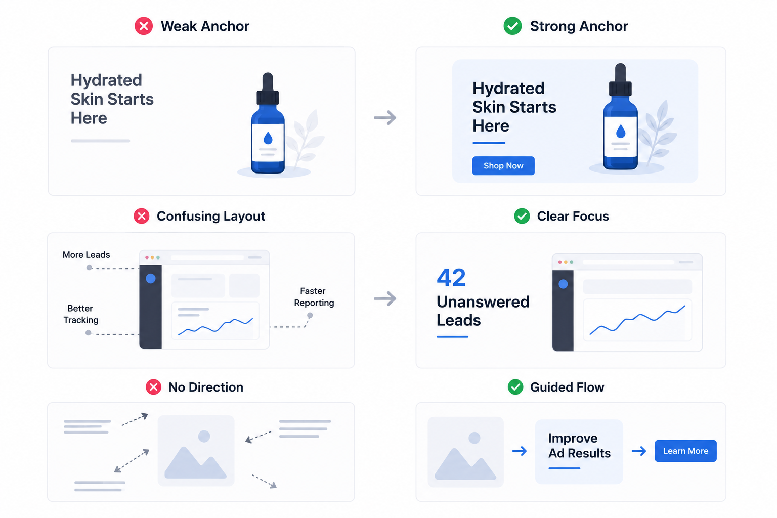
On Instagram, users scan quickly. They do not study layouts. The brain looks for structure immediately:
- A face looking toward the headline.
- A product connected to a benefit statement.
- A shape or contrast area containing the main message.
- A clear size difference between primary and secondary text.
Without those signals, the text feels detached from the creative.
This is why some ads get impressions but weak CTR. The audience technically sees the ad, but the layout slows comprehension.
You can often spot this inside Ads Manager when CPM stays stable while CTR drops. The platform keeps delivering impressions, but users stop reacting because the creative creates friction.
For more examples of structured creative layouts, see how to use text overlays effectively for Meta ads.
Floating text creates visual confusion
A common mistake is placing text in empty parts of the image without connecting it to the focal point.
For example:
- A skincare product sits at the bottom while the headline floats alone in the upper corner. The user processes them separately instead of as one message.
- A SaaS dashboard screenshot appears in the center, but the benefit statement sits outside the main viewing path. The eye moves back and forth instead of following one flow.
- A fitness ad uses multiple text blocks around the subject. Each block competes for attention, so none becomes dominant.
This usually increases cognitive load. Users should understand the ad in under two seconds. If the layout requires effort, scrolling wins.
The best-performing ads guide attention deliberately
High-performing Instagram creatives usually direct attention through one visual path. The image leads into the text. The text supports the image. The CTA finishes the sequence.
That structure matters because Instagram is not a reading platform first. It is a scanning platform.
Strong creatives often use:
- One dominant focal element.
- One primary text area.
- Strong contrast between headline and background.
- Tight spacing between the image and the supporting message.
The goal is not decoration. The goal is comprehension speed. This becomes even more important for cold audiences. People unfamiliar with your brand need immediate clarity before they consider clicking.
The article on visual hierarchy in Instagram ads explains how attention order affects performance across placements.
Better targeting cannot fully fix weak visual structure
Many advertisers try solving this with audience changes.
Sometimes the problem is not targeting. The issue is that users cannot identify the core message quickly enough.
Even high-intent audiences react poorly to creatives that feel visually disorganized.
This is especially visible in B2B lead generation campaigns. Decision-makers scroll fast. If the headline does not attach clearly to the main visual, the ad looks generic immediately.
That is where precise targeting from platforms like LeadEnforce becomes more useful. Better audience quality increases the chance that users care about the offer, but the creative still needs a clear visual entry point.
Otherwise, expensive audiences produce weak engagement.
Small layout changes can improve CTR fast
You usually do not need a full redesign. Most fixes involve improving directional clarity:
- Move the headline closer to the focal object.
- Reduce the number of competing text areas.
- Increase spacing around the primary message.
- Use contrast to separate the main statement from secondary information.
These changes often improve thumb-stop rate without changing the offer itself.
If you want to improve first-impression performance further, study creatives that earn attention in 3 seconds or less.
The strongest Instagram ads do not just contain text. They tell the eye exactly where the message belongs.