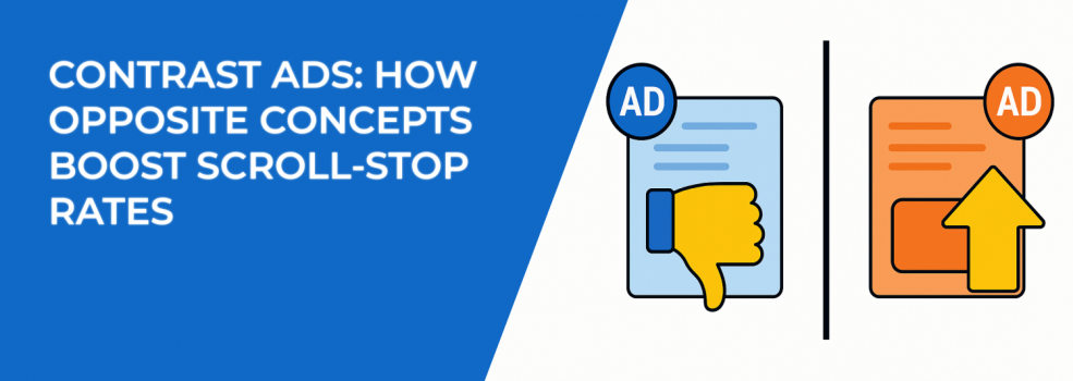
When your ads blend into the feed, they don’t just go unnoticed — they waste money. People scroll right past them, and you miss the chance to make an impact.
If you want better results, your first goal isn’t to get clicks or conversions. It’s to stop people mid-scroll and get them to look.
That’s where contrast comes in.
Whether it’s visual, emotional, or conceptual, contrast grabs attention. It creates a pattern break — something the brain isn’t expecting. And that moment of surprise? It’s powerful.
Let’s explore how contrast ads work and how you can use them to boost performance across Meta, Instagram, TikTok, and more.
Why Contrast Grabs Attention So Fast
People don’t look at everything in a feed. They scan — quickly. The brain is built to look for what stands out, not what blends in.
That means if your ad feels too similar to what came before or after it, most people won’t notice it at all. But if something visually or emotionally breaks the flow, they pause.
Contrast ads do just that. They create a clear difference — a “before and after,” a “wrong vs right,” or a “mess vs clean” — that’s easy to understand in seconds.
This quick clarity works especially well in high-scroll environments, where people don’t have time to process complex messages.
Types of Contrast That Stop the Scroll
There’s no one way to use contrast in ads. In fact, the more creative you get with it, the better your chances of standing out.
Here are several high-performing contrast styles to try — with tips for each one:
1. Before vs After
One of the most common and effective types of contrast.
Think of messy vs tidy, tired vs energized, or cluttered vs organized. Show what life looked like before your product or service — then show how it improves things.
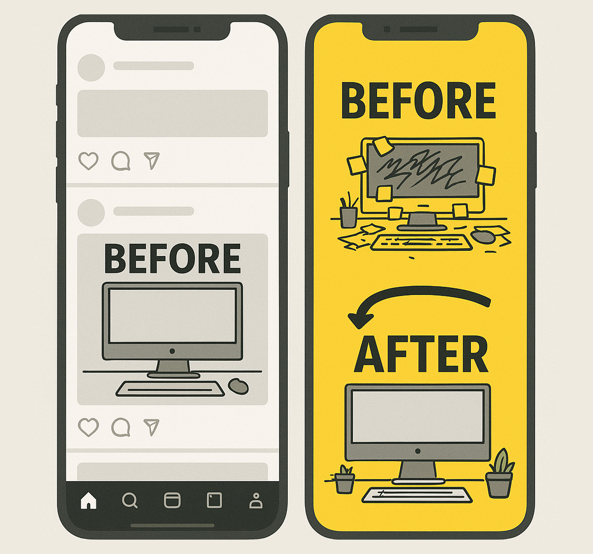
A bold contrast ad (right) grabs more attention than a plain, low-contrast post (left), using a messy vs. clean desk to highlight the difference.
Tip: The key is to make the difference really obvious. If the change is too subtle, people won’t care.
Use bold visuals and clear text to highlight the transformation. This format also works great for carousels and videos.
Want to see what ad formats work best for visuals like this? Check out The Ultimate Guide to Facebook Ad Formats.
2. Problem vs. Solution
This version shows the struggle — and then the fix.
Start with something that feels familiar to your audience: stress, frustration, confusion, delay. Then show how your product solves that problem in a simple, clear way.
It’s not just about showing benefits. It’s about showing relief.
Tip: Keep the “problem” visual relatable and specific, not generic. The more real it feels, the stronger the connection.
3. Old Way vs New Way
This is great when your offer is faster, smarter, easier, or more modern than what people are used to.
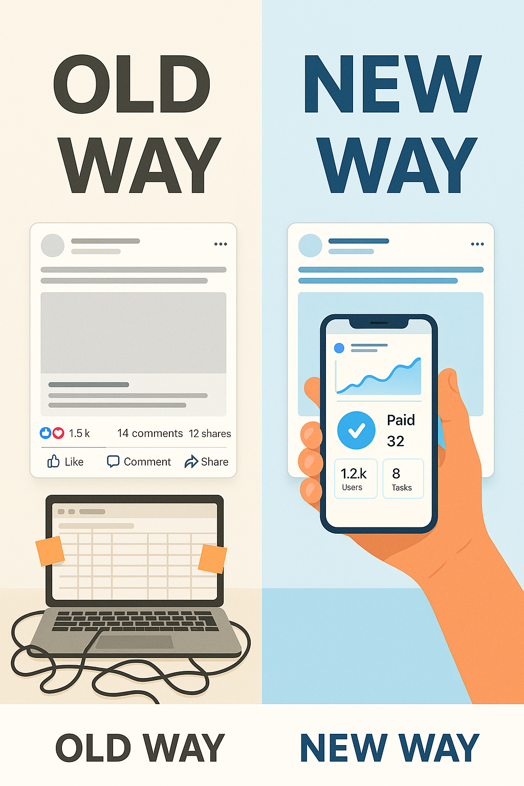 From messy spreadsheets to streamlined automation — show how your workflow can evolve with smarter ad management tools.
Show the outdated way first — messy spreadsheets, manual tasks, long lines, wasted time — then flip to a cleaner, more efficient “new way.”
Tip: This is perfect for tools, platforms, and services that automate, simplify, or modernize a task. Use split-screen visuals to drive the contrast home.
4. Expectation vs Reality
This works especially well with humor, surprise, or storytelling.
Think of a fancy product photo — followed by what it actually looks like when you open the box. Or the difference between how people think a tool works vs what really happens.
It’s relatable, entertaining, and scroll-stopping.
Tip: This format grabs attention fast, but it works best when people already have assumptions you can flip. Don’t overuse it if your audience is unfamiliar with your category.
5. Chaos vs Calm
This is all about visual tension. On one side, you show something cluttered, noisy, or overwhelming. On the other side, you show simplicity and clarity — usually the outcome of using your product.
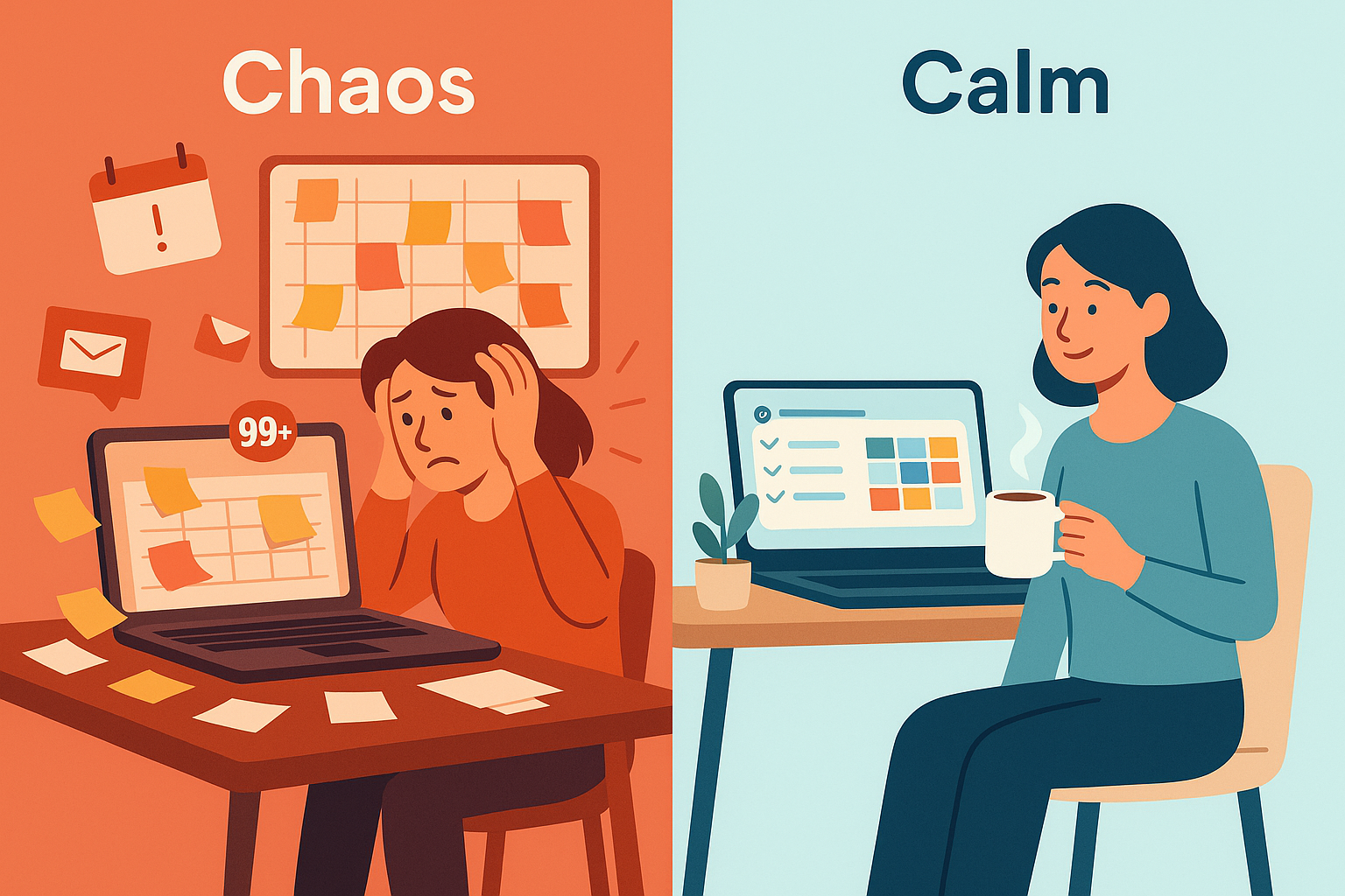
Great for wellness, productivity, time-saving tools, and lifestyle brands.
Tip: Use color contrast here too. A bright, cluttered background next to a clean, calm space makes the message even stronger.
6. Manual vs Automated
This is ideal for SaaS, services, or tools that replace manual labor with smarter systems.
Show someone doing something the hard way (by hand, with sticky notes, or constant reminders), then contrast it with a streamlined process handled in seconds.
Tip: If you're struggling to visualize this well, consider using an AI-powered creative tool to generate concept mockups before testing.
Bonus: Use Movement to Emphasize the Switch
If you’re running video or animation, use movement to show the transformation happening in real time.
Swipe transitions, tap-to-reveal sliders, and visual swaps (like a “chaos-to-calm” animation) all drive engagement — especially on Instagram Reels or Stories.
Looking to improve performance on Reels or Story placements? Here’s a guide to using Instagram Reels in your strategy.
When to Use Contrast Ads in Your Funnel
Contrast ads work in almost every stage, but they shine brightest at the top and middle of your funnel:
-
Top of funnel: Grab attention fast, show the big difference, and create curiosity.
-
Middle of funnel: Make the choice feel obvious — “Why stay stuck in the old way?”
They’re also effective in retargeting campaigns. You can remind people of the problem they still have — and show that the solution is just one click away.
If you’re seeing low performance, don’t assume the ad itself is the problem. Sometimes it’s the setup. Read this article on why some ad sets get zero delivery for tips on spotting bigger issues.
Final Thoughts: Think in Opposites
When you’re stuck trying to improve ad performance, don’t just rewrite the headline or test a new CTA.
Ask:
- What’s the most powerful contrast I can show my audience?
- Can I make the before more painful?
- Can I make the after more desirable?
Because the clearer that difference is, the faster people stop, pay attention — and act.