Some Facebook ads lose clicks before users ever think about the offer.
The problem is not always the audience, budget, or objective. Sometimes the ad itself creates confusion. The image suggests one idea. The copy explains another. The CTA asks for an action that does not match either one.
When that happens, users hesitate. In a fast-moving feed, hesitation usually becomes a scroll.
This affects performance marketers, agencies, ecommerce brands, local advertisers, B2B lead-generation teams, startup marketers, and freelancers. If the ad message does not feel coherent at a glance, the campaign can pay for impressions without earning enough clicks to justify the spend.
The Problem
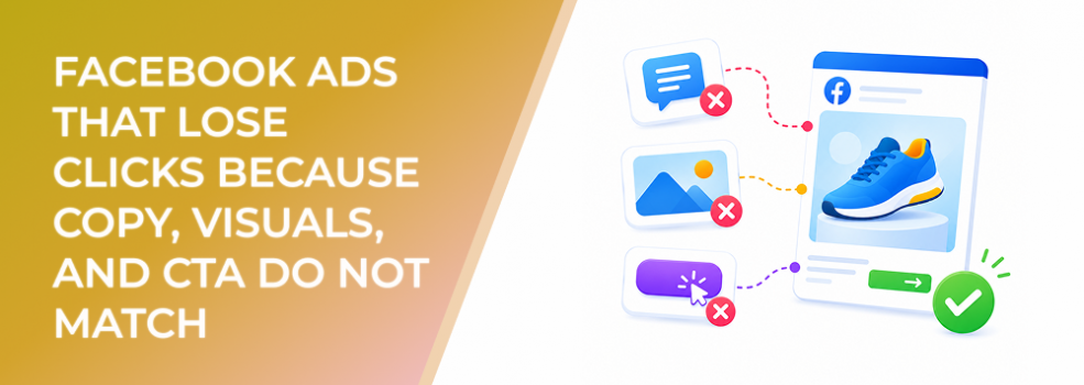
The problem is a broken message chain.
A Facebook ad has several parts working together: the visual, primary text, headline, description, CTA button, and destination. Each part should support the same idea. When those parts compete with each other, the user has to work too hard to understand what the ad is about.
For example, the visual may show a product feature, the copy may talk about a discount, and the CTA may say “Learn More.” The user cannot quickly tell whether the ad is asking them to shop, compare, download, book, or read.
That confusion weakens click intent.
The ad may still look professional, but it does not create a clear next step.
Why This Problem Hurts Performance
Mismatched creative hurts both attention and efficiency.
First, it reduces CTR. Users are more likely to click when they understand the value and the action immediately. If the message requires interpretation, the ad loses momentum.
Second, it can increase CPC. When fewer people click, the campaign may need more impressions to generate the same amount of traffic. That can make each useful visit more expensive.
Third, it weakens conversion quality. Even when users click, they may arrive with the wrong expectation. If the ad implied one offer and the landing page delivers another, conversion rate drops.
Fourth, it creates unreliable testing. A marketer may think the headline failed, when the real issue was that the CTA did not match the visual. Or they may blame the image when the copy created the confusion.
A mismatched ad does not just perform poorly. It also makes optimization harder.
Common Scenarios Where This Happens
An ecommerce brand shows a lifestyle image of a product in use, writes copy about a limited-time discount, and uses a “Learn More” CTA. The user does not know whether the main reason to click is the product benefit, the discount, or education.
A B2B company runs a clean ad for a guide, but the headline says “Book a Demo.” The visual feels educational, while the CTA feels sales-focused. Cold users hesitate because the commitment level feels unclear.
A local service provider uses a before-and-after image, but the copy focuses on company history instead of the result. The CTA says “Contact Us,” but the ad never gives a strong reason to start a conversation.
An agency repurposes a client’s organic post as an ad. The post image was designed for engagement, the copy was written for awareness, and the CTA is added later for lead generation. The parts were never built for the same purpose.
A startup uses a polished founder photo, a headline about product speed, and a CTA for a webinar. Each piece could work in a separate ad, but together they create friction.
Why the Problem Happens
This problem usually happens because creative assets are assembled instead of designed as one message.
The first cause is repurposing organic content without rebuilding it for paid intent. A post that works for engagement may not work as a conversion ad.
The second cause is unclear campaign purpose. If the team does not know whether the ad should drive traffic, leads, messages, purchases, or awareness, the creative elements often point in different directions.
The third cause is treating the CTA as an afterthought. Many advertisers choose the button at the end of setup instead of designing the ad around the action they want.
The fourth cause is too many ideas. Marketers often try to include the product, brand story, offer, discount, proof, and CTA in one ad. That makes the ad feel busy even when the design is clean.
The fifth cause is weak creative review. Teams approve assets because each part looks acceptable on its own. They do not check whether the parts work together in the feed.
The Solution
The solution is to build the ad around one message chain.
Start with the action. Before choosing the image or writing the copy, decide what the user should do next. Should they click to shop, read, download, book, compare, message, sign up, or request a quote?
Then define the reason to act. The ad should communicate one primary value proposition. That value may be speed, savings, expertise, convenience, proof, urgency, relevance, or risk reduction. Choose the strongest reason for the audience and campaign stage.
Next, assign each creative element a job.
The visual should stop the scroll and make the idea visible. The primary text should explain why the offer matters. The headline should compress the value into a clear click reason. The CTA should match the commitment level. The destination should deliver exactly what the ad promised.
Use a simple alignment test: if the user only saw the visual and CTA, would the action make sense? If they only read the headline and CTA, would the value be clear? If they clicked, would the landing page feel like the expected next step?
If the answer is no, the ad is not ready.
Risks and Considerations
Do not make every ad overly direct.
Some campaigns are designed for education, awareness, or retargeting pool growth. In those cases, the CTA may be softer. The issue is not whether the CTA is aggressive or gentle. The issue is whether the CTA matches the user’s likely intent.
Also avoid stripping away all personality. Clear does not mean boring. A strong ad can still be creative, emotional, visual, and brand-led. It simply needs one dominant message.
Watch for platform and placement differences. A message that works in Feed may need a different visual hierarchy in Stories or Reels. If the CTA is hidden, delayed, or disconnected from the format, clicks may suffer.
Finally, do not judge the fix too quickly. A cleaner message chain should improve interpretability, but performance still depends on audience fit, offer strength, budget, delivery, and destination quality.
Prerequisites and Dependencies
Before rebuilding the ad, define the campaign objective, funnel stage, and primary KPI.
You need to know whether the ad is meant to drive CTR, landing page views, qualified leads, purchases, booked calls, messages, or retargeting audience growth. Without that clarity, it is hard to choose the right CTA.
You also need a clear offer. If the offer is vague, the creative cannot make the next step feel compelling.
The landing page or destination must be ready. If the ad says “Download the checklist,” the destination should open with the checklist. If the ad says “Book a consultation,” the booking path should be obvious. If the ad says “Shop the collection,” the product experience should match the creative.
A simple creative review process helps as well. Someone should evaluate the full ad as a user would see it, not just approve each asset separately.
Practical Recommendations
Write the CTA first. This forces the team to clarify the action before designing the rest of the ad.
Use one message per ad. If you have multiple benefits, build multiple ads rather than crowding one creative.
Make the visual and headline support the same promise. If the image shows speed, the copy should not focus mainly on price. If the headline promises a guide, the CTA should not feel like a sales call.
Avoid default CTAs when they do not match intent. “Learn More” can work, but it often becomes a vague fallback. Use the CTA that best reflects the next step.
Create a final pre-launch check. Ask: what is the offer, who is it for, why should they care, what should they do, and does every ad element support that action?
Final Takeaway
Facebook ads lose clicks when users cannot quickly understand the message or the next step.
The fix is not simply making the ad prettier. The fix is alignment. When the copy, visual, headline, CTA, and destination all support one clear promise, users have less reason to hesitate and more reason to click.
Related LeadEnforce Articles
- How to Structure a High-Converting Facebook Ad: Hook, Body, CTA — Provides a simple structure for making each part of the ad support the same action.
- How to Craft Irresistible Call-to-Actions in Your Facebook Ads — Helps refine the CTA so it clarifies value and reduces friction.
- Why Your Visual Hierarchy Determines Facebook Ad Click-Through Rates — Explains how layout and visual priority affect clicks.
- How to Test Headlines, CTAs, and Images Without Wasting Budget — Useful for isolating which creative element is causing the mismatch.
- How to Write Copy That Sells in Static Facebook Ads — Helps improve the copy side of the message chain.