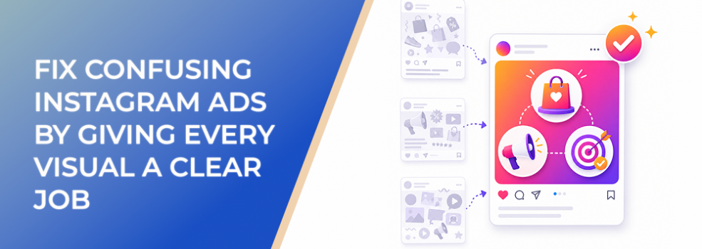
Confusing Instagram ads often have too many visual elements and not enough visual responsibility.
The image is present. The headline is present. The logo is present. The CTA is present. The background, badge, product, testimonial, and offer may all be present too.
But what is each element doing?
If every visual element competes for attention, the user has no clear path through the ad. They may notice the creative but still miss the message.
For performance marketers, this is costly. Confusing visuals can weaken CTR, raise CPC, increase CPA and CAC, reduce ROAS, and attract lower-quality leads.
The fix is to give every visual a clear job before launch.
The Problem
The problem is that many Instagram ads treat visuals as decoration instead of communication.
A visual element should not exist only because there is space to fill.
Every major visual should help the viewer do one of five things:
- Recognize the problem
- Understand the offer
- Desire the outcome
- Believe the claim
- Take the next step
If a visual does not support one of those jobs, it may create friction.
Common examples include:
- A background that makes the product harder to see.
- A headline that repeats what the image already shows.
- A badge that distracts from the main offer.
- A testimonial that appears before the user understands the product.
- A CTA that shows up before the ad creates enough reason to act.
- A logo that dominates the layout but does not improve trust or recall.
- A screenshot that shows the interface but not the problem it solves.
The ad may look complete, but it does not guide attention.
Why This Problem Hurts Performance
Instagram ads have very little time to create understanding.
When visuals compete, users must decide where to look first. That slows down comprehension. Slower comprehension often means weaker response.
This can affect performance in several ways:
- Users scroll because the ad feels hard to decode.
- CTR drops because the next step is not obvious.
- CPC rises because fewer relevant users engage.
- CPA and CAC increase because the campaign needs more impressions to generate action.
- Conversion rate drops because clicks come from low-clarity interest.
- Lead quality suffers because users misunderstand the offer.
- Creative tests become noisy because no one knows which element caused the result.
A confusing ad does not only lose attention. It also produces unclear learning.
Common Scenarios Where This Happens
Ecommerce Product Ads
A product ad includes a lifestyle image, discount badge, product name, benefit headline, review stars, free-shipping note, logo, and CTA. Nothing is technically wrong, but everything is fighting for attention.
B2B Lead Generation
A SaaS ad uses a dashboard screenshot, feature callouts, a headline, a customer logo, a report title, and a demo CTA. The viewer cannot tell whether the ad is selling software, a report, a consultation, or a workflow solution.
Local Service Ads
A service ad shows a team photo, phone number, location, coupon, service list, and testimonial. The ad feels busy, and the viewer cannot quickly identify the main booking reason.
Agency Creative Reviews
An agency receives feedback from multiple stakeholders. Every stakeholder adds one more element. The final ad satisfies internal requests but becomes harder for the user to understand.
Affiliate Campaigns
An affiliate marketer uses comparison tables, product screenshots, badges, urgency language, and broad lifestyle imagery in one ad. The decision is not simplified; it becomes more complex.
Why the Problem Happens
This problem often starts because marketers confuse information with persuasion.
More information does not always make an ad stronger. Sometimes it makes the ad slower.
Another cause is unclear hierarchy. If the image, text, CTA, logo, and proof all have equal visual weight, the viewer does not know where to start.
The problem also happens when creative teams do not define the job of each asset. A designer may receive product shots, reviews, badges, screenshots, and brand elements without knowing which one matters most.
Finally, confusing visuals appear when teams try to make one ad serve every funnel stage. Cold users need recognition. Warm users need proof. Retargeting users may need urgency. One ad should not carry every job at once.
The Solution
The solution is to assign one primary job to every visual element.
Before production, decide what each part of the ad must do.
Give the Main Image One Job
The main image should usually carry the most important message.
Choose one role:
- Problem role
Show what the user wants to avoid. - Outcome role
Show what the user wants to gain. - Product role
Show what is being offered. - Mechanism role
Show how the solution works. - Proof role
Show why the claim is credible. - Offer role
Show why the user should act now.
Do not ask the main image to do all six.
Give Text Overlay a Support Job
Text overlay should clarify the visual, not fight it.
Use overlay text to name:
- The audience
- The problem
- The outcome
- The mechanism
- The proof point
- The offer
- The next step
Keep it short. If the overlay needs several lines to explain the image, the visual concept is probably too complicated.
Give the Logo a Recognition Job
The logo should help users connect the ad to the brand.
It does not always need to dominate the layout. In many performance ads, a smaller but stable logo placement works better than a large logo that competes with the message.
The logo’s job is recognition, not persuasion.
Give Proof a Trust Job
Proof should reduce hesitation.
Use proof when the viewer already understands the basic offer. If proof appears too early, before the user knows what is being proven, it can become visual noise.
Proof visuals may include:
- Reviews
- Testimonials
- Product use
- Customer examples
- Expert cues
- Supported claims
- Before-and-after evidence where appropriate
Give the CTA a Direction Job
The CTA should tell the user what to do next.
It should not carry the whole offer. The image and message should create the reason to act. The CTA should make the next step clear.
Common CTA jobs include:
- Book
- Shop
- Download
- Compare
- Learn
- Register
- Request
- Message
Choose the CTA based on campaign objective and audience readiness.
How LeadEnforce Helps
LeadEnforce can support this approach by helping advertisers test visual jobs against clearer audience segments.
Different audiences may need different visual jobs. Cold users from a relevant Instagram audience may need problem recognition. A professional B2B audience may need mechanism clarity. A community-based audience may respond better to proof or local relevance. LeadEnforce’s product pages describe audience building from Instagram profile followers, Facebook group members, LinkedIn job-title and company filters, and custom social-profile links.
This can make visual testing more useful.
For example:
- Test a problem-led visual against cold niche audiences.
- Test a mechanism-led visual against professional role-based audiences.
- Test a proof-led visual against competitor or category-aware audiences.
- Test an offer-led visual against warmer or more specific segments.
LeadEnforce does not fix unclear creative by itself. The creative team still needs a strong concept, offer, and landing page. Its role is to help advertisers reduce audience guesswork so each visual job can be evaluated against a more relevant user group.
Risks and Considerations
Assigning visual jobs improves clarity, but it does not remove every risk.
Be careful of these issues:
- Too many jobs in one ad.
If every element has a job but there are ten jobs, the ad is still confusing. - Wrong job for the audience stage.
A direct offer may work for retargeting but feel too abrupt for cold users. - Weak offer.
Clear visuals cannot compensate for an offer with no real value. - Poor landing page alignment.
If the ad’s visual job is proof but the landing page opens with vague brand copy, trust can drop. - Small or poor-fit audiences.
If audience tests are too narrow or mismatched, results may be unstable. - Unsupported claims.
Proof visuals must be credible, accurate, and compliant. - Over-reliance on one channel.
Instagram creative should fit the broader funnel, not carry the whole acquisition strategy alone.
Prerequisites and Dependencies
To make this system work, you need:
- A clear campaign objective
- A defined ICP or audience segment
- A specific offer
- A known funnel stage
- A primary visual role for each ad
- A clear hierarchy for image, text, proof, logo, and CTA
- Creative assets that can express different roles
- A destination that continues the same message
- Reliable conversion tracking and lead-quality feedback
- Enough budget to test visual roles cleanly
- If using LeadEnforce, relevant source profiles, groups, professional criteria, or custom social-profile data
Practical Recommendations
Use this practical review process before launch:
- Identify the main job of the ad.
- Assign the main image one role.
- Assign the overlay text a support role.
- Assign the logo a recognition role.
- Assign proof a trust role.
- Assign the CTA a direction role.
- Remove any element with no clear job.
- Review the ad at mobile size.
- Test one visual job at a time when budget is limited.
- Evaluate results by business quality, not only engagement.
A simple creative review question can prevent many weak ads:
What job is this visual doing?
If the team cannot answer quickly, the user probably cannot either.
Final Takeaway
Confusing Instagram ads often happen because too many visual elements compete without a clear purpose.
When every visual has a job, the ad becomes easier to understand. The image creates meaning, the text clarifies it, proof builds trust, the logo supports recognition, and the CTA directs action.
Better visual jobs lead to cleaner creative, stronger user understanding, and more useful campaign learning.
To test clearer visual-job hypotheses against more relevant Meta audiences, join the free 7-day LeadEnforce trial period.
Related LeadEnforce Articles
- Fix Flat Instagram Ads With More Intentional Visual Messaging — Directly supports giving every visual element a communication purpose.
- Change Flat Instagram Ads Creative By Defining The Viewer Reaction First — Helps connect visual jobs to the response the ad should create.
- Improve Instagram Ads Creative By Designing Around The Response You Want — Useful for building creative around specific viewer reactions.
- What Your Instagram Story Ad First Frame Must Show to Improve CTR — Helps assign a stronger job to the first Story frame.
- How Floating Instagram Ad Text Makes Creatives Harder to Understand — Explains why text needs a clear visual role and anchor.