What is a landing page?
A landing page is a separate page inside your website where people “land” when they click the link in an advertisement or any other resource. Landing page is where you drive traffic in order to increase your conversion rate.
You might think: isn’t any page a landing page? Well, it’s different from the homepage or any other page on your website. Landing pages are created specifically for marketing purposes and usually serve to collect leads, get emails or phones, sell products, and so on. So landing pages that convert should meet some standards to effectively do their job.
Landing pages are focused on a call to action (or CTA). In contrast, homepages usually have multiple goals while, when it comes to a landing page, the less CTAs it has the better. Ideally, it should have only one specific CTA and encourage visitors to take some action: subscribe to a newsletter, register for an event, register for a trial, or even make a purchase. There you can place a lead-capture form to collect users’ emails or phone numbers and further use them for retargeting.
Why you need a landing page to increase conversion rate
1. Generate customer list of leads
Landing pages are a “legal” way to gather users’ information. Basically, you can ask for whatever information you need. It’s their choice to provide it or not. But considering it’s in exchange for some reward like free service, discount, or valuable content, that’s an incentive to share personal info.
2. Get insight into your target audience
First of all, landing pages are perfect for testing. Testing different versions of landing pages you can track what’s more interesting to your customers. In addition, using a lead-capture form you can not only collect contacts but also ask for more specific personal information. To get insight into your target audience’s interests and demographics you can ask to specify their age, profession, education, interests and so on.
3. Increase brand value
A landing page is a good place to present your company and show how the customer can benefit from using your service. It’s a brief and concise demonstration of your brand.
Considering marketers typically run ads on landing pages, they’re a good way to make the first impression. Do your best to create an engaging landing page. A skillfully designed landing page can increase your brand value.
Types of landing pages
In all their diversity there are 2 main types of landing pages:
1. Lead generation landing pages.
Lead generation landing pages, also called lead-capture pages are focused on collecting leads. You place a lead-capture form to collect email addresses or phone numbers. You can further use this customer list for retargeting campaigns. Thus you make your advertising campaigns more effective by targeting people who at least once interacted with your brand. There’s a high chance they’re one step from converting.
2. Click-through landing page.
Click-through landing pages are focused on encouraging users to take an action you want: buy, order, schedule a demo. They have a CTA button that redirects them to a website mainly designed for making sales. For example, you can persuade visitors to register for a trial period on your platform. Let your potential customers test the service for free before they decide to purchase your product.
Landing page essential elements
Surely, creating a landing page you should try to make it as unique, colorful and attractive to your customers as possible. However, there are some fundamental elements that make up an effective landing page.
This is connected with the fact that landing pages serve one main purpose. They have to convince people to convert.
Once you learn the structure that is most appropriate for increasing your conversion rate, you’re free to unleash your inner artist and apply all your creativity. Let’s look at what should be in a landing page.
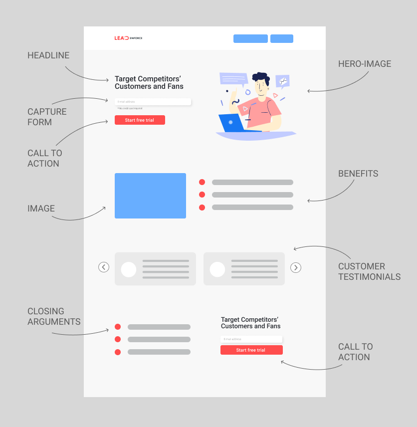
1. Headline and sub-headline.
The headline of your landing page has to be both brief and concise. The visitors must have a clear understanding of what your product or service is and what you’re offering. Be direct and straightforward in your proposition.
The sub-headline must serve as a supplement to your headline providing additional information. It should support and reinforce your headline.
When creating a headline and a sub-headline, focus on your unique selling proposition. Make your offer special and appealing to your potential customers.
2. Hero image.
A hero image is what marketers call a big banner image at the top or the center of your webpage. As well as your headline, it should be eye-catching and edgy.
Remember that humans are visual creatures. We prefer to obtain information through images.
Make sure the hero image corresponds to what you’re selling. It should support your offer and not stand aside.
3. Call to action.
Obviously, the main focus is on your call to action (or CTA). Or it would be better to say that all the roads lead to your CTA making sure the customers will take the desired action. It’s either a CTA button or a CTA button accompanied by a capture-form.
To choose the right call to action you should first define your conversion goal. One landing page must serve only one conversion goal to send your visitors down the defined sales funnel.
There are standard CTAs like:
- Sign up
- Subscribe
- Learn more
Yet you better personalize your button. For example, instead of Click here > you can say Get 10% off.
4. Benefits bullet-points.
In addition to the headline and supporting headline, give users some other grounds for using your product. You can outline the main features of your product but it will be more effective and illustrative if you provide its benefits.
As an option, you can combine both and turn the features into benefits. Show how different characteristics will be beneficial to your potential customer.
Structure the benefits into a list of bullet points because it’s catchy. Make them on point.
5. Customer testimonials.
It’s not a secret that people have a huge influence on our decisions. Social proof may become a turning point in the customer journey. That’s why it’s a good idea to include your customers’ testimonials. You can just place logos of the companies you collaborate with, provide your customers’ direct quotes or video interviews. Share your real customers’ experience to attract new ones.
6. Closing argument.
This is not obligatory but will serve as an asset to your landing page. If your landing page is quite long and scrolling down the visitors lose sight of your “above the fold” content, it makes sense to remind them about your offer.
It should be a reinforcing statement that leaves your visitors no chance but to convert.
Also, spare your potential customers the need to scroll back up. Duplicate your call-to-action button.

Tips for optimizing landing pages
1. No tricks.
Be honest with your customers. Make the contents of your landing page correspond to your offer and text in the advertisement. If a user comes to your landing page for one offer and doesn’t get what he or she came for… Well, that’s bad for your reputation. Don’t try to fool people, no one likes that.
2. Limit exit points.
The landing page has one particular goal. You expect the visitors to take a certain action. So to maximize the effectiveness of your CTA, remove any site navigation. The same concerns the footer, it’s just another visual distraction and a way to leave the page. Also, avoid using popups. Popups get people distracted and may have a negative impact on your conversion rate. They can not only distract from the main CTA but also be irritating.
3. Make the next step obvious.
People will quickly lose interest if they don’t get clear instructions on what they have to do to receive the desired. Make your landing page as easy and intuitive as possible. The less steps they need to go through to obtain your offer, the better.
4. Proofread.
Check the text for the typos. Get someone to proofread the landing page for grammatical and logical mistakes.
5. Test test test.
Landing pages are perfect candidates for A/B testing. Only through testing different page versions you’ll be able to find what best resonates with your target audience.
To get more tips on optimizing landing pages follow this link to the article we posted earlier.
Conclusion
I hope this article persuaded you that landing pages are a necessary element in any marketing strategy. Make use of such an effective tool to increase conversion and attract more customers.

