
An Instagram image ad can look clean and still fail if users do not know what to look at first. The main offer may be buried inside a product shot, hidden under too much text, or competing with background details.
This is a focal point problem. The ad has attention, but it does not direct that attention toward the action you want. For paid social advertisers, that can mean lower CTR, weaker conversion intent, and wasted spend on users who never understood the offer.
The fix is to make the offer visually obvious before users read the caption. A strong image ad should answer one question fast: what is being offered here?
Why the main offer gets lost in Instagram image ads
Most weak focal points come from trying to show everything at once. Brands want to show the product, benefits, logo, discount, testimonial, lifestyle context, and CTA in one static image. At mobile size, that becomes visual noise.
When the offer is not obvious, the user has to interpret the ad. Instagram users rarely do that. They scroll unless the image gives them a fast reason to stop.
This affects campaign data because unclear ads can attract scattered engagement. Some users click because of the image, some because of the text, and some because they misunderstand the offer. Meta then receives mixed signals about who the ad is actually for.
How to choose one focal point
The focal point should match the campaign objective. A lead magnet ad needs a different visual center than an ecommerce discount ad. A webinar ad should not be structured like a product catalog image.
Before designing the ad, choose the one thing the user must notice first. It may be the product, the result, the price point, the form benefit, or the pain point.
Use this simple decision path:
- For lead generation, make the outcome the focal point. A report, checklist, audit, or demo should show the result the user gets after submitting.
- For ecommerce, make the product or product use case the focal point. Users should immediately understand what is being sold and why it fits their need.
- For B2B offers, make the business problem visible. A dashboard, cost leak, missed lead, or workflow gap can work better than a generic brand image.
- For retargeting, make the next step clear. Returning users need a sharper reason to continue, not another broad awareness image.
This is where visual hierarchy in Instagram ads matters. The strongest element should guide the eye toward the offer, not away from it.
Make the offer readable at feed speed
The offer does not need to be loud. It needs to be easy to understand. Use size, contrast, spacing, and placement to make the main idea visible within one glance.
If the product is the focus, avoid placing it in a crowded scene. If the offer is text-based, keep the wording short and give it enough space. If the result is the focus, show the before/after meaning without using confusing or policy-sensitive visuals.
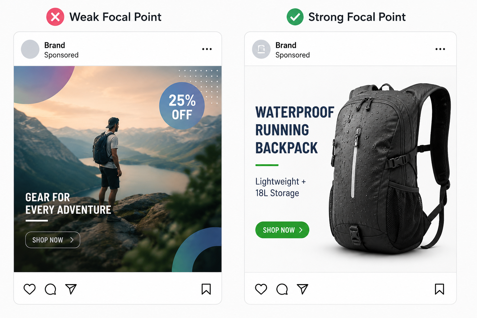
For example, a SaaS ad promoting a lead scoring checklist should not show a generic laptop on a desk. A stronger image would show a clean checklist title, one visible scoring category, and a simple visual cue around “qualified leads.” The user should understand the promise before reading the caption.
Strong focal points also help the copy work harder. Once the image shows the main idea, the caption can explain the value instead of rescuing a confusing visual. This is why value propositions make or break Instagram ads.
Remove elements that compete with the offer
A focal point gets weaker every time another element demands equal attention. Extra icons, decorative shapes, multiple badges, and small product thumbnails can dilute the message.
The easiest test is to blur your eyes slightly while looking at the ad. The first visible shape should be the offer area or the main subject. If the logo, background, or decoration stands out first, the hierarchy is wrong.
Do not treat every element as equally important. The CTA can be smaller than the core promise. The logo can sit in a supporting position. The background should create context, not compete for attention.
This also applies to ad structure. If the image says one thing, the headline says another, and the CTA points somewhere else, the user receives mixed instructions. A cleaner way to structure a high-converting ad is to let the image, copy, and CTA support the same action.
Final takeaway
Instagram image ads fail when users cannot tell what matters first. A strong focal point makes the offer easier to process, which can improve click quality and reduce wasted spend.
Do not add more visual elements to make the ad stronger. Choose one main idea, make it visible at mobile size, and remove anything that competes with it. Clear attention creates cleaner signals, and cleaner signals make the campaign easier to optimize.