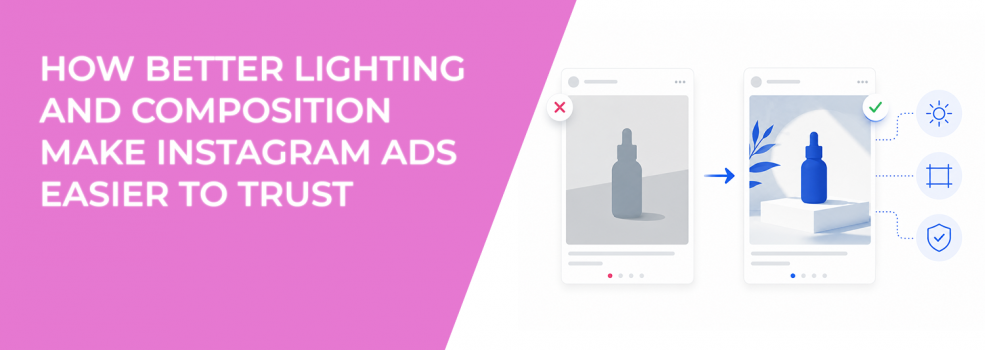
Lighting and composition affect how trustworthy an Instagram ad feels. Users may not describe the issue in those terms, but they react to it quickly.
A dark photo can make a product look cheaper than it is. A cluttered composition can make a serious service feel less credible. A poorly placed subject can make the ad look accidental, even when the offer is strong.
For advertisers, this creates a performance gap. The campaign may target the right audience and use a solid offer, but the image does not give users enough confidence to click, submit, or buy.
Why lighting affects trust before the click
Good lighting makes the subject easier to inspect. Users can see the product, person, space, or result clearly. That helps them decide whether the offer feels real.
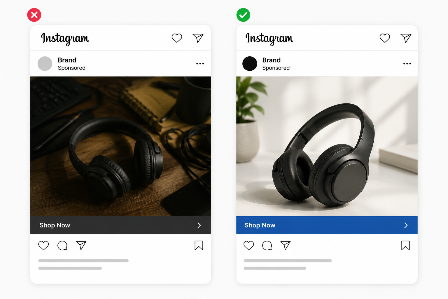
Bad lighting creates friction. Shadows hide details, harsh highlights distract the eye, and low contrast makes the ad harder to process on mobile. Even if the product is good, the user receives a weaker trust signal.
This matters most for cold traffic. People who do not know your brand use the image as a shortcut for quality. If the first impression feels unclear, the ad may lose them before the copy has a chance to explain the offer. That is why it helps to build trust in the first ad impression.
Composition decides whether the ad feels intentional
Composition is how the visual elements sit inside the frame. It controls balance, spacing, and where the eye moves first. A strong composition makes the ad feel planned without making it look artificial.
Weak composition usually creates doubt. The product may sit too close to the edge. The person may face away from the message. The background may take up more attention than the offer.
In performance terms, composition influences attention quality. A clear layout helps users understand the offer faster, which can support stronger CTR and post-click behavior. A confusing layout can still get impressions, but those impressions are less likely to turn into valuable action.
How to improve lighting without making the ad look staged
You do not need a studio setup to improve Instagram ad lighting. Most problems can be fixed by controlling the light source and removing visual distractions.
Natural light is often enough for product photos, service photos, and founder-led images. The goal is even visibility, not dramatic lighting. If the ad is for a B2B offer, clean screen visibility and readable surfaces matter more than creative effects.
Practical lighting checks:
- Keep the subject brighter than the background. This helps users find the main visual faster.
- Avoid mixed light sources. Warm indoor light and cool daylight can make the image look inconsistent.
- Remove harsh shadows across important details. Shadows should not cover product labels, faces, screenshots, or proof points.
- Check contrast on mobile. If the subject blends into the background, users may scroll before understanding the ad.
Lighting is closely tied to readability. If the image has poor contrast, even strong copy or product detail can disappear. This is why poor contrast and color choices hurt CTR.
How to compose Instagram ad images for stronger trust
Place the main subject where users can understand it quickly. For square feed ads, the center area usually carries the most visual weight. For vertical placements, leave safe space around important details so the crop does not damage the message.
Use negative space on purpose. Empty space around a product, person, or offer card makes the ad easier to process. It also gives text overlays room to breathe when you need a short message inside the image.
For service businesses, composition should show credibility. A consultant ad can use a clean workspace, a simple client result visual, or a focused screen detail. A clinic, studio, or local business can show the environment, but the frame should still guide attention toward the service.
For ecommerce, composition should show product clarity. Avoid placing the product in a scene where too many props compete with it. The user should not have to guess what is being sold.
Trust should improve conversion quality, not just clicks
Better lighting and composition can increase CTR, but that is not the only goal. The real win is better click intent. Users should click because the ad feels relevant and credible, not because the image tricks them into curiosity.
This is why advertisers should design ads for trust, not clicks. A visually cleaner ad should reduce confusion, improve landing page engagement, and help CPA stabilize. If CTR improves but conversion rate falls, the image may be attractive but not aligned with the offer.
Final takeaway
Lighting and composition make Instagram ads easier to trust because they reduce uncertainty. Users can see the subject, understand the offer, and decide whether the brand feels credible.
The fix is not to over-polish every ad. The fix is to make each image look intentional, readable, and aligned with the offer. When users trust what they see, they are more likely to click with real intent, and that gives the campaign stronger signals to build on.