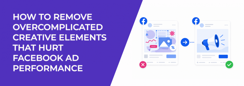
A Facebook ad can look professionally designed and still perform badly.
The issue is often not the offer, the audience, or the budget. It is the amount of visual and message friction inside the creative. Too many text blocks, badges, icons, arrows, product shots, claims, and CTAs can make the ad harder to process in the feed.
That matters because users do not study ads. They scan them. Meta also reacts to how users behave after seeing them. If people hesitate, scroll past, misclick, or click without clear intent, the campaign collects weak signals.
Overcomplicated creative does not just look busy. It can make CPC, CPA, CPL, and ROAS harder to stabilize.
Why too many creative elements make the ad harder to understand
Overcomplicated Facebook ad creative usually fails because every element competes for attention.
A headline fights with a badge. A product image fights with a testimonial. A discount fights with a feature list. A CTA fights with a background graphic. The user does not know what to process first, so they often process nothing.
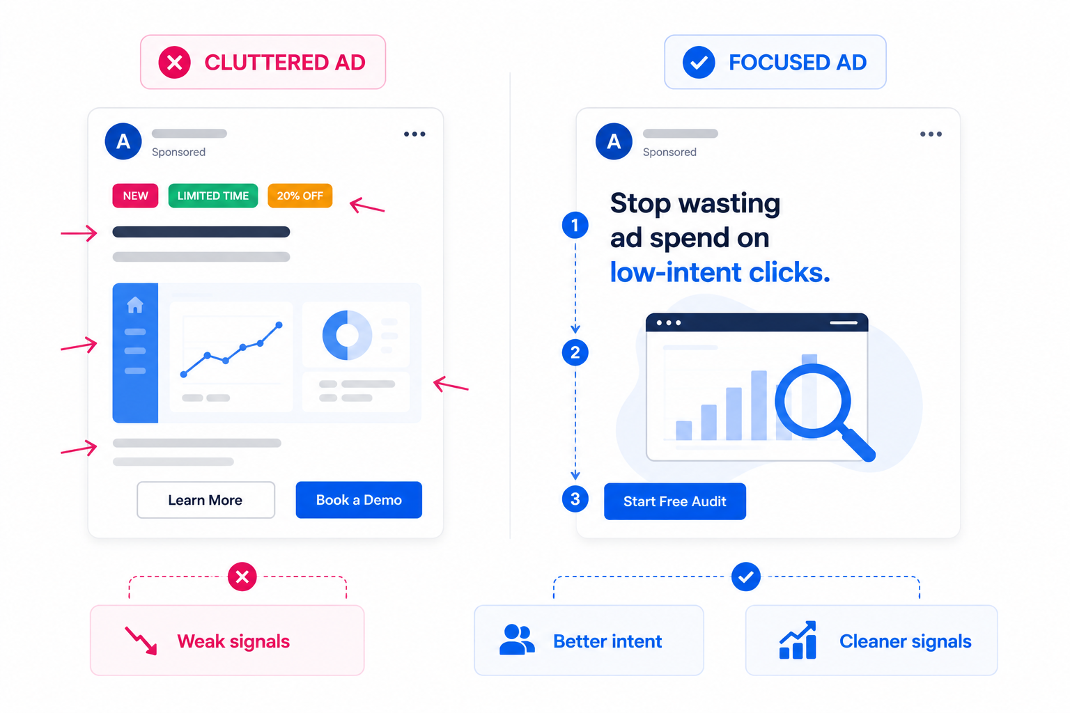
This becomes a bigger issue on mobile. A desktop mockup may look balanced, but the same creative can feel cramped inside a Facebook feed placement. Small text becomes unreadable. Icons lose meaning. The CTA gets buried below visual decoration.
The performance damage often appears in uneven signals. CTR drops because the ad does not create a clear reason to click. CPC rises because fewer users engage meaningfully. CPA rises because the users who do click may not understand the offer well enough to convert.
This is why creative clutter can hurt Facebook ad performance. The more competing elements you add, the harder it becomes to know which part of the ad is driving or blocking results.
How to fix this
1. Define the one job of the creative before editing the design
Before removing anything, decide what the ad is supposed to do.
A cold traffic ad may need to make the problem obvious. A retargeting ad may need to answer one objection. A lead generation ad may need to qualify the user before the form. An e-commerce ad may need to make one product benefit instantly clear.
Once the job is defined, every creative element should be judged against it.
If the element does not support the main job, remove it or move it to another asset. A review badge may help if the ad is about trust. It may distract if the ad is about a specific product feature. A discount label may help if the ad is price-led. It may weaken the ad if the real value is quality, speed, or status.
This is the first cleanup rule: one ad should not carry the whole sales page.
2. Remove elements that compete with the main message
Most overloaded ads improve when you remove before you redesign.
Start with the parts that make the user work harder. These are usually decorative, repetitive, or secondary to the main decision.
Common elements to remove first:
- Extra badges and labels. “New,” “Best seller,” “Limited offer,” and “Free shipping” should not all appear in the same frame unless one clearly leads the message.
- Secondary benefit blocks. If the ad already explains one strong reason to click, three smaller benefits can dilute the point.
- Decorative icons without decision value. Icons should clarify meaning, not fill empty space.
- Duplicate CTAs. One clear action is stronger than multiple prompts fighting for attention.
This does not mean stripping the ad until it looks empty. It means removing anything that does not help the user decide faster.
For example, a SaaS ad promoting a free audit does not need a dashboard screenshot, three feature icons, a testimonial, a founder quote, a “limited slots” label, and two CTA buttons. The stronger version might show one painful metric, one short promise, and one next step.
3. Make one element visually dominant
A strong Facebook ad usually has one visual anchor.
That anchor might be the product, the pain point, the result, the offer, or the proof. The problem starts when five elements look equally important. Equal visual weight creates confusion.
This is where visual hierarchy in Facebook ads matters. The user should know where to look first, second, and third without thinking.
A practical hierarchy might look like this:
- Main visual or problem cue.
- Short hook.
- Supporting proof or benefit.
- CTA.
If the user sees the CTA before they understand the hook, the ad feels pushy. If they see the product before they understand the problem, the ad feels irrelevant. If they see proof before they understand the offer, the proof has no context.
For mobile placements, this hierarchy needs to be even stricter. The first frame or static image should work at a glance. If the creative only makes sense when viewed full-size in a design file, it is probably too complex for feed delivery.
4. Cut text overlays until every word has a job
Text overlays can improve performance when they clarify the message quickly.
They hurt performance when they become a second landing page.
Too much on-image text forces the user to read while scrolling. That is a high-friction task. It also makes the creative harder to adapt across placements, especially Stories, Reels, and smaller mobile feed previews.
A good text overlay should do one of three things:
- Name the problem.
- State the outcome.
- Clarify the offer.
Everything else should be questioned.
For example, “Stop wasting spend on low-intent clicks” is easier to process than a full list of platform benefits. The caption, landing page, or follow-up ad can explain the details later.
If your creative needs a long overlay to make sense, the concept may not be clear enough yet. Review how to use text overlays effectively for Meta ads before adding more copy to the image.
5. Separate proof from the first message when it creates clutter
Proof is useful, but too much proof too early can slow the ad down.
Advertisers often add logos, star ratings, review snippets, before-and-after claims, case study numbers, and testimonials into one creative. The intention is trust. The result is often visual congestion.
Proof works best when it supports a clear claim. It does not work well when it appears before the user understands the claim.
For example, “4.8 stars from 2,000 customers” can help if the offer is already obvious. But if the ad does not clearly explain what the product does, the rating adds noise. The user may register that something is popular without understanding whether it is relevant.
A cleaner approach is to split the message by funnel stage. Use the prospecting ad to establish the problem and main promise. Use retargeting creative to add testimonials, case studies, comparison points, or objection handling.
That gives each ad a sharper role and makes performance easier to diagnose.
6. Remove creative elements that attract the wrong action
Some design elements increase engagement but weaken conversion quality.
This happens when the creative uses clickbait-style visuals, exaggerated arrows, mystery hooks, or overly dramatic contrast. The ad may earn more pauses or clicks, but those users may not have real purchase or lead intent.
The diagnostic pattern is familiar: CTR improves, CPC drops, but CPA does not follow. Lead quality may also decline because the creative attracts users who were curious about the ad, not serious about the offer.
This is especially risky in B2B lead generation. A dramatic hook may get form fills, but sales teams later report low fit, weak recall, or poor meeting attendance.
Remove elements that create attention without qualification. Strong creative should not only stop the scroll. It should help the right user understand why the offer is relevant.
7. Use cleaner creative to improve testing accuracy
Overcomplicated creative makes testing harder.
If one ad includes a new hook, new visual style, testimonial, discount, feature list, and new CTA, you cannot tell what caused the result. A win may be hard to repeat. A loss may be hard to learn from.
Cleaner creative gives you cleaner data.
When testing, isolate the main variable. Test one hook against another. Test one product angle against another. Test one visual concept against another. Do not change every element at once unless you are testing a completely new concept.
This matters because Meta’s delivery system will often push spend toward early engagement patterns. If the creative contains too many competing elements, early signals can become noisy. You may end up scaling an ad without knowing what users actually responded to.
A simpler creative structure helps both the algorithm and the advertiser read the result.
8. Audit the ad before launch with a removal checklist
Before launching or scaling, review the creative with one question: what can be removed without weakening the message?
If removing an element makes the ad clearer, it probably should not be there.
Use this checklist before launch:
- Does the ad have one main message?
- Is one visual element clearly dominant?
- Can the text overlay be read in under three seconds?
- Is there only one primary CTA?
- Does every badge, icon, or proof point support the main decision?
- Would the ad still make sense if the caption were not read?
If the answer is no, simplify before increasing budget.
This is often faster than rebuilding the campaign. A cleaner creative can improve signal quality without changing the objective, audience, or spend level.
Final takeaway
Overcomplicated Facebook ad creative hurts performance because it slows down understanding.
When too many elements compete, users do not know what to notice first. Meta receives weaker engagement and post-click signals. Advertisers then see the symptoms in CTR, CPC, CPA, CPL, ROAS, and lead quality.
The fix is not to make ads plain. It is to make every element earn its place.
Define the ad’s job, remove secondary clutter, create a clear visual hierarchy, reduce text overlays, and keep proof focused. The easier the ad is to process, the easier it is for the right user to act.