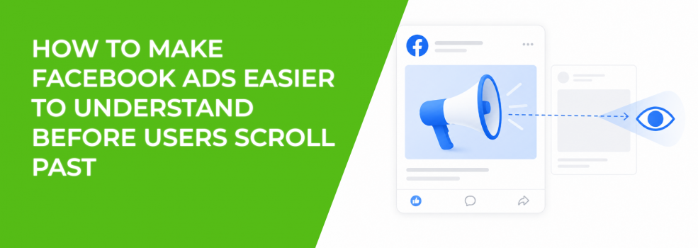
Facebook ads often lose users before the message has a chance to work.
The problem is not always weak targeting or a bad offer. Many ads fail because the user cannot understand them fast enough inside the feed. By the time the headline, image, CTA, and offer start to make sense, the user has already moved on.
This matters because Facebook ads are judged in motion. Users are scrolling, scanning, and making fast relevance decisions. If the ad needs careful reading, it is already at a disadvantage.
A clear ad does not force users to stop and decode the message. It gives them one obvious reason to pay attention before the scroll continues.
Problem: Users scroll past before the ad becomes clear
The core problem is speed.
A Facebook ad may explain the offer eventually, but “eventually” is too late for cold or low-attention traffic. If the first visual impression does not tell the user what the ad is about, the rest of the message may never be seen.
This is especially common with ads that rely on small text, abstract imagery, crowded layouts, or slow video openings. The creative may look good in preview mode, but it does not survive real feed behavior.
In Ads Manager, this often appears as low thumb-stop performance, weak CTR, short video watch time, or low landing page quality after clicks. The ad is technically delivering, but users are not processing it with enough intent.
That is why scroll speed affects Facebook ad performance. The faster users move through the feed, the less tolerance they have for unclear creative.
Solution: Make the first visual impression explain the category
The user should understand the general category before reading every word.
If the ad is about lead generation, the visual should not look like a generic software announcement. If it is about a local service, the image should not feel like a stock lifestyle post. If it is about e-commerce, the product and use case should be obvious.
This does not mean every ad needs a literal product shot. It means the first impression should give the user a clear frame.
For example, a B2B ad about low-quality leads could show a simple visual contrast between “form fills” and “sales-ready leads.” That is easier to understand than a dashboard screenshot with no context.
A home service ad could show the specific problem being solved, not just a smiling technician. A SaaS ad could show the broken workflow before showing the platform.
The first visual should answer one question: “What kind of problem is this about?”
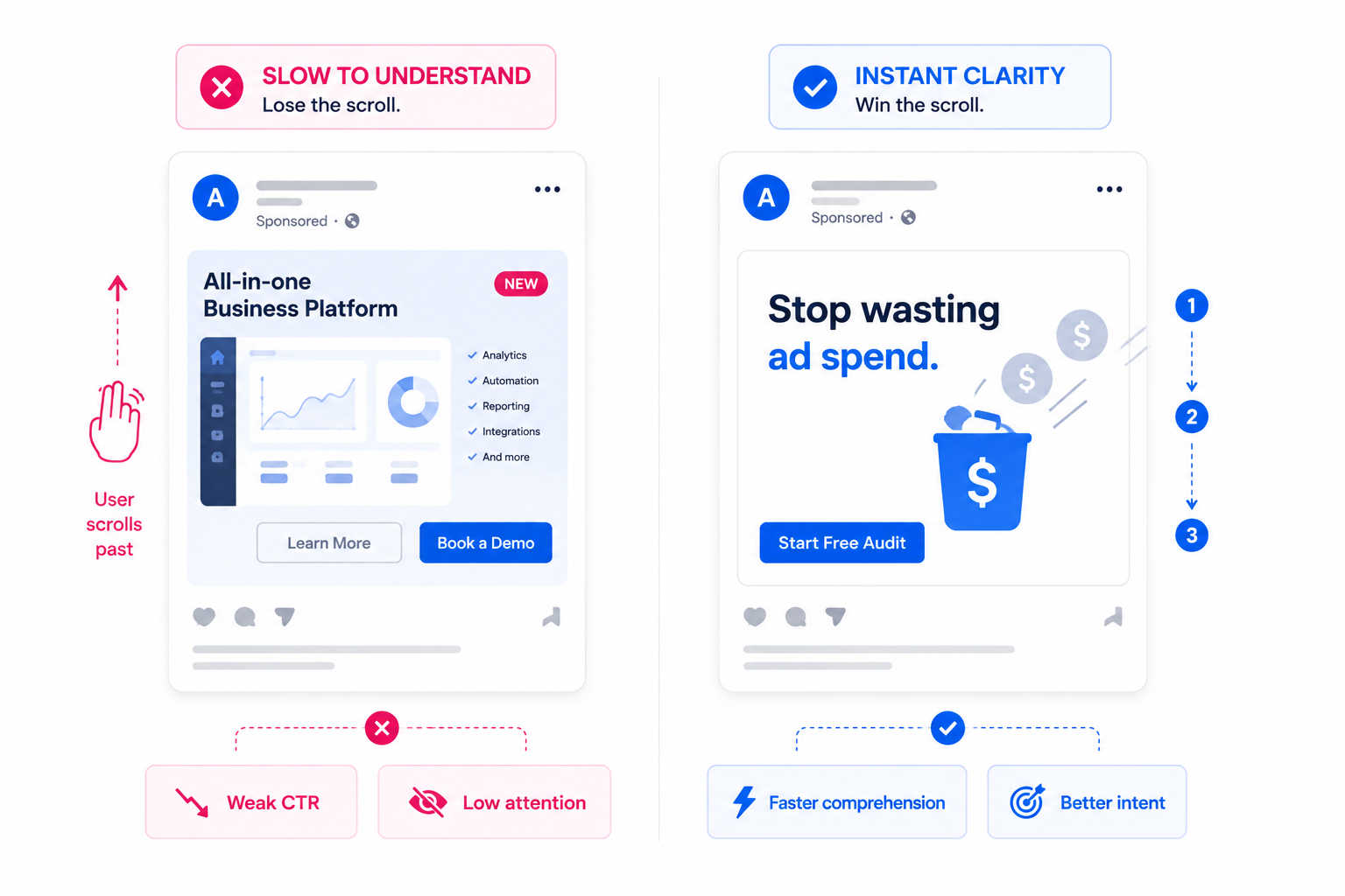
Solution #1: Put the most important idea in the first reading path
Users do not read ads in the order advertisers hope they will.
They usually notice the largest visual element first. Then they scan the biggest text. Then they decide whether the rest is worth reading. If the key message is hidden in the caption, a small label, or a lower corner, many users will miss it.
A strong Facebook ad needs a clear reading path:
- Primary visual cue. The image or first video frame should set the topic immediately.
- Short hook. The main text should state the problem or outcome in plain language.
- Supporting detail. One proof point, benefit, or mechanism can clarify the claim.
- Simple next step. The CTA should match what the user now understands.
If the user sees the CTA before they understand the problem, the ad feels premature. If they see a visual without a message, the ad feels decorative. If they see proof without context, the proof has no meaning.
This is why visual hierarchy determines Facebook ad click-through rates. The ad should guide attention, not make users assemble the meaning themselves.
Solution #2: Write hooks that can be understood without the caption
The hook should work even if the user never reads the full caption.
That is a practical requirement, not a copywriting preference. Many users process the visual and overlay first. Some never expand the primary text. Others skim only the first few words before deciding whether to continue.
A strong quick-read hook usually does one clear job. It names the problem, frames the outcome, or creates a direct comparison.
For example, “Too many clicks, not enough booked calls?” is faster to understand than “A better way to optimize campaign performance.” The first hook gives the user a specific situation. The second requires interpretation.
For e-commerce, “A laptop bag that does not look like office luggage” is easier to process than “Designed for modern professionals.” The first version creates a visual expectation. The second sounds polished but vague.
The test is simple: if the hook needs explanation, it is too slow for the feed.
Solution #3: Design for mobile size, not desktop preview
Many ads become hard to understand because they are designed too large.
A creative may look clear in a design file, a desktop preview, or a presentation. Then it appears inside a mobile feed, where text shrinks, spacing compresses, and small details disappear.
Before launch, check the ad at the size users will actually see it. If the text overlay becomes hard to read, reduce the wording. If the product detail disappears, crop tighter. If the CTA blends into the design, increase separation.
Mobile clarity usually improves when you simplify three areas:
- Text size. Important copy should be readable without zooming or pausing.
- Focal point. One object, face, product, or problem cue should dominate the frame.
- Spacing. Crowded layouts make users work harder during a fast scroll.
This matters for Stories and Reels as well. A vertical ad with multiple small elements may look complete, but it can fail when the user processes it in motion.
Solution #4: Make video ads understandable in the first frame
Video ads do not get extra time just because they move.
If the first frame is unclear, many users scroll before the message develops. A slow intro, logo animation, lifestyle opening, or vague scene can waste the most valuable moment of the ad.
The first frame should work like a static ad. It should show the problem, product, or outcome immediately enough for the user to understand why the video exists.
For example, a lead generation video should not open with a generic office scene. It could open with a visible problem: “100 leads, 6 real sales conversations.” That gives the viewer a reason to keep watching.
An e-commerce video should not wait three seconds to show the product. The product, use case, or transformation should appear immediately.
This is how advertisers earn attention in 3 seconds or less. The first moment must create comprehension, not just motion.
Solution #5: Remove ambiguity from the CTA
A CTA should not make users guess what happens next.
“Learn more” can work, but only when the ad has already made the value clear. If the offer is vague, a generic CTA adds more uncertainty. Users may click without intent, or avoid clicking because they do not know what they will get.
A clearer CTA connects to the action the ad has prepared the user to take.
For lead generation, “Check your lead quality” may be stronger than a generic “Learn more.” For SaaS, “See the workflow” may fit better than “Get started.” For a local service, “Check availability” can feel more concrete than “Contact us.”
The CTA should complete the message, not compensate for a weak one.
If the ad says, “Find where your ad budget is being wasted,” the CTA should lead into that same promise. A landing page that suddenly talks about a broader agency service will create a mismatch.
Solution #6: Match the ad and landing page above the fold
Users scroll past ads when they are unclear. They also abandon landing pages when the post-click message changes.
The ad and landing page should feel like one continuous path. If the ad promises a specific problem fix, the landing page should repeat that problem and expand on it above the fold.
For example, if the ad says, “Stop paying for clicks that never become leads,” the landing page should not open with “Full-service digital growth solutions.” That forces the user to reconnect the dots. Many will not bother.
A good post-click flow keeps the same language, same promise, and same next step. This improves conversion rate because users do not have to re-evaluate what they clicked for.
It also gives Meta cleaner downstream signals. When users click and stay engaged, the campaign has a stronger pattern to learn from.
Solution #7: Test comprehension before testing more variations
Before creating more creative variations, test whether people understand the current one.
Ask someone outside the campaign to view the ad for three seconds. Then ask what the ad is about, who it is for, and what they would expect after clicking.
If they cannot answer quickly, more variations will not fix the issue. You may simply create more versions of the same unclear idea.
Use this pre-launch check:
- Can the user name the problem without reading the full caption?
- Can the user identify the offer category at a glance?
- Can the user tell what action the CTA leads to?
- Does the first frame or static image carry the main idea?
- Does the landing page continue the same message?
This type of check is simple, but it catches issues that Ads Manager reports only after spend is already wasted.
Final takeaway
Facebook ads need to be understood before they can persuade.
If users scroll past before the message becomes clear, the campaign loses attention, signal quality, and conversion potential. The fix is not only stronger copy or better design. It is faster comprehension.
Make the category obvious. Build a clean reading path. Use hooks that work without extra explanation. Design for mobile size. Make the first frame useful. Keep the CTA and landing page aligned.
The faster the right user understands the ad, the better chance the campaign has to turn attention into action.