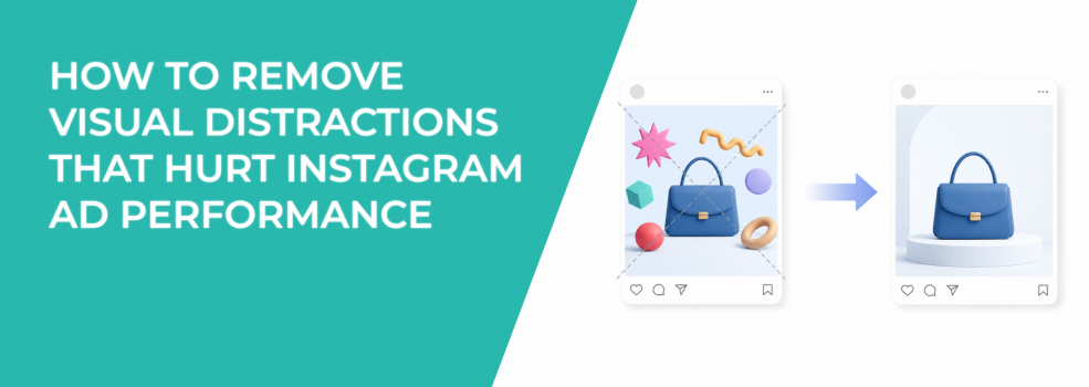
Visual distractions hurt Instagram ads by pulling attention away from the reason to click. The ad may look active, colorful, or polished, but the user misses the offer.
This problem is easy to overlook because distractions often look like design improvements. Extra icons, badges, shapes, props, and background details can make the image feel fuller. They can also make the message harder to process.
For performance marketers, that can mean lower CTR, weaker lead quality, and higher CPA. The campaign spends money to deliver impressions, but the ad does not direct attention toward the action that matters.
Distractions compete with the offer
Every visual element in an ad creates a signal. Some signals help the user understand the offer. Others compete with it.
A discount badge can help if price is the main reason to click. It becomes a distraction if the campaign is selling trust, quality, or a high-ticket consultation. A background image can add context, but it becomes a problem when it is more noticeable than the product or message.
This is why some ads look good in a design file but fail in the feed. The creative has visual energy, but no clear priority. Users notice the wrong part first, then scroll.
That behavior connects with what makes audiences ignore ads. People often ignore ads when the first visual signal feels irrelevant or too hard to interpret.
How to spot distractions before launch
The easiest way to find distractions is to test the ad at mobile size. Large previews make clutter look manageable. Mobile previews reveal what users actually see.
Look at the ad for one second. Then ask what you remember first. If the answer is not the product, offer, problem, result, or CTA, something else is stealing attention.
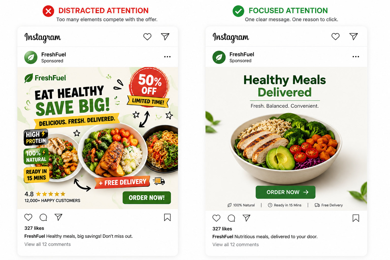
Check these common distraction points:
- Decorative shapes. Circles, arrows, stickers, and frames should guide attention. If they only decorate, remove them.
- Competing text blocks. Multiple claims inside the image make users choose what to read first.
- Unrelated props. Lifestyle objects can add context, but random props often dilute the product story.
- Oversized branding. A logo should support credibility, not overpower the offer.
This audit is faster than a full redesign. You are not asking whether the ad looks nice. You are asking whether each element helps the user act.
Remove distractions in the right order
Do not remove everything at once unless the ad is clearly overloaded. Start with the elements that compete most directly with the main offer.
If the product is hard to see, remove background objects before changing the copy. If the message is hard to read, reduce text blocks before changing the image. If users notice the CTA before understanding the offer, move the CTA into a supporting role.
For example, an Instagram ad for a fitness program may show a trainer, a workout space, a discount badge, three benefit icons, and a “Join now” CTA. If the main selling point is a beginner-friendly plan, the benefit should be the visual center. The badge and icons should not compete with that promise.
For B2B, the same logic applies. An ad promoting a demo should not lead with abstract shapes, a large logo, and a full dashboard screenshot. A cleaner version might show one painful workflow issue and one clear next step.
Diagnose the angle, not just the format
A visual distraction is sometimes a sign that the creative angle is unclear. The team adds more elements because the main idea is not strong enough.
Before rebuilding the design, ask what the ad is trying to prove. Is it proving that the product is easy to use? That the offer saves time? That the brand is trusted? That the user is missing an opportunity?
Once the angle is clear, distractions become easier to identify. Anything that does not support that angle can be removed.
This is why advertisers should audit creative angles instead of formats. The issue is not always whether the ad is static, carousel, or video. The issue may be that the visual contains signals from too many ideas.
Watch the metrics after removing distractions
A cleaner ad should create a more direct path from impression to click. Watch outbound CTR, CPC, landing page views, and conversion rate. For lead generation, also check form completion rate and lead quality.
If CTR rises and conversion rate holds, the removed elements were probably creating friction. If CTR drops but conversion quality improves, the old ad may have been attracting curiosity clicks. If nothing changes, the distraction may not have been the main bottleneck.
Instagram ad performance often has hidden issues that do not appear in one metric. Reviewing the silent killers of Instagram ad performance can help separate visual problems from targeting, offer, and funnel issues.
Final takeaway
Visual distractions hurt Instagram ad performance because they make users notice the wrong things. The ad may look designed, but it does not guide attention toward the offer.
Remove anything that does not help the user understand the message faster. Keep the product, problem, result, or offer as the visual center. A cleaner ad gives users a clearer reason to click and gives the campaign better signals to optimize from.