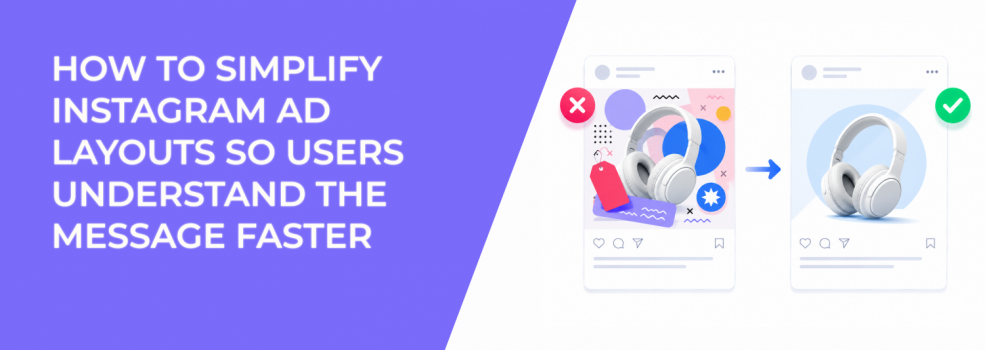
A complicated Instagram ad layout slows the user down. The message may be good, but the structure makes it harder to read, scan, and trust.
Simple layouts perform better when they create a clear path for the eye. The user sees the main subject, understands the offer, and knows what the ad is about before reading the full caption.
For advertisers, this matters because faster comprehension can improve CTR and reduce wasted clicks. A simple layout can also help CPA by setting clearer expectations before the user lands on the page.
Simple layouts reduce visual decision-making
Every ad layout creates a reading path. Users usually notice the largest, highest-contrast, or most central element first. If that first element is not connected to the offer, the ad loses time.
A simple layout does not mean empty or boring. It means the ad has clear priority. The user does not need to decide where to look.
This is why what people notice first in ads matters for Instagram creative. The first visible element should support the campaign goal, not distract from it.
The layout should match the offer type
Different offers need different structures. A discount ad can lead with price or product. A lead magnet may need a clear outcome. A SaaS demo ad may need a problem-and-solution layout.
If every ad uses the same template, the layout can work against the message. A product grid may suit a collection sale, but it can weaken a single high-ticket product. A heavy text overlay may work for a webinar, but it can hurt a visual product ad.
The layout should make the user’s next decision easier. If the ad asks for a form fill, the visual should explain why the form is worth completing. If the ad asks for a purchase, the visual should make the product and value clear.
A practical layout structure for clearer Instagram ads
Most static Instagram ads become easier to read when they use fewer zones. A clean layout usually has one main visual area, one message area, and one supporting brand or CTA area.
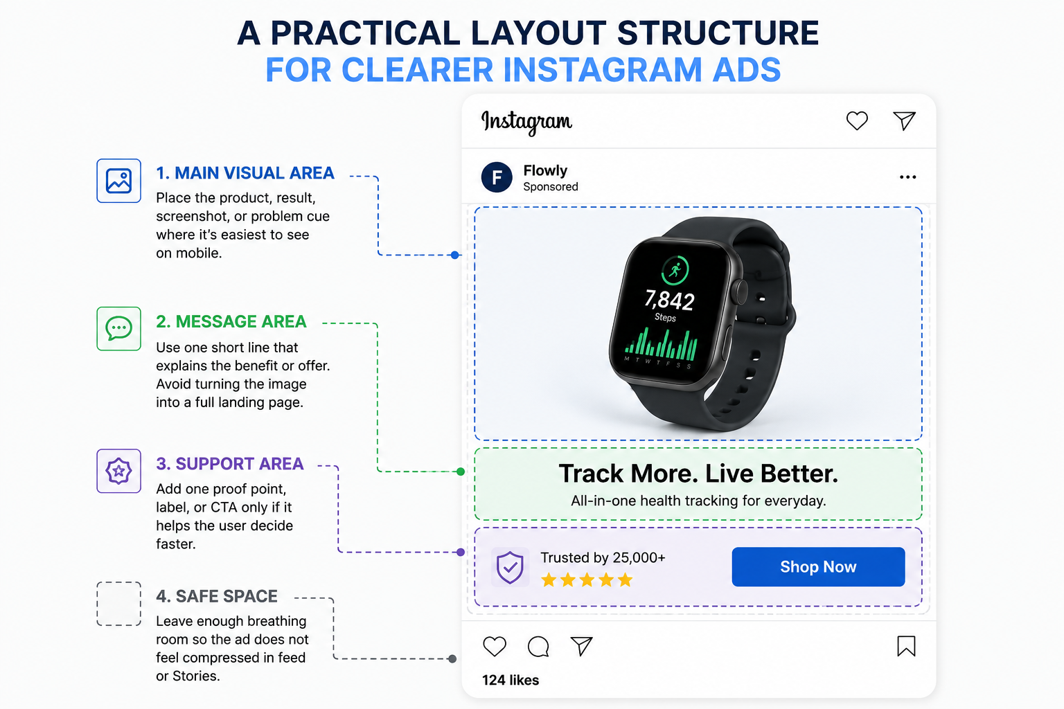
Use this structure as a starting point:
- Main visual area. Place the product, result, screenshot, or problem cue where it is easiest to see on mobile.
- Message area. Use one short line that explains the benefit or offer. Avoid turning the image into a full landing page.
- Support area. Add one proof point, label, or CTA only if it helps the user decide faster.
- Safe space. Leave enough breathing room so the ad does not feel compressed in feed or Stories.
This structure works because it creates order. The user sees the main thing first, then the reason to care, then the next step.
Use text overlays carefully
Text overlays can help an Instagram ad when the image alone does not explain the offer. They can also hurt performance when they cover the subject, repeat the headline, or add too many claims.
Keep overlay text short. It should clarify the visual, not replace the caption. If the user needs to read three lines inside the image before understanding the offer, the layout is doing too much.
For example, “Free audit for SaaS lead funnels” is easier to process than “Discover how our proven audit framework helps SaaS companies identify funnel leakage and increase qualified demo requests.” The second version may belong on the landing page, not the image.
A cleaner approach to use text overlays effectively is to place one short idea near the visual focus. The image and text should work together instead of fighting for attention.
Simplify before increasing budget
When an Instagram ad underperforms, many teams increase budget, change the audience, or launch new variations. Sometimes the cheaper fix is layout clarity.
If the ad has reach but weak CTR, simplify the visual before changing the offer. If CTR is strong but CPA is high, check whether the layout is attracting curiosity instead of qualified intent. If users click but leave quickly, the ad may be creating the wrong expectation.
Layout changes are useful because they do not require rebuilding the whole campaign. You can test a simpler version against the original while keeping the audience, copy, and offer stable. That makes the result easier to interpret.
This is one practical way to improve campaign performance without increasing budget.
Final takeaway
Simple Instagram ad layouts work because they reduce the time between seeing and understanding. The user does not need to decode the image or hunt for the offer.
Build the layout around one main visual, one short message, and one clear next step. When users understand the ad faster, they click with better intent, and your campaign has cleaner signals to optimize around.