Let’s be honest — people don’t go on Facebook to see your ad.
They’re scrolling, swiping, messaging friends, stalking their ex (no judgment), and watching videos they didn’t mean to watch. Your ad? It’s just another thing in the feed… unless you know how to stop the scroll.
That’s where psychology comes in.
If you understand what makes people pause, click, and say “I need that,” you’re already way ahead of the curve. And when you pair those psychological cues with smart targeting — especially now, with all of Meta’s recent changes — you’ve got a formula that actually works.
In this article, we'll check the strategies that really hook people plus talk about how to use Facebook’s evolving targeting tools to reach the right crowd in the right mindset.
How to use psychology for your Facebook ads
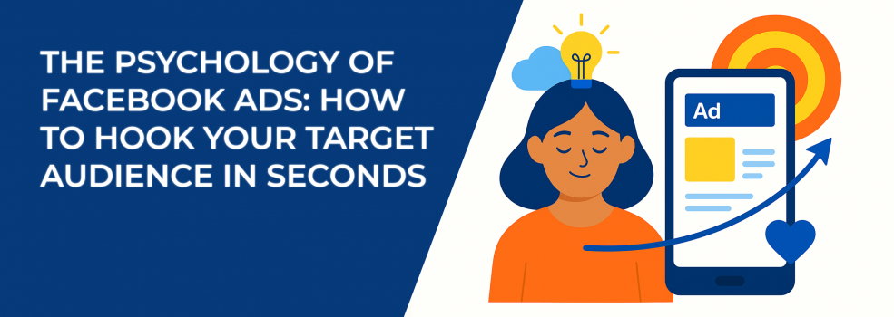
1. Grab attention in 3 seconds
Think about how you use your phone. You’re scrolling — half-distracted, maybe waiting in line, maybe watching TV with one eye. It takes something really compelling to make you stop mid-scroll, doesn’t it?
Your audience is doing the exact same thing. That means your ad has maybe three seconds (honestly, often less) to earn even a flicker of attention. So what makes someone pause?
It’s not always the most polished or expensive-looking ad. It’s the ad that feels like it needs to be looked at.
Here are a few proven elements you can build into your creative:
-
Eye contact: images with a direct gaze naturally draw attention. It’s almost instinctual — people look where other people are looking.
-
Contrast and brightness: use unexpected color combinations or bold backgrounds that “pop,” especially for mobile users. If most ads are beige and soft, go bright and sharp.
-
Emotional authenticity: think beyond happy smiles. Raw, unfiltered emotions — frustration, surprise, relief — are more likely to trigger curiosity.
-
Headline curiosity: lead with a question or a mini cliffhanger. Something that nudges the viewer to stop and think. For example:
-
“What if your team could finish in half the time?”
-
“Still doing this the hard way?”
-
“3 hours a day. That’s what it was costing him.”
-
You’re not just selling something — you’re starting a tiny mental conversation. You’re tapping into something unresolved or intriguing in the viewer’s mind. That’s what earns the pause.
You can try running two versions of the same ad:
-
One with bright, high-contrast visuals and a bold headline.
-
One with a muted, natural image that shows strong emotion — like someone looking visibly overwhelmed or relieved.
Which one makes people stop longer? Which one leads to more engagement? Check the metrics and see what works better.
Also, think about where your ad is showing up. Is it going into a Reels feed full of fast-moving, sound-on content? Or is it in a quiet sidebar during work hours?
Your ad doesn’t exist in a vacuum. Design it for the environment it’s going into.
For example:
-
A quick 6-second vertical video with subtitles might thrive in Reels.
-
A still image with a bold overlay headline may perform better in News Feed placements.
-
A minimalist product photo could shine in Stories — especially if paired with a short, curious caption.
2. Sell the feeling, not the feature
Let’s cut to the chase: people don’t care about your features — at least, not right away.
What they really care about is how your product makes them feel. Does it help them feel more in control? Less stressed? More confident in their decisions? That’s where emotional appeal comes in.
Even if you’re selling the most functional, technical thing in the world — like a project management app or an automated inventory system—there’s still a story to tell about what that functionality does for someone’s everyday experience.
Instead of saying: “This tool helps teams collaborate asynchronously”, try something like “Finally — team projects without 2 a.m. Slack messages and last-minute stress”.
See the difference? One tells you what the product does. The other shows you why it matters.
Here are some common emotional drivers to consider, no matter what you sell:
-
Security: the comfort of knowing something important is taken care of, e.g., “Know your data’s safe, even while you sleep.”
-
Freedom: more time, more autonomy, less micromanagement, e.g., “No more chasing down payments. Just click, send, done.”
-
Belonging or identity: making the buyer feel part of a smarter, savvier, or cooler group, e.g., “Trusted by growing startups worldwide.”
-
Relief: the removal of a problem or pain point, e.g., “Stop juggling spreadsheets and just get paid.”
-
Confidence: helping someone feel capable and ahead of the game, e.g., “Run your business like the pros with zero guesswork.”
So lead with feeling, then follow up with logic on your landing page or follow-up ads.
Your first job is to make them feel seen. After that, they’ll want to know more.