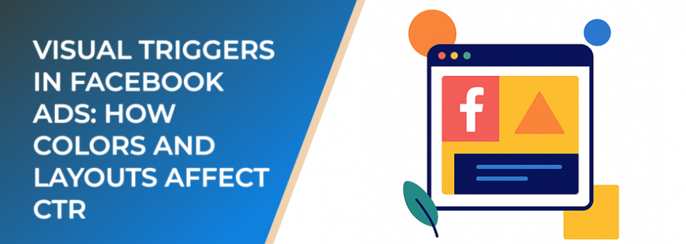
When it comes to Facebook Ads, visuals often determine whether someone scrolls past or clicks through. While ad copy plays a role, design elements like color and layout have a profound impact on click-through rates (CTR). Understanding the psychology behind visual triggers can help advertisers build ads that consistently attract attention and drive conversions.
Why Visuals Matter in Facebook Ads
Studies show that people process visuals 60,000 times faster than text. In a crowded Facebook feed, this means the first impression often comes from the image or video rather than the headline. Ads that use well-chosen colors and layouts can outperform those with weak design, even when the offer is identical.
The Role of Colors in CTR
Color influences perception, emotion, and ultimately behavior. For Facebook Ads:
-
Red and Orange: Often associated with urgency and excitement. These colors can increase action-taking but should be used sparingly.
-
Blue: Represents trust, stability, and calmness. A strong choice for brands that want to establish credibility.
-
Green: Linked to growth, balance, and positivity. Works well in wellness, eco-friendly, and finance niches.
-
Yellow: Bright and attention-grabbing. Useful for highlighting offers or CTAs.
According to HubSpot’s research, CTA buttons with contrasting colors can increase conversions by up to 21% compared to buttons that blend into the background.
Layouts That Influence Engagement
The arrangement of elements within an ad determines how the viewer’s eye travels across the design. Some best practices include:
-
Hierarchy of Information
Ensure the most important element (product image, headline, or CTA) stands out visually. -
Whitespace
Ads with too many elements feel cluttered. Using whitespace increases clarity and directs focus to the CTA. -
Symmetry vs. Asymmetry
Symmetrical layouts convey balance, while asymmetrical designs create energy and movement. Testing both can reveal which resonates more with your audience. -
Consistent Branding
Align ad visuals with your brand’s overall design system to build trust and recognition.
Combining Colors and Layouts for Maximum CTR
To maximize performance, advertisers should:
-
Use high-contrast color combinations to make CTAs stand out.
-
Pair warm, energetic colors with clean, simple layouts to balance excitement with clarity.
-
Test different arrangements, such as carousel ads versus single-image ads, to see which generates more clicks.
Facebook’s own data suggests that ads designed with clear focal points and contrasting colors achieve up to 30% higher CTR compared to less structured designs.
Measuring Impact
Advertisers should track:
-
CTR: The most direct measure of visual effectiveness.
-
Engagement Rates: Likes, shares, and comments can indicate how appealing the ad appears visually.
-
Conversion Rate: Ensures that clicks generated by visuals also translate into sales or leads.
Final Thoughts
Colors and layouts are not just aesthetic choices—they are psychological triggers that influence audience behavior. By applying proven design principles and testing combinations, advertisers can significantly improve their Facebook Ad CTR and maximize return on ad spend.