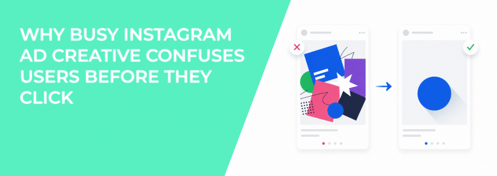
Busy Instagram ads often fail before the user reads the caption. The image may include a product, discount badge, testimonial, icon set, brand logo, background pattern, and CTA all at once. At mobile size, those elements compete instead of helping the user understand the offer.
This creates a decision problem. The user has to figure out what matters first, what the ad is about, and whether the offer is relevant. In the feed, that is usually too much work.
For advertisers, busy creative can lower CTR, raise CPC, and reduce post-click quality. The campaign may still get impressions, but the visual does not create a clean reason to click.
Busy ads slow down the first impression
Instagram users process ads quickly. They scan the image first, then decide whether the copy is worth reading. If the visual is overloaded, the user has no clear starting point.
This matters because attention is not the same as understanding. A busy ad may catch the eye, but it can still fail to explain the offer. That gap often shows up as weak outbound CTR or a high number of low-quality engagements.
The problem is not that the ad has too much design. The problem is that the design gives every element equal importance. When everything looks important, nothing guides the user toward the next action.
This is closely connected to what makes people stop on ads. Stopping the scroll is only useful if the ad quickly turns attention into understanding.
Why clutter creates weaker campaign signals
Meta’s delivery system learns from user behavior. If an ad attracts scattered attention, the platform may receive mixed signals about who is likely to respond. Some users may click because of the image, others because of the discount, and others because they misunderstood the offer.
That can create unstable performance. CPC may move up because fewer users click with clear intent. CPA may rise because confused users are less likely to complete the action after the click.
This is why creative clutter hurts ad performance. A cluttered visual does not only make the ad look worse. It also weakens the signal between the creative, the audience, and the conversion event.
What makes Instagram ad creative feel too busy
Busy creative usually comes from adding fixes instead of making choices. A team sees that the product is not clear, so they add a label. Then they add a badge to improve urgency. Then they add icons to explain benefits. The ad becomes heavier, but not clearer.
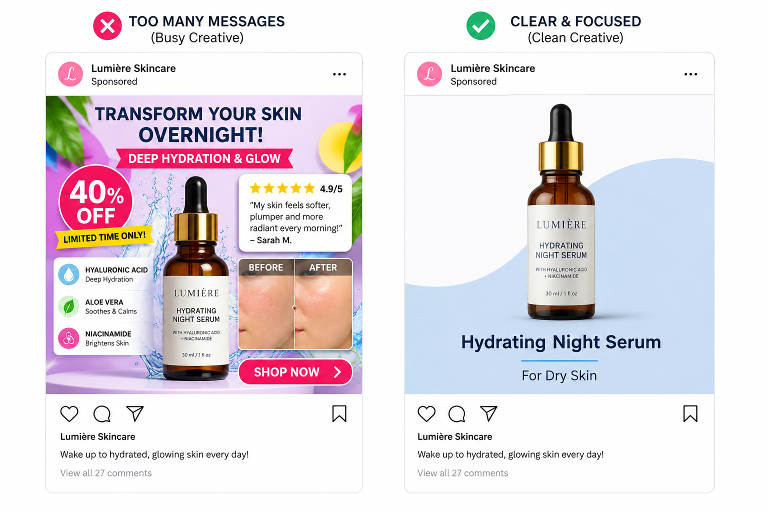
The most common causes are:
- Too many messages in one image. The user sees a discount, feature list, benefit, proof point, and CTA before knowing the main offer.
- Too many visual styles. Mixed fonts, icons, shadows, colors, and shapes make the ad feel less controlled.
- Too many products or screenshots. Multiple items can work in a carousel, but they often weaken a single-image ad.
- Too much background detail. Props, patterns, and lifestyle scenes can distract from the action you want.
Each element should earn its place. If it does not help the user understand the offer faster, it is probably creating visual drag.
How to make busy creative easier to understand
Start by choosing one message for the image. The caption can explain details later. The image should only make the first decision easier.
For example, an ad for a lead magnet should not show five benefits, a large logo, a stock photo, and a CTA button inside the same square. A cleaner version could show the lead magnet title, one strong outcome, and a simple visual cue that makes the download feel useful.
For ecommerce, replace crowded product grids with one product, one use case, or one bundle story. If the user needs comparison, use carousel format instead of forcing every product into one frame.
For B2B lead generation, make the problem visible. A clean workflow gap, dashboard issue, or cost leak can explain the offer faster than a generic image with many icons.
Track whether clarity improves click quality
A cleaner ad should not only increase CTR. It should improve what happens after the click. Watch landing page views, form starts, add-to-cart rate, demo requests, or qualified leads.
If CTR improves but CPA gets worse, the new ad may be more attractive but less precise. If CTR improves and conversion rate holds or rises, the creative is likely doing a better job of pre-qualifying users.
This is why clicks don’t always equal conversions. The goal is not to make the ad louder. The goal is to make the right users understand the offer faster.
Final takeaway
Busy Instagram ad creative confuses users because it asks them to sort the message themselves. Most users will not do that in the feed.
The fix is to reduce the number of competing elements and make one idea obvious. A clear ad gives Meta cleaner engagement signals, gives users a stronger reason to click, and gives advertisers a better chance of turning attention into qualified traffic.