
Cluttered Instagram ads lose users because they take too long to read visually. The ad may contain useful information, but the user does not stay long enough to process it.
This is a feed-speed problem. People scroll past ads that make them pause for the wrong reason. If the first glance feels crowded, the user often leaves before seeing the offer.
That hurts performance at the top of the funnel. You may see impressions, but not enough clicks. You may see clicks, but not enough serious post-click behavior. The ad is reaching people, but it is not giving them a clear reason to act.
Fast-scrolling users need instant visual order
Instagram is not a slow browsing environment. Users move through content with quick visual checks. They stop when something feels relevant, clear, or emotionally useful.
A cluttered ad breaks that pattern. The user sees too many elements and cannot quickly decide what the ad is asking them to notice. That delay is enough to lose the impression.
This is why scroll speed affects ad performance. A strong image ad works at the speed of the placement. If users need three or four seconds to understand the visual, the ad is already late.
Clutter weakens the first second of delivery
The first second is where the ad earns permission for the next second. A crowded visual makes that harder because the user has no clear entry point.
In Ads Manager, this may appear as decent reach with weak outbound CTR. It can also show up as poor landing page view volume compared with link clicks, because users click with low commitment or abandon quickly.
For campaigns focused on lead generation, clutter can be especially costly. A user who does not understand the promise before clicking is less likely to complete the form. That pushes CPL up and reduces lead quality.
What to remove when the ad feels too crowded
The fastest way to improve a cluttered ad is to remove anything that does not help the first glance. Do not start by redesigning everything. Start by cutting weak elements.
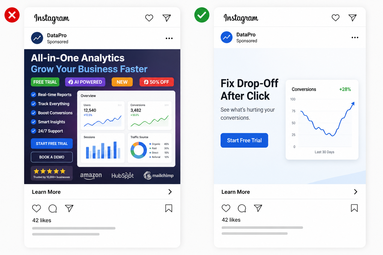
Focus on these checks:
- Remove duplicate messages. If the image, headline, and CTA all repeat the same phrase, keep the clearest version and use the other space for support.
- Cut decorative icons. Icons should explain something. If they only fill space, they slow the user down.
- Limit badge stacking. “New,” “Sale,” “Free,” and “Limited” badges in one image compete with each other.
- Reduce background noise. Product props, patterns, and screenshots should not overpower the offer.
A cluttered ad is usually not short on information. It is short on priority.
Give the user one reason to stop
Fast-scrolling users need one clear hook. That hook can be a visible product, a short benefit, a strong contrast, or a clear problem. It should not be five smaller hooks competing inside one ad.
For example, a B2B ad promoting an audit should not show a full dashboard, client logo row, three benefits, and a CTA button in one static image. A stronger version could show one visible problem, such as “leads dropping after click,” supported by a clean diagnostic visual.
An ecommerce ad can use the same logic. Instead of showing ten products in one image, show the hero product in use. If the campaign needs multiple products, use a carousel where each card has one job.
This aligns with the idea that ad creative must earn attention in 3 seconds or less. The first job is clarity, not completeness.
Match creative density to placement
A feed ad has more room than a Story, but both still need fast comprehension. Reels and Stories are less forgiving because interface elements can cover parts of the creative. Explore can be even more competitive because users are actively scanning.
If one image is used across every placement, clutter often gets worse. Text becomes smaller, crops become tighter, and secondary elements become harder to read.
Create placement-safe versions when the ad matters. Keep the feed version clean, but make the Story or Reels version even simpler. Put the main subject in the safe area and avoid small text near the edges.
Diagnose clutter before changing the offer
When you see impressions but no clicks, do not assume the audience is wrong immediately. First check whether the creative is readable at feed speed.
Open the ad preview on mobile and look away after one second. Ask what you remember. If you cannot name the product, offer, or main benefit, the ad is too cluttered for the placement.
Final takeaway
Cluttered Instagram ads lose fast-scrolling users because they delay understanding. The user does not have time to decode the visual, compare messages, or search for the offer.
To fix it, reduce the ad to one strong reason to stop. Make the main subject obvious, remove elements that compete, and check the image at mobile speed before launch. Faster clarity can improve CTR, protect CPC, and send better traffic into the funnel.