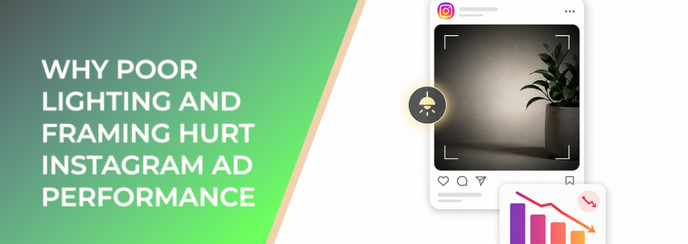
Poor lighting and framing can make a strong Instagram ad look weak.
The product may be good. The offer may be competitive. The targeting may be reasonable. But if the image is too dark, too cluttered, too far away, or awkwardly cropped, users may not trust the ad enough to click.
For performance marketers, this is not a creative taste issue. Lighting and framing influence how quickly people understand the ad, how credible the brand feels, and whether the click comes from real intent or casual curiosity.
The Problem
The problem is that many Instagram ads are judged visually before they are evaluated rationally.
A poorly lit image makes the subject harder to inspect. A poorly framed image makes the message harder to process. Together, they create friction before the user reads the headline, caption, CTA, or landing page.
Common problems include:
- The product is hidden in shadows.
- The subject blends into the background.
- The frame cuts off important details.
- The camera angle makes the product or service look less credible.
- The background is busier than the offer.
- The image leaves no clear focal point.
- The ad looks accidental instead of intentional.
- The image does not fit the placement crop.
This matters because Instagram is a visual-first environment. Users do not pause to decode unclear images. They scroll.
Why This Problem Hurts Performance
Poor lighting and framing hurt ad performance because they weaken visual trust.
When users cannot see the product, person, result, or offer clearly, they hesitate. That hesitation can reduce the quality of engagement and make the campaign work harder for every meaningful action.
The performance impact can show up in several ways:
- Lower CTR because the image does not create enough confidence.
- Higher CPC because fewer relevant users click.
- Lower conversion rate because clicks come from unclear curiosity.
- Higher CPA or CAC because the campaign needs more traffic to generate results.
- Lower ROAS because visual attention does not convert into purchase motivation.
- Weaker lead quality because users misunderstand the service or offer.
- Poorer creative learning because the image execution masks the message test.
Lighting and framing also affect perceived value. A dark product image can make a premium item feel cheaper. A cluttered service photo can make a professional business feel less reliable. A poorly framed B2B screenshot can make software feel harder to understand than it actually is.
Common Scenarios Where This Happens
Ecommerce Campaigns
A brand promotes a product using a lifestyle image where the product is small, dark, or surrounded by too many props. The photo looks stylish, but shoppers cannot evaluate the item quickly.
B2B Lead-Generation Ads
A SaaS company uses a dashboard screenshot with poor contrast or a wide crop. Decision-makers see a screen, but they cannot understand the problem being solved.
Local Service Ads
A studio, clinic, gym, salon, or repair business uses real photos from the location, but the lighting is uneven and the frame includes clutter. The business may be credible, but the image does not communicate that credibility.
Agency Creative Reviews
A client approves a photo because it is “on brand,” but the ad performs poorly because the subject is not framed for mobile delivery.
Startup Campaigns
A startup uses founder-led photos or early product shots. The authentic style is useful, but poor lighting makes the ad feel less polished than the offer deserves.
Why the Problem Happens
Poor lighting and framing usually happen because marketers focus on the asset, not the ad experience.
A photo can look acceptable in a folder, pitch deck, website section, or organic post. That does not mean it is ready for paid Instagram placements.
The problem often comes from these root causes:
- The image was not created for mobile viewing.
- The team reviewed the image too large on desktop.
- The main subject was not defined before the shoot.
- Props, backgrounds, or brand elements were allowed to compete with the offer.
- The crop was forced into multiple placements.
- The photo was chosen for mood instead of clarity.
- Nobody checked whether the image still worked after upload.
The deeper mistake is assuming that good design is enough. For performance marketing, the image must be readable, intentional, and aligned with the action you want the user to take.
The Solution
The solution is to treat lighting and framing as performance levers.
The image should help users answer three questions quickly:
- What am I looking at?
- Why does it matter to me?
- Can I trust this enough to continue?
1. Make the Subject Brighter Than the Background
The subject should be easy to find.
For product ads, the item should not disappear into shadows or similar colors. For service ads, the person, space, or result should be visible. For B2B ads, screenshots, devices, or offer visuals should be readable enough to create context.
Simple fixes include:
- Move the subject closer to natural light.
- Reduce shadows over key details.
- Avoid placing dark products on dark backgrounds.
- Avoid placing light products on overexposed backgrounds.
- Use contrast to separate the subject from the scene.
Better lighting does not mean dramatic lighting. It means useful visibility.
2. Frame the Image Around One Focal Point
Every Instagram ad image needs a visual anchor.
That anchor may be:
- The product.
- The person.
- The result.
- The offer card.
- The interface.
- The proof point.
- The problem scene.
Once the focal point is clear, remove or reduce anything that competes with it.
A good frame tells the user where to look first. A weak frame makes every element fight for attention.
3. Protect Important Details From Cropping
Instagram placements can display images differently depending on format, device, and placement.
Before launch, check whether the crop cuts off:
- Product labels.
- Faces.
- Hands showing product use.
- Before-and-after details.
- Offer cards.
- CTA areas.
- Screenshots.
- Proof elements.
Keep essential information away from the edges. Leave safe space around the subject, especially for vertical placements.
4. Use Negative Space Intentionally
Empty space is not wasted space.
Negative space helps the user process the image faster. It also creates room for short overlays when needed.
Use negative space to:
- Separate the product from background noise.
- Give the eye a clear path.
- Make text easier to read.
- Make the ad feel cleaner on mobile.
- Reduce visual stress.
A crowded ad may feel informative internally, but it often feels difficult in the feed.
5. Match the Frame to the Funnel Stage
Different audiences need different visual cues.
Cold audiences may need clear problem recognition or product explanation. Warm audiences may respond better to proof, specific benefits, or offer urgency. Retargeting audiences may need a closer product detail, testimonial, or conversion-focused frame.
Do not use the same image logic for every funnel stage.
6. Review the Ad at Mobile Size
This is the simplest and most overlooked step.
Before launch, preview the ad on a phone and ask:
- Is the subject visible immediately?
- Is the image bright enough?
- Is the product or service clear?
- Does the crop remove context?
- Does the frame guide the eye?
- Does the image feel credible?
- Does the image still work without reading the caption?
If the image fails at mobile size, it is not ready.
Risks and Considerations
Improving lighting and framing can make ads easier to trust, but there are still risks.
- Over-polished images can feel less native in some markets.
- Better lighting can increase clicks without improving conversion quality if the offer is weak.
- Tight framing can remove useful context.
- Lifestyle images can become too vague if the product is not visible.
- Clean images can still underperform if the audience is wrong.
- Strong creative can send users to a landing page that does not match the visual promise.
- Too many creative changes at once can make test results unreadable.
Lighting and framing should improve clarity, not just aesthetics.
Prerequisites and Dependencies
To make lighting and framing improvements work, you need:
- A clear offer.
- A defined audience stage.
- A known primary subject.
- Source images with enough resolution.
- Placement-specific crops.
- Mobile preview before launch.
- Consistent creative-review criteria.
- Reliable conversion tracking.
- A landing page that matches the ad’s visual message.
- A testing plan that isolates the image change where possible.
Without these dependencies, you may improve the photo but still misread the campaign result.
Practical Recommendations
Before launching your next Instagram ad, use this lighting and framing checklist:
- Identify the visual focal point.
- Make the subject brighter or clearer than the background.
- Remove distracting objects.
- Crop closer if the product or person feels too small.
- Leave safe space around important details.
- Avoid shadows across labels, faces, screens, or proof points.
- Check contrast on mobile.
- Make sure the image fits the placement.
- Compare the improved image against the previous version.
- Judge performance by downstream quality, not CTR alone.
Do not wait until the campaign underperforms to check the image. Lighting and framing should be reviewed before spend starts.
Final Takeaway
Poor lighting and framing hurt Instagram ad performance because they weaken clarity and trust before the user evaluates the offer.
The solution is to make the image easier to understand at a glance. Use better visibility, cleaner composition, stronger focal points, safer cropping, and mobile-first review. When the image feels intentional, users can click with more confidence, and the campaign produces cleaner performance signals.
Related LeadEnforce Articles
- How Better Lighting and Composition Make Instagram Ads Easier to Trust — Directly supports lighting, framing, and trust improvement.
- How To Fix Instagram Ad Photos That Look Unprofessional in the Feed — Useful for cleaning up photos that weaken first impressions.
- Why Blurry or Low-Quality Instagram Ad Images Increase CPC and Lower Click Intent — Explains how image clarity affects click confidence.
- Why People Scroll Past Your Instagram Ads Without Noticing the Product — Helpful for focal-point and product visibility problems.
- Fix Confusing Instagram Ads by Giving Every Visual a Clear Job — Shows how to improve visual hierarchy and reduce confusion.