Your Facebook ads are driving solid traffic. You’ve got the targeting dialed in, the creative looks sharp, and click-through rates are healthy. Yet conversions remain underwhelming.
Chances are, the problem isn't your ads — it’s your mobile landing page.
With more than 70% of paid traffic now coming from mobile devices, the mobile user experience (UX) is no longer optional or secondary. It’s the front line of your conversion funnel. If your landing page fails to meet mobile standards for speed, clarity, and usability, you’re likely wasting valuable ad spend and leaving revenue on the table.
Let’s take a closer look at the six most common mobile landing page mistakes — and the practical fixes that can unlock much stronger performance.
1. Slow Load Times Are Costing You Leads
Speed is a foundational element of mobile performance. Google research shows that over half of mobile visitors abandon pages that take longer than 3 seconds to load. In a high-cost environment like paid social, that bounce is more than a nuisance — it’s a budget leak.
Why is this happening?
Several technical issues may be dragging your page speed down:
-
Heavy image files or uncompressed video that are not optimized for mobile bandwidth.
-
Excessive third-party scripts, such as tracking pixels or live chat tools, that slow down rendering.
-
Unminified or bloated code, which adds unnecessary weight and complexity.
What should you do?
To improve page load time and preserve ad ROI:
-
Compress image assets using tools like TinyPNG or Squoosh, and use WebP or AVIF formats when possible.
-
Defer non-essential JavaScript and eliminate unused code with tools like Lighthouse or Web.dev.
-
Use lazy loading for images and embedded media below the fold.
-
Host fonts locally, and reduce font weights and variations.
-
Run regular performance audits using Google PageSpeed Insights or GTmetrix to catch regressions.
By keeping your mobile page lean and efficient, you not only improve conversions — you also gain favor with algorithms that reward user experience.
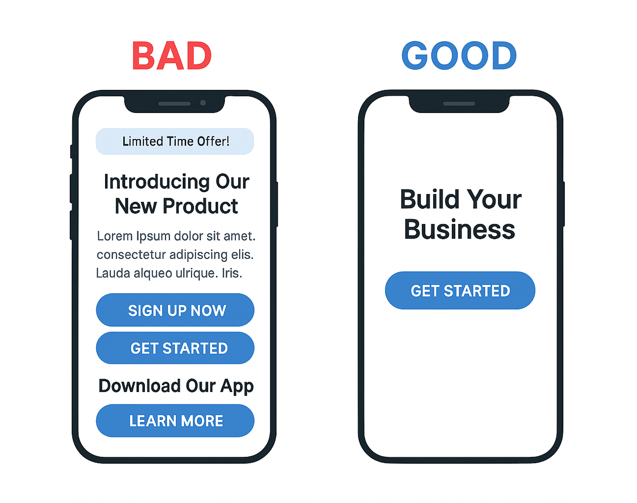
2. The Messaging Is Overwhelming or Unclear
A successful mobile landing page communicates its value proposition almost instantly. Users shouldn't have to scroll, decode vague headlines, or read large blocks of text to understand what you’re offering.
What often goes wrong?
Here are a few of the most common content-related mistakes on mobile:
-
Dense paragraphs or long-form copy that’s hard to scan on a small screen.
-
Generic or confusing headlines that fail to clarify the offer.
-
Multiple CTAs competing for attention, creating friction and decision fatigue.
How can you improve messaging?
Streamline your mobile content with these tactics:
-
Use a short, benefit-focused headline. Make sure it fits comfortably on two lines or less on most devices.
-
Break up information using subheadings, bullet points, and visual cues to create breathing room.
-
Stick to one primary CTA per page, especially for top-of-funnel campaigns. If your user has to choose between "Download," "Subscribe," and "Book a Call" — they’re more likely to choose none.
Quick mobile messaging checklist:
-
Is your primary CTA clearly visible above the fold?
-
Can a new visitor describe the offer after 5 seconds?
-
Does every element on the page support a single conversion goal?
When in doubt, reduce. The goal is to guide, not overwhelm, your mobile users.
And of course, no amount of clever messaging will help if you're speaking to the wrong audience — make sure you're following the right approach in Facebook Ad Targeting 101 to match your offer with audience expectations.
3. The CTA Placement (and Design) Is Failing You
Your call-to-action is the most important element on your landing page — yet on mobile, it often gets buried, overlooked, or de-emphasized due to poor layout decisions.
What should you avoid?
Several common missteps can quietly sabotage CTA performance:
-
Buttons located deep down the page, forcing excessive scrolling.
-
CTA buttons that blend into the background, with poor color contrast or weak sizing.
-
Generic button text, such as “Submit” or “Click Here,” that doesn’t communicate any benefit.
What works better?
To improve CTA visibility and conversion potential:
-
Position your main CTA above the fold, ideally right below your hero section or headline.
-
Use bold, high-contrast colors that make your button unmistakable and easy to tap.
-
Deploy sticky CTA bars on longer pages to ensure users can act at any time during their scroll.
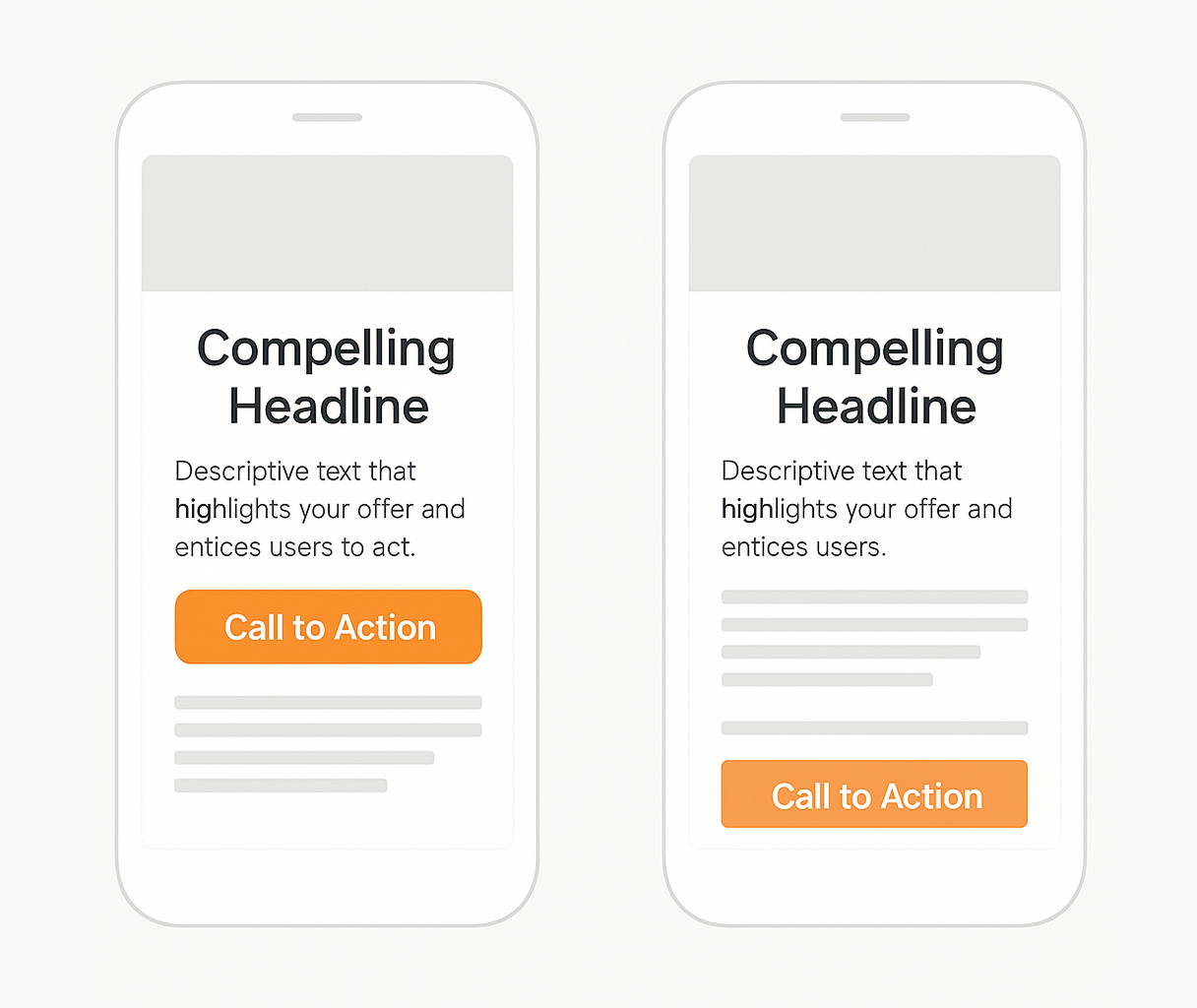
Both CTAs are colorful and contrast with the surrounding elements. But one is above the fold and the other isn't - it may be less visible to users.
Examples of strong, action-oriented CTA copy:
-
“Get My Instant Quote”.
-
“Start Your 14-Day Trial”.
-
“Download the Free Guide Now”.
Each CTA should be clear, concise, and benefit-driven. If a user needs to think about what will happen after tapping, it’s time to revise.
4. Mobile UX Isn’t Designed for Real-World Use
Mobile usability isn’t just a design problem — it’s a behavioral one. Mobile users aren’t sitting at desks with full attention. They’re on the move, distracted, and often operating their devices with one hand.
What UX elements are essential?
To create an intuitive and frustration-free mobile experience, ensure the following:
-
Touch targets (buttons and links) are at least 44 × 44 pixels to support accurate taps.
-
Adequate spacing between elements to avoid accidental clicks.
-
Form fields with mobile-friendly features, like autofill, field masking, and numeric keyboards for phone/email fields.
-
Vertical scrolling only — avoid side-to-side navigation or hover effects that don’t translate to touchscreens.
Why it matters: your landing page should be usable in less-than-ideal environments — think poor lighting, slow networks, or users multitasking. Test it yourself: try completing your form one-handed while walking. If that’s a challenge, your users will likely bounce.
Designing for mobile also extends to your ad creatives — these best practices for designing mobile-friendly Facebook ads can help align pre-click and post-click experiences more effectively.
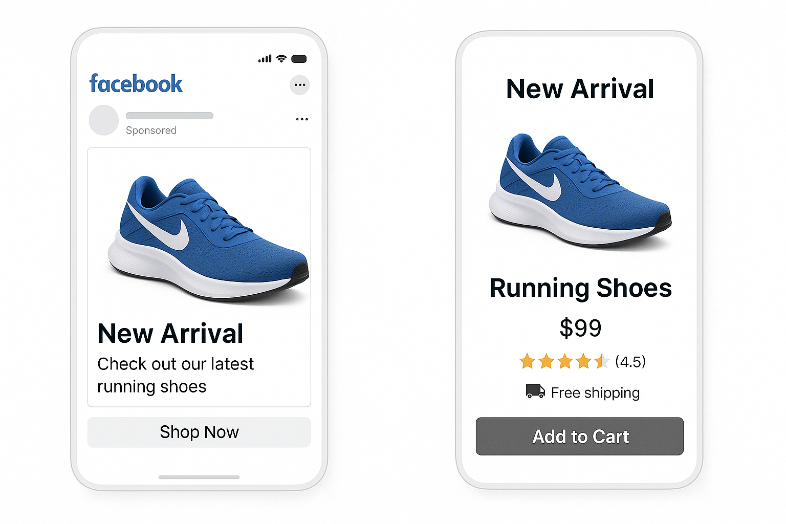
5. The Page Doesn’t Match the Ad Experience
Message mismatch is one of the most common — and costly — mistakes in digital advertising. When users click an ad expecting one thing and land on a page that delivers something else, trust erodes immediately.
What creates this disconnect?
These inconsistencies can kill momentum fast:
-
Headlines or imagery that differ from what was shown in the ad.
-
A tone or message that feels different or less specific.
-
An offer that’s hidden behind extra steps or isn’t mentioned at all.
What builds consistency?
To keep users aligned and engaged from click to conversion:
-
Mirror the ad headline on your landing page, or use language that reinforces the original promise.
-
Keep the tone, visuals, and structure aligned between ad and page for a seamless experience.
-
Reiterate the offer clearly in the opening section — don’t bury it under brand storytelling or generic introductions.
Congruency improves trust, encourages forward movement, and reduces bounce rates across all traffic sources.
For a seamless journey from ad to landing page, review how to build a full Facebook ads funnel strategy that connects every touchpoint — from audience identification to final conversion.
6. You’re Not Optimizing or Testing for Mobile Behavior
You can’t improve what you don’t measure — and you can’t measure mobile behavior accurately by looking at desktop data alone. Yet many marketers make the mistake of treating mobile and desktop visitors the same during testing.
Which mobile-specific behaviors should you track?
Keep an eye on the following metrics:
-
Scroll depth, especially where most users drop off.
-
Mobile bounce rates and time on page.
-
Form abandonment rates, segmented by device type.
What tools can help?
Use the right stack to gather and act on mobile-specific insights:
-
Hotjar or Microsoft Clarity for session recordings and heatmaps filtered by device.
-
Google Analytics 4 for real-time event tracking and mobile traffic segmentation.
What kinds of tests should you run?
Consider running experiments that address mobile friction directly:
-
Short-form vs. long-form landing pages.
-
Hero image vs. autoplay video headers.
-
Anchor menus vs. infinite scroll structures.
-
Sticky vs. standard CTA placement.
Build mobile-first, not just mobile-friendly. The difference can significantly impact performance at scale.
Final Takeaway: Don’t Let Mobile Be the Weak Link in Your Funnel
Your landing page is the bridge between ad engagement and business impact. On mobile — where users are impatient, distracted, and skeptical — that bridge must be as fast, clear, and easy to cross as possible.
To recap, here’s what you should focus on:
-
Speed: Optimize load times to under 3 seconds.
-
Clarity: Deliver value clearly and immediately.
-
Simplicity: Design for real mobile behavior, not just screen size.
-
Consistency: Align ad and page content seamlessly.
-
Testing: Segment and optimize based on actual mobile usage patterns.
Advertising platforms like Facebook, Instagram, and TikTok are mobile-first ecosystems. If your landing page isn’t fully optimized for mobile users, you’re not just missing conversions — you’re paying for people to leave.
Want to stop losing conversions to poor UX? Start by fixing the mobile experience. The results will speak for themselves.
