When people scroll through Facebook, they don’t read ads — they scan them. That means your visual hierarchy has to work fast. It needs to show the eye where to look first, what to notice next, and when to click.
And when it fails? Your click-through rate drops, no matter how good your targeting is.
Visual hierarchy is not just a design term. It’s a practical framework that advertisers can use to influence real behavior — like clicks, views, and conversions. Let’s look at how it works and how you can apply it to your Facebook ads.
What Is Visual Hierarchy, Exactly?
Visual hierarchy refers to the arrangement and prioritization of elements in a layout — like headlines, buttons, images, and text — to guide the viewer’s eye in a specific order. In the context of Facebook ad creatives, it directly affects whether users stop scrolling, pay attention, and ultimately click.
Strong visual hierarchy clarifies three things:
-
What the ad is about
-
Why it matters
-
What action to take
If those signals aren’t immediately obvious, users scroll past. Worse, Facebook’s algorithm may learn that your ad is being ignored — which hurts your overall performance and budget efficiency.
If your ad isn’t getting impressions or has low engagement, the visual presentation might be the culprit. You can explore other causes in this breakdown of “Ad Set May Get Zero” issues.
1. Anchor the Ad With a Single Focal Point
A common mistake? Trying to fit too much into one frame. When everything looks important, nothing stands out.
Every high-performing Facebook ad has one dominant visual entry point. This could be:
-
A large product image that captures the user’s attention.
-
A headline in bold, high-contrast type.
-
A CTA badge or sticker that immediately signals intent (e.g., “Try free,” “20% off,” or “New drop”).
Why it matters: Visual attention is limited. If viewers don’t know where to focus, their attention fragments — and that leads to cognitive fatigue, which makes them scroll on.
To create a clear entry point, use scale (make it bigger), contrast (use light vs. dark), or positioning (place it top center or top left).
2. Use Contrast Intentionally — Not Decoratively
Contrast isn’t just about color. It’s also about weight, motion, spacing, and type hierarchy. Use it to make sure viewers notice the most important parts of the ad — and not waste attention on the wrong details.
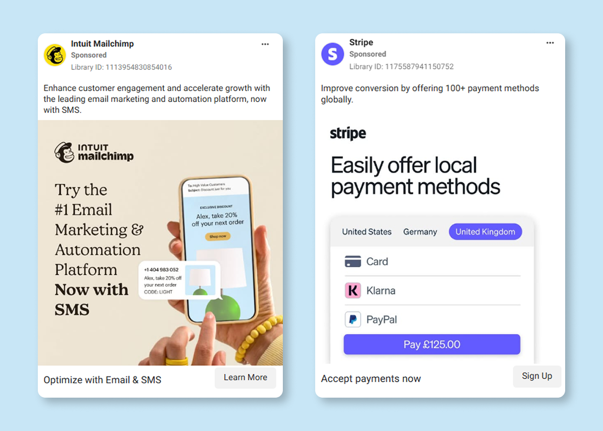
These ads showcase smart use of contrast and focal point. Mailchimp uses color contrast and product positioning; Stripe uses whitespace and a bold CTA structure.
Use contrast to emphasize:
-
Headlines: A bold, black-on-white header is easier to read than pastel-on-pastel color combos.
-
CTAs: Use a color that stands out against the background — red on neutral tones, for example.
-
Product images: Make sure the product doesn’t blend into the background. Consider a drop shadow or outlined edge.
Be cautious: too much contrast across too many areas creates noise. Pick one or two elements to emphasize.
Tip: Learn how contrast fits into the larger ad design process in this guide on creating scroll-stopping Facebook ad creatives.
3. Keep Copy Brief — And Visually Structured
Short copy doesn’t just read better. It performs better — especially on mobile.
When you write long sentences, they either get compressed into a small box or broken awkwardly across lines. Neither format encourages reading, especially when users are scrolling fast.
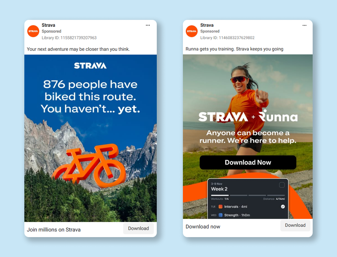
These Strava ads demonstrate effective copy structure and headline hierarchy — one leads with curiosity (“You haven’t... yet”), the other uses bold text placement and visual CTA reinforcement.
Aim for:
-
5–7 words per line. Short lines are easier to scan and maintain their layout on all screen sizes.
-
2–3 total lines of copy. Focus on clarity, not cleverness.
Instead of saying:
“Are you tired of spending money on ads that don’t convert?”
Try:
“Tired of wasted ad spend?”
Clarity always beats cleverness, especially in the first few seconds of exposure. This principle is supported by patterns we’ve seen in high-CTR ad examples.
4. Make the CTA Obvious — and Immediate
If your CTA is buried at the end of a video, hidden in a caption, or requires a second glance, you're losing conversions.
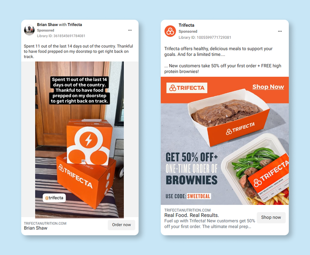 Trifecta uses CTA-forward layouts. The second ad highlights urgency and incentive with large, contrasting text and a clear “Shop Now” action — ideal for conversion-focused campaigns.
The best-performing CTAs:
-
Appear in the first 3 seconds of video or motion ads.
-
Are embedded directly in the creative, not just in the text field.
-
Use visual reinforcement: buttons, arrows, or framing.
You can also boost clicks by pairing visual hierarchy with strategic placement. Learn how Facebook places impact performance in this overview of ad formats.
5. Design for Silent Viewing
Most Facebook users don’t watch ads with sound. This is especially true on mobile. So if your creative only makes sense with sound, you’re excluding most of your audience.
Use visual hierarchy to make your message land even in mute mode:
-
Add large text overlays that communicate the main message.
-
Use motion graphics or visual cues instead of voiceovers.
-
Make the CTA clickable and visible, not just spoken at the end.
This is especially important if you're relying on video or Reels. For tips on how to make those formats perform without audio, see this Instagram Reels strategy guide.
6. Test Layouts — Not Just Copy
Most advertisers test headlines and visuals. Fewer test layouts. And that’s a missed opportunity.
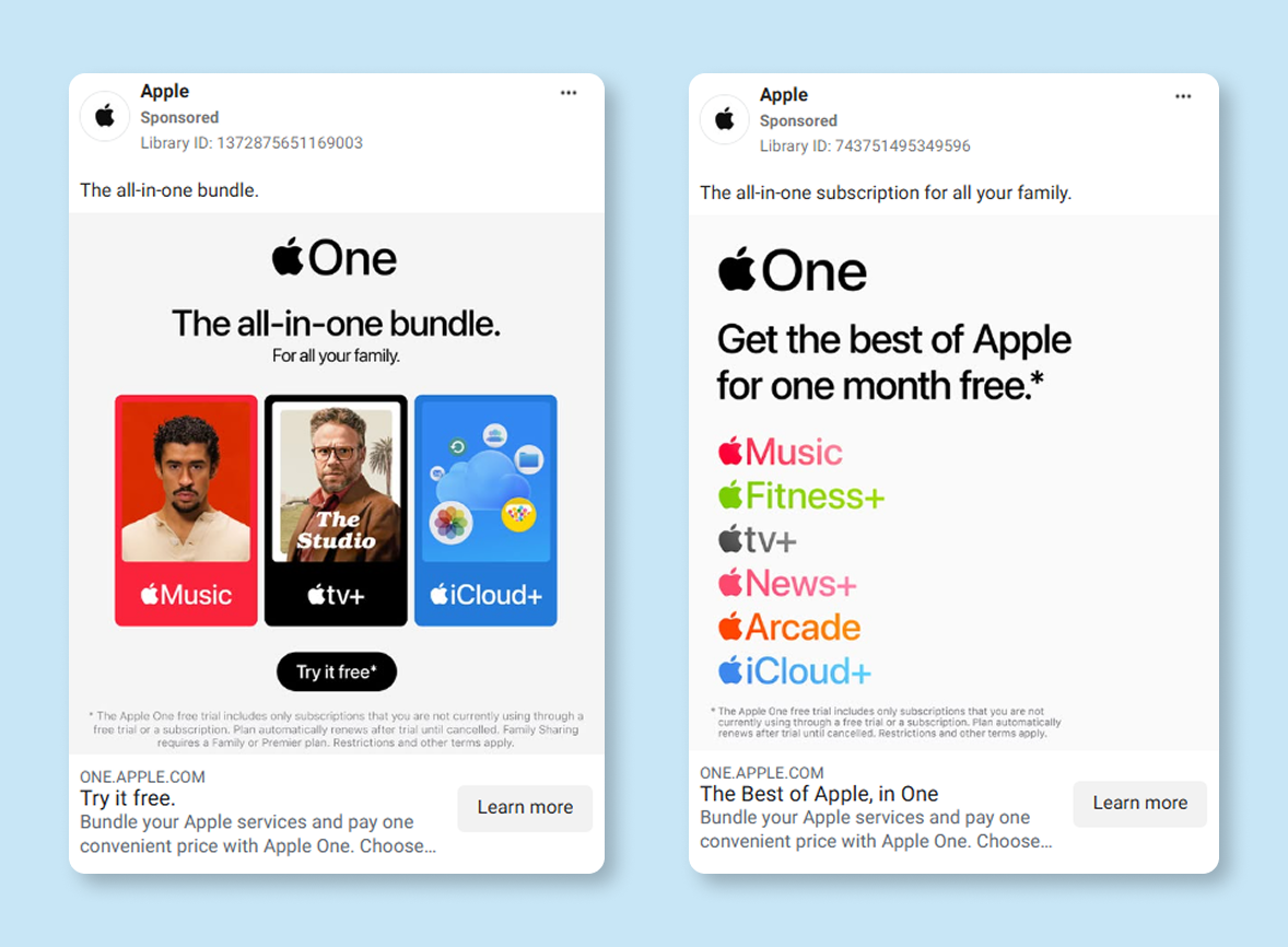
Apple’s ads test layout strategies — from image-driven blocks to minimalist, text-only compositions — both anchored by strong vertical flow and brand clarity.
Try split-testing:
-
CTA on the top vs. the bottom. Some audiences respond better when action is front-loaded.
-
Headline overlaid on image vs. separate block. This changes eye flow significantly.
-
Visual-heavy layout vs. text-driven. Depending on your niche, one may outperform the other.
Even subtle changes in the reading path can influence CTR. For more on how layout interacts with delivery, targeting, and performance, read Facebook Ads Not Converting: How To Fix It.
Final Word: Make It Easy to Click
Visual hierarchy isn’t abstract design theory. It’s what determines whether someone notices your ad, understands what it’s about, and feels confident enough to click.
If your click-through rate is underperforming, review your ad like this:
-
Is there one thing that immediately draws attention?
-
Can you read the main message in one glance?
-
Is the CTA visually clear and easy to act on?
If the answer is no, revisit your hierarchy.