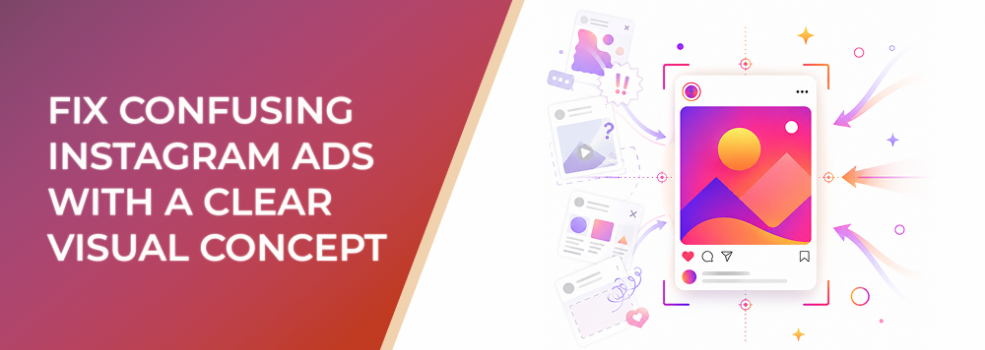
Confusing Instagram ads rarely look broken at first glance.
The image may be polished. The colors may fit the brand. The product may be visible. The headline may be readable. But users still do not immediately understand what the ad is trying to say.
That is a visual concept problem.
For performance marketers, agencies, SMB owners, startup teams, ecommerce advertisers, and B2B lead-generation teams, unclear creative can quietly waste budget. The campaign may get impressions and even some clicks, but the attention is weak because the ad does not communicate one obvious idea.
The fix is not simply better design. The fix is a clear visual concept before production starts.
The Problem
A confusing Instagram ad usually tries to communicate without a central creative idea.
Instead of one concept, the ad contains disconnected parts:
- A product photo
- A lifestyle background
- A short headline
- A discount badge
- A logo
- A CTA
- A few visual decorations
- Maybe a testimonial or feature claim
Each part may be useful on its own. Together, they can create confusion.
The viewer sees the ad and has to work out:
- What is being offered?
- Who is this for?
- What problem does it solve?
- Why should I care now?
- What should I look at first?
- What should I do next?
On Instagram, that is too much work. Users are moving quickly. If the visual does not create immediate understanding, many people scroll before the ad has a chance to explain itself.
A clear visual concept prevents that. It gives the creative one controlling idea that every visual element supports.
Why This Problem Hurts Performance
Confusing visual concepts hurt paid performance because they weaken the first impression.
When users do not understand the ad quickly, CTR can fall because fewer people see a reason to click. CPC can rise because the campaign needs more impressions to earn meaningful action. CPA and CAC can increase because the ad attracts low-intent curiosity clicks or passive engagement instead of qualified traffic.
For lead-generation teams, confusing visuals can also damage lead quality. Users may submit forms without fully understanding the offer, which creates weak sales conversations and poor downstream conversion.
For agencies, the problem becomes harder to diagnose. A confusing ad can make the audience look wrong, the offer look weak, or the landing page look underperforming, when the first issue is actually visual clarity.
Common Scenarios Where This Happens
This problem appears in many paid social accounts.
- A SaaS company promotes a demo with a dashboard screenshot.
The interface looks professional, but the viewer cannot tell what business problem the software solves. - An ecommerce brand uses a lifestyle image without an offer cue.
The image looks aspirational, but users do not know whether the ad is about a product, bundle, sale, launch, or subscription. - A local service business uses a generic customer photo.
The ad feels friendly, but it does not quickly show the service, location, outcome, or booking reason. - A B2B lead-generation campaign promotes a guide.
The visual looks like thought leadership, but the viewer cannot tell what practical problem the guide helps solve. - An agency combines too many stakeholder requests.
Sales wants proof, product wants features, brand wants identity, and leadership wants urgency. The final ad says a little bit of everything and nothing clearly.
Why the Problem Happens
Confusing Instagram ads usually start with vague creative direction.
A brief may say:
- “Make it eye-catching.”
- “Show the product.”
- “Use lifestyle imagery.”
- “Make it premium.”
- “Include the discount.”
- “Add social proof.”
- “Keep it on-brand.”
Those directions are not wrong, but they are not a concept.
A visual concept answers a more important question: What should the viewer understand from the ad before reading the full caption?
The problem also happens when teams start with available assets instead of message strategy. They ask, “What photos do we have?” before asking, “What idea must this image communicate?”
Another common cause is broad targeting. When the audience is too loosely defined, the creative team tries to make the ad appeal to everyone. The result is usually a safe, generic visual that does not strongly resonate with anyone.
The Solution
The solution is to build a clear visual concept before selecting images, layouts, or formats.
A visual concept is the central idea the ad communicates through image, text, hierarchy, and CTA.
Use this simple concept formula:
For this audience, this visual should make one idea obvious: this offer helps them solve this problem or achieve this outcome.
For example:
For busy ecommerce founders, this ad should make one idea obvious: this reporting tool helps reduce wasted ad spend by showing performance clearly in one dashboard.
That concept gives the creative team direction. The image could show messy reporting, one clean dashboard, a founder making budget decisions, or a before-and-after comparison. Different visuals are possible, but they all support the same idea.
Step 1: Define the One Idea
Before design starts, answer:
- What is the main audience?
- What is the main problem?
- What is the main outcome?
- What is the main offer?
- What is the one thing the viewer should remember?
Do not write five ideas. Write one.
If the ad needs to communicate several things, separate them across multiple ads:
- One ad for the problem
- One ad for the outcome
- One ad for proof
- One ad for the offer
- One ad for retargeting urgency
A single Instagram ad should not carry the entire sales funnel.
Step 2: Choose the Right Concept Type
Most performance-focused Instagram ads use one of five visual concept types.
- Problem concept
Shows the pain or frustration the audience wants to avoid. - Outcome concept
Shows the desired result or transformation. - Mechanism concept
Shows how the product, service, or process works. - Proof concept
Shows evidence, credibility, usage, reviews, or customer outcomes. - Offer concept
Shows the deal, trial, consultation, bundle, event, or next step.
Choose the concept type based on what the audience needs most before acting.
Cold audiences often need problem or outcome concepts. Warm audiences may need proof. Retargeting audiences may need offer clarity or urgency.
Step 3: Remove Anything That Does Not Support the Concept
Once the concept is clear, review the creative with one question:
Does this element help the viewer understand the concept faster?
If the answer is no, remove it, reduce it, or move it to another ad.
Common visual clutter includes:
- Decorative shapes
- Extra badges
- Too many product angles
- Long text overlays
- Multiple CTAs
- Unnecessary icons
- Stock backgrounds
- Competing claims
Clarity improves when every visible element has a reason to exist.
Step 4: Align the Caption, CTA, and Destination
A clear visual concept should continue after the image.
If the ad visual says “save time on reporting,” the caption should support that idea. The CTA should match the next step. The landing page should continue the same promise.
When the ad says one thing and the landing page says another, users lose confidence. Even strong visuals cannot fix a disconnected post-click experience.
How LeadEnforce Helps
LeadEnforce helps with the audience side of visual concept testing.
A clear concept should be tested against people who are likely to understand and care about it. LeadEnforce can help advertisers build more intentional audiences from Instagram profile followers, Facebook group members, LinkedIn-derived professional criteria, and custom social-profile links. Its product pages describe targeting Instagram profile followers, building Facebook group member audiences, using LinkedIn job-title and company data inside Facebook and Instagram ads, and turning social profile links into custom audiences.
That matters because a visual concept can look weak when it is shown to the wrong people.
For example:
- A B2B dashboard concept may work better when tested against specific job titles or industries.
- An ecommerce product concept may be clearer when tested against followers of niche Instagram profiles.
- A local service concept may be stronger when tested against relevant community or interest groups.
- An affiliate offer concept may perform differently when tested against competitor or category audiences.
LeadEnforce does not create the ad, choose the image, guarantee conversions, or fix a weak offer. It helps reduce audience guesswork so the creative test is easier to interpret.
Risks and Considerations
A clear visual concept is powerful, but it has limits.
Watch for these risks:
- The concept is clear but the offer is weak.
Better creative cannot create demand for an offer users do not value. - The concept is too narrow.
Specificity helps, but a concept that only appeals to a tiny audience may limit scale. - The ad becomes overexplained.
Clarity does not mean adding more text. Often, it means removing distractions. - Audience fit is poor.
Even a strong concept can fail if shown to users who do not recognize the problem. - The landing page breaks the message.
If the destination does not continue the same idea, conversion rate may suffer. - Compliance is ignored.
Avoid exaggerated claims, unsupported proof, misleading urgency, or sensitive personal-attribute assumptions.
Prerequisites and Dependencies
Before this approach works well, you need:
- A clear ICP or buyer segment
- A specific campaign objective
- A defined offer
- A known pain point or desired outcome
- Enough creative assets to express the concept
- A landing page or profile that continues the same message
- Reliable reporting beyond surface engagement
- Enough budget to test concept variations
- If using LeadEnforce, relevant audience sources that genuinely match the buyer hypothesis
Practical Recommendations
Start with a creative concept brief before opening a design file.
Use this workflow:
- Write the audience in one sentence.
- Write the problem or outcome in one sentence.
- Choose one concept type: problem, outcome, mechanism, proof, or offer.
- Select only visuals that support that concept.
- Remove decorative elements that do not improve understanding.
- Build two or three visual variations around the same concept.
- Keep the audience, CTA, and landing page stable during the test.
- Judge results by CTR quality, conversion rate, CPA, lead quality, CAC, and ROAS, not only engagement.
If LeadEnforce is part of the workflow, use it after the concept is defined, not before. Build a relevant source-based audience, test the concept against that audience, and use the results to decide whether the idea needs stronger visual execution or a different audience hypothesis.
Final Takeaway
Confusing Instagram ads usually do not fail because they lack design. They fail because they lack a clear visual concept.
A strong concept gives the image, text, layout, and CTA one shared purpose. When users understand the ad faster, campaigns generate cleaner signals, better-qualified clicks, and more useful performance learning.
To test clearer Instagram ad concepts against more relevant source-based audiences, join the free 7-day LeadEnforce trial period.
Related LeadEnforce Articles
- Pretty Instagram Images Still Fail Without a Strong Creative Concept — Explains why attractive visuals still need a strategic concept.
- How to Find the Right Creative Theme for Your Meta Ads — Helps connect creative direction with audience emotion and intent.
- How to Use Creative Themes Instead of Single Ads — Useful for building multiple ads around one coherent idea.
- Fix Random Instagram Ads Visuals With One Clear Message Concept — Closely related to replacing scattered visuals with one message concept.
- Fix Confusing Instagram Ads Storytelling With One Clear Visual Message — Helps simplify ad storytelling around one visual message.