A strong Instagram ad image should do more than look good.
It should make one message easier to understand.
Many advertisers choose images based on style, availability, or brand preference. They ask whether the image is attractive, polished, native, or on-brand. Those questions matter, but they are not enough for performance marketing.
The better question is:
What message does this image communicate before the user reads anything else?
For paid social advertisers, that question affects CTR, CPC, CPA, CAC, ROAS, lead quality, and conversion rate. If the image communicates one clear message, users can understand the offer faster. If it communicates several competing messages, the ad becomes harder to process.
The Problem
The problem is that many Instagram ad images are selected for appearance rather than communication.
The image may show the product, but not the benefit.
It may show a person, but not the problem.
It may show a lifestyle moment, but not the offer.
It may show a screenshot, but not the outcome.
It may show a testimonial, but not the reason to believe.
The result is an image that looks usable but does not do enough strategic work.
A performance ad image should help the viewer understand one of these things quickly:
- “This is my problem.”
- “This is the outcome I want.”
- “This is the product or service being offered.”
- “This is how it works.”
- “This claim is believable.”
- “This offer is worth acting on now.”
If the image does not help create one of those reactions, it may be decorative.
Why This Problem Hurts Performance
Weak image-message fit hurts performance because it slows comprehension.
On Instagram, users process the image before they decide whether to read, watch, swipe, click, or convert. If the image is unclear, the rest of the ad starts at a disadvantage.
That can create several performance issues:
- Lower CTR because the image does not create an obvious reason to engage.
- Higher CPC because fewer relevant users respond.
- Lower conversion rate because clicks come from curiosity rather than qualified intent.
- Higher CPA or CAC because the campaign needs more traffic to produce results.
- Weaker ROAS because visual attention does not translate into purchase motivation.
- Lower lead quality because users misunderstand the offer before submitting a form.
Poor image selection also hurts testing. If the image and message do not match, the advertiser may incorrectly blame the audience, format, copy, or offer.
Common Scenarios Where This Happens
Ecommerce
A brand promotes a premium product but uses an image that only shows packaging. Users see the item, but they do not see texture, use case, scale, benefit, or reason to buy.
B2B SaaS
A company promotes a demo but uses a dashboard screenshot with no annotation or context. Users see software, but they do not see the problem it solves.
Local Business
A service provider uses a happy customer photo. The image feels positive, but it does not show the service, location, urgency, or booking reason.
Lead Generation
A B2B team promotes a report or consultation using a generic graphic. The image looks professional, but users cannot tell why the offer matters.
Affiliate Marketing
An affiliate ad uses a broad lifestyle image that attracts attention but does not clarify the comparison, benefit, or action.
Why the Problem Happens
This problem usually happens because image selection starts too late.
The team has already written the copy, chosen the offer, built the landing page, and set up the campaign. Then someone asks, “What image should we use?”
At that point, image selection becomes asset matching instead of message strategy.
Another cause is overvaluing polish. A beautiful image can still fail if it does not communicate the offer. On Instagram, beauty may earn a pause, but clarity earns qualified action.
The problem also happens when teams try to make one image do too much. They want it to show the product, brand, benefit, proof, discount, CTA, and lifestyle context all at once. The result is visual overload.
Finally, image-message mismatch happens when advertisers do not account for audience awareness. A warm audience may understand a product image quickly. A cold audience may need a problem or outcome image first.
The Solution
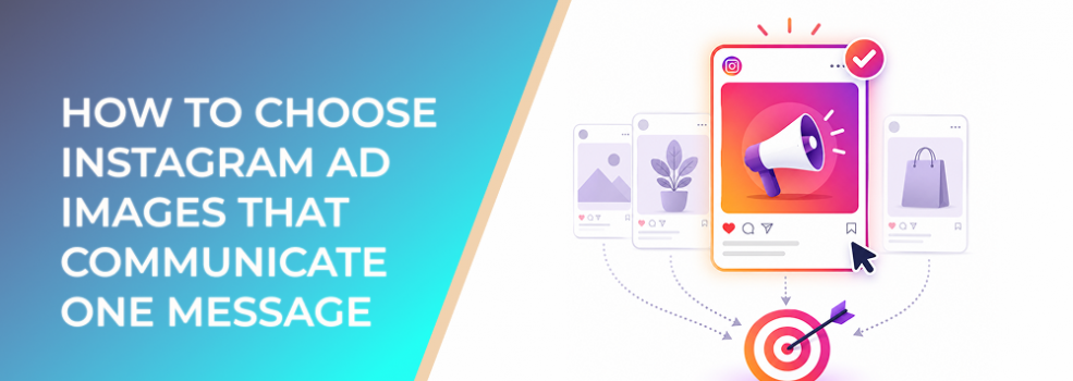
The solution is to choose the image based on the one message the user must understand first.
Start with this question:
What is the image’s primary communication job?
Then choose the image type that fits that job.
1. Use a Problem Image When Users Need Recognition
A problem image shows the pain, frustration, or inefficient situation the audience wants to escape.
Use this when the audience may not yet be actively shopping.
Examples:
- A messy reporting spreadsheet for a SaaS analytics tool.
- A cluttered closet for a storage solution.
- A stressed homeowner for an emergency repair service.
- A pile of unqualified leads for a B2B lead-generation offer.
The message is: “This ad understands my problem.”
2. Use an Outcome Image When Users Need Desire
An outcome image shows the result the audience wants.
Use this when the desired state is easy to visualize.
Examples:
- Clear skin after using a skincare product.
- A clean dashboard for a reporting tool.
- A finished renovation for a home service.
- A calm workspace for a productivity product.
The message is: “I want that result.”
3. Use a Product Image When Users Need Clarity
A product image shows what is being sold.
Use this when users need to quickly identify the item, category, or offer.
Examples:
- A product bundle arranged clearly.
- A software interface with the main feature visible.
- A service vehicle or technician in context.
- A lead magnet cover with a specific title.
The message is: “I understand what this is.”
4. Use a Mechanism Image When Users Need Explanation
A mechanism image shows how the solution works.
Use this for tools, services, software, courses, comparisons, and unfamiliar offers.
Examples:
- A three-step process graphic.
- A screenshot with annotations.
- A before-and-after workflow.
- A carousel explaining the method.
The message is: “I understand how this helps.”
5. Use a Proof Image When Users Need Trust
A proof image shows credibility.
Use this when users understand the offer but need reassurance.
Examples:
- Customer review cards.
- Real product usage.
- Before-and-after evidence where appropriate.
- Expert cues.
- Customer examples.
- Supported performance claims.
The message is: “This seems believable.”
6. Use an Offer Image When Users Need a Reason to Act
An offer image makes the next step visible.
Use this for retargeting, warm audiences, product launches, limited offers, consultations, trials, bundles, webinars, and lead magnets.
Examples:
- “Free audit for ecommerce brands.”
- “Book same-week repair.”
- “Download the 2026 checklist.”
- “Starter bundle available today.”
- “Join the workshop.”
The message is: “I know what to do next.”
How LeadEnforce Helps
LeadEnforce helps when image selection depends on audience specificity.
A problem image, outcome image, proof image, or offer image may perform differently depending on who sees it. LeadEnforce can help advertisers create more relevant test audiences from Instagram profile followers, Facebook group members, LinkedIn-derived job-title and company data, and custom social-profile links.
That supports a cleaner testing workflow.
For example:
- Test a problem image against cold audiences from relevant Instagram profiles.
- Test a proof image against users connected to competitor or category communities.
- Test a mechanism image against B2B segments built from job titles or industries.
- Test an offer image against a more specific niche audience instead of broad interests.
LeadEnforce does not decide which image is best. It helps reduce audience guesswork so marketers can better understand whether the image is communicating the right message to the right people.
Risks and Considerations
Choosing images by message is useful, but several risks remain.
- The message may be clear but unappealing.
A clear image still needs a strong offer. - The audience may not match the image.
Cold users may need problem framing, while warm users may prefer proof or urgency. - The image may overpromise.
Avoid unsupported outcomes, exaggerated before-and-after claims, or misleading proof. - The design may become cluttered.
One message should dominate. Do not force five image roles into one asset. - The landing page may create a mismatch.
If the ad image communicates one promise and the landing page emphasizes another, conversion can suffer. - Audience size may be too small.
If using niche audiences, make sure the segment is large enough for meaningful delivery and learning.
Prerequisites and Dependencies
To choose better Instagram ad images, you need:
- A clear campaign objective
- A defined audience or ICP
- One primary message
- A specific offer
- A known awareness stage
- Image assets that can support different message roles
- A landing page or profile aligned with the same message
- Reliable tracking and lead-quality feedback
- Enough budget to compare image roles fairly
- If using LeadEnforce, relevant source audiences that match the creative hypothesis
Practical Recommendations
Use this image-selection checklist:
- Write the one message the image must communicate.
- Identify the audience’s awareness level.
- Choose one image role: problem, outcome, product, mechanism, proof, or offer.
- Remove images that are attractive but strategically vague.
- Avoid combining too many roles in one image.
- Match the headline to the image role.
- Match the CTA to the user’s likely stage.
- Test image roles cleanly instead of changing every element at once.
- Review results beyond CTR by looking at conversion rate, CPA, CAC, ROAS, and lead quality.
- Keep winning message roles and refresh the execution.
If LeadEnforce is part of the workflow, use it to create more specific audience tests after the image role is defined. The goal is not just to find a better-looking image. The goal is to learn which visual message works for which audience.
Final Takeaway
Instagram ad images should not be chosen only because they look good.
They should be chosen because they communicate one clear message quickly. When the image has a defined role, users understand the offer faster, clicks become more intentional, and performance data becomes easier to interpret.
To test one-message Instagram ad visuals against more relevant source-based audiences, join the free 7-day LeadEnforce trial period.
Related LeadEnforce Articles
- Choose Instagram Ads Visuals That Communicate the Offer Faster — Directly supports image selection based on offer clarity.
- Improve Instagram Ad Response With a Clear Offer in the First Visual — Helps make the first image or frame more commercially clear.
- Fix Instagram Ads That Hide the Offer With Clear Visual Messaging — Useful for ads where polished visuals bury the actual offer.
- Why Instagram Ad Text Gets Ignored Without a Clear Visual Anchor — Explains why text needs to connect visually to the main image.
- Why Instagram Ad Copy Gets Ignored When It Competes With the Main Image — Helps align image and copy around one message.