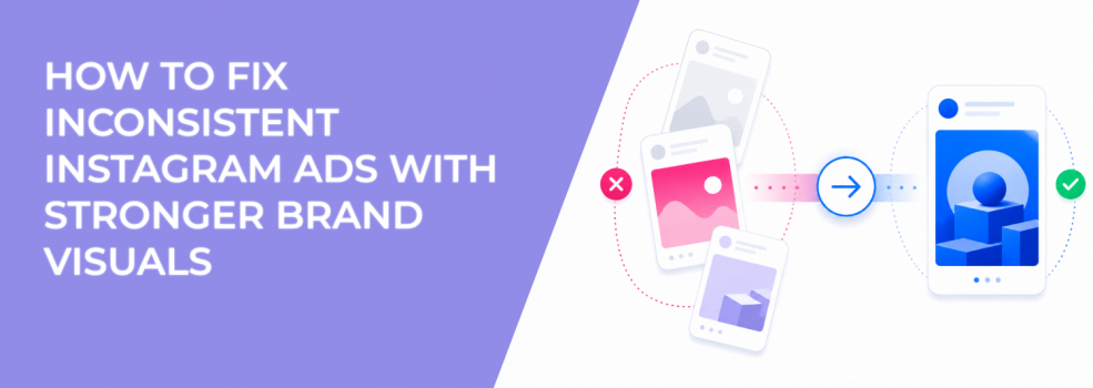
Instagram ads can look “fresh” in preview and still feel disconnected in the feed. That usually happens when each creative is made as a standalone asset, not as part of one recognizable brand system.
The issue is not just design taste. When colors, fonts, product framing, and editing style change too often, users do not build memory. Every impression feels like a new introduction.
That weakens the cumulative effect of paid social. A person may see three ads from the same company and still not realize they came from the same brand.
Why visual inconsistency raises CPC and weakens conversion intent
Instagram is a fast visual placement. People often decide whether to stop, tap, or swipe before they process the offer.
If the creative does not look familiar, the ad has to work harder. The hook, image, and offer must create attention from zero. That can raise CPC because fewer users stop long enough to engage.
The bigger problem appears after the click. Users may land on a product page or lead form and feel a mismatch between the ad and the brand experience. That hesitation can lower conversion rate and push CPA up, even when CTR looks acceptable.
For e-commerce, this often shows up as product page visits without add-to-cart growth. For B2B lead generation, it can show up as form fills from people who remember the offer but not the company behind it.
The campaign workflow problem behind mismatched ad creative
Most inconsistent Instagram ads come from a messy production workflow. A designer creates static images. A freelancer edits Reels. The media buyer pulls UGC clips. Someone on the team adds last-minute Story assets before launch.
Each asset may look fine alone. The problem appears when they run together inside the same funnel.
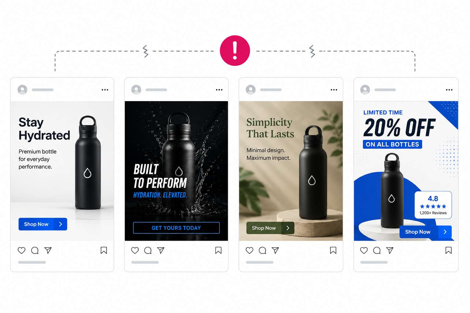
A user might see a polished Feed ad, then a rough UGC Story, then a carousel with different fonts, then a retargeting ad that looks like another company. That breaks recognition and makes creative reporting harder to interpret.
If one ad wins, you may not know whether the winning variable was the offer, format, hook, or visual identity. That is why teams need to balance creative variety with brand consistency before scaling creative output.
Build a repeatable visual system before testing more Instagram ads
A stronger visual system does not need to slow down testing. It gives the team fixed rules so every new ad does not restart the brand from scratch.
Start with the assets that appear most often in your Instagram campaigns. For most advertisers, this means product shots, founder videos, UGC edits, offer graphics, testimonials, and retargeting creatives.
Then define the visual elements that should stay stable:
- Core colors: Use the same main colors and accent colors across ad formats so users can recognize the brand quickly.
- Typography style: Keep text overlays, captions, and headline treatments consistent enough to feel connected.
- Product framing: Decide how the product or service is usually shown, especially in the first frame.
- Proof placement: Put testimonials, ratings, or credibility cues in predictable places so users can process them faster.
This gives creatives a shared structure. Hooks can change. Formats can change. The brand still feels familiar.
Adapt brand visuals for Feed, Stories, Reels, and Explore
Inconsistent visuals often come from lazy placement adaptation. A Feed image gets cropped into Stories. A Story layout gets forced into Reels. A product image gets resized until the main visual cue disappears.
Each Instagram placement needs a different layout, but not a different brand. Feed can carry more detail. Stories need faster hierarchy. Reels need stronger first-frame recognition. Explore needs a clear focal point because users are already scanning dense visual content.
The practical fix is to create placement-specific templates inside the same visual system. That keeps the brand recognizable while respecting how each placement is consumed.
A guide on building a consistent ad style across multiple campaigns fits well here. The goal is not to make every asset identical. The goal is to make every asset feel like it belongs to the same advertiser.
Diagnose visual inconsistency before blaming the audience
When Instagram ads underperform, advertisers often blame targeting first. That can be expensive if the real issue is creative recognition.
Check creative-level performance before rebuilding the audience. Compare CTR, outbound CTR, video hold rate, saves, profile visits, and comments across visual styles. If ads with the same offer perform differently, the visual system may be affecting response quality.
Also review retargeting performance. If warm audiences do not respond to new ads, check whether those ads look connected to the original prospecting creative. Retargeting should build on memory, not force users to identify the brand again.
This is where studying best-performing ad creatives helps. Strong ads usually have clear visual hierarchy, fast recognition, and a message that matches the audience stage.
Keep testing new creatives without breaking brand recognition
Consistency does not mean repeating the same ad until it burns out. It means keeping key brand markers stable while testing one meaningful variable at a time.
An e-commerce brand can test different opening hooks while keeping the same product framing. A SaaS advertiser can test different pain points while keeping the same interface treatment. A service business can test different proof angles while keeping the same visual tone and local cues.
This makes performance data cleaner. If one version wins, you know the tested variable likely moved results. If the entire visual identity changes at once, the test becomes noisy.
Final takeaway: consistent visuals make Instagram ad testing cleaner
Inconsistent Instagram ads make campaigns harder to scale because users do not build memory. CPC can rise, CPA can become unstable, and creative test results become harder to trust.
Fix the visual system before launching more random variations. Keep brand cues stable, adapt layouts by placement, and test one major creative variable at a time. That gives Meta cleaner engagement signals and gives users a brand they can recognize after repeated impressions.