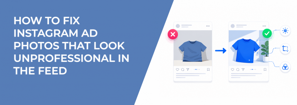
Instagram users judge an ad before they read the caption. If the photo looks rushed, dark, awkwardly cropped, or visually messy, the offer starts from a weak position.
That does not mean every Instagram ad needs studio production. Some of the best ads look simple and native. The problem starts when the image feels careless instead of intentional.
For performance marketers, this matters because the photo affects the first layer of ad response. A weak image can lower CTR, reduce engagement quality, and make Meta work harder to find users willing to interact. Over time, that can raise CPC and make CPA harder to control.
Why unprofessional photos weaken Instagram ad performance
A photo looks unprofessional when the user has to work too hard to understand it. Poor framing hides the product. Bad backgrounds distract from the offer. Weak focus makes the ad feel less credible.
In Ads Manager, this often shows up as low outbound CTR, weak engagement, and cheap but low-quality clicks. The campaign may still spend, but the traffic is less likely to convert because the ad did not build enough trust before the click.
This hurts small brands and B2B advertisers especially hard. If the audience does not already know the company, the image becomes a fast trust signal. A sloppy visual can make a useful product look less reliable than it is.
What makes an Instagram ad photo look amateur
Most weak ad photos fail because the image has no clear visual control. The camera may be too far from the subject, the background may compete with the product, or the image may look like it was pulled from an old folder without checking placement fit.
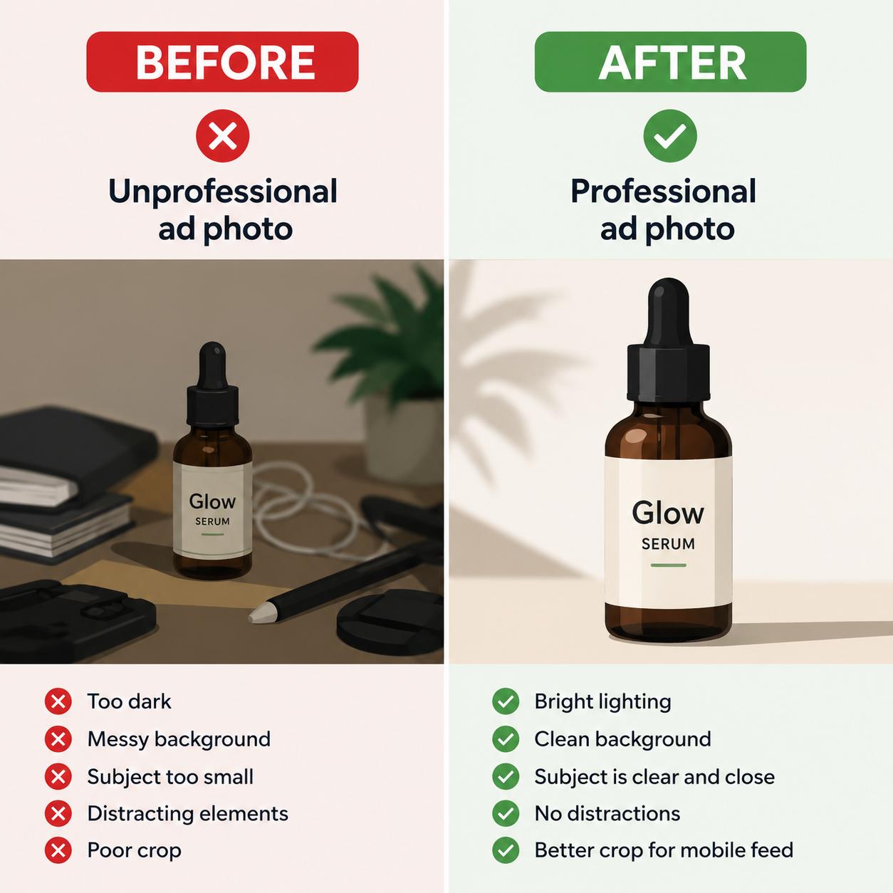
You can usually spot the issue before testing. Review the ad at mobile size, not desktop preview size. If the subject is unclear in the first second, the photo is not ready for feed delivery.
Common problems include:
- The subject is too small. The product, person, or offer cue takes up too little space, so users cannot identify the ad quickly.
- The crop cuts off important details. A product label, face, result, or CTA area gets lost when the image appears in feed or Stories.
- The background is louder than the offer. Busy desks, random objects, or high-contrast patterns pull attention away from the message.
- The image feels accidental. Tilted angles, poor spacing, and harsh shadows make the brand look less careful.
These are not just design problems. They change how users process the ad, which changes the quality of traffic the campaign attracts.
How to clean up weak Instagram ad photos
Start with the photo’s job. An Instagram ad image should make one thing obvious: what the user is looking at and why it matters.
For a SaaS lead magnet, the image may need to show the outcome or interface clearly. For an ecommerce product, it may need to show texture, size, or use case. For a local service, the image may need to show the environment and credibility of the provider.
A cleaner ad photo usually comes from better control, not more production. Use a simple background, crop closer to the subject, remove unrelated objects, and keep the most important visual element away from the edges. This protects the image when Meta adjusts placements.
If your team does not have a designer, use simple ad formats that still convert instead of forcing a complex layout. A clean product photo with one strong caption area often beats a crowded design that tries to say too much.
Match the photo style to the audience and offer
A polished image is not always the right image. A local fitness studio, creator brand, or service provider may get better results from native-looking photos that feel real. A B2B software company may need cleaner structure because decision-makers judge credibility faster.
The key is intent. A casual image can work when it feels natural. It fails when it looks careless.
If you are targeting cold audiences, the photo must do more trust-building. Users have no prior context, so the image needs to show quality, relevance, and clarity fast. This is where common Instagram ad design mistakes can quietly damage performance.
LeadEnforce can help when the issue is not only creative quality but audience fit. If you are running strong visuals to broad audiences, you may still attract weak clicks. Building audiences from Instagram engagers and followers can improve signal quality before the ad enters the auction.
Test the cleaned-up photo against the original
Do not rebuild the whole campaign just because the photo looks weak. Create a controlled test where the offer, copy, CTA, and audience stay the same. Change only the image quality and framing.
Watch more than CTR. A better photo should improve the quality of attention, not just clicks. Compare outbound CTR, CPC, landing page views, form starts, purchases, and CPA.
If CTR rises but conversion rate drops, the new image may be more clickable but less qualified. If CTR rises and CPA falls, the cleaner photo is probably helping users understand the offer earlier.
For more image-specific testing ideas, review how to build scroll-stopping Instagram image ads without adding visual noise.
Final takeaway
Unprofessional Instagram ad photos hurt performance because they weaken trust before the user reads anything. The fix is not always better equipment or expensive production. It is better control over framing, background, crop, and visual intent.
A strong Instagram ad photo should make the offer easier to understand, not just nicer to look at. When the image feels clear and deliberate, Meta gets better engagement signals, users click with stronger intent, and your budget has a better chance of turning into qualified traffic.