Instagram video ads often fail because they are built like small commercials, not mobile-native placements.
The video may have a clean intro, polished transitions, and a strong offer. But if it takes too long to show the product, explain the value, or create visual movement, users swipe before the ad starts working.
Vertical placements change the rules. Reels and Stories are not passive viewing environments. Users hold the phone vertically, move quickly, and judge the ad within the first second.
The problem: Instagram video ads are often structured for horizontal viewing
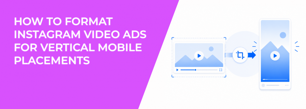
A video can use the correct 9:16 size and still feel wrong on Instagram.
The common mistake is taking a landscape video structure and rebuilding it vertically without changing the sequence. The brand intro stays first. The product appears late. The main offer waits until the middle. The CTA arrives after most users have already skipped.
That structure may work in a longer YouTube-style video. It rarely works in Instagram Reels or Stories.
In vertical placements, the viewer needs immediate context. They should understand what the ad is about before they decide whether to keep watching. If the first second is only a logo, lifestyle shot, or slow setup, the ad pays for impressions without creating enough intent.
Why vertical mobile formatting affects engagement and CPA
Instagram video performance depends on how fast the creative earns attention and how clearly it moves the viewer toward action.
When a video is not structured for vertical mobile viewing, several performance signals can weaken:
- Lower hold rate: Users leave before the product or offer appears.
- Weak CTR: The viewer may watch briefly but never receive a clear reason to click.
- Higher CPC: The campaign needs more impressions to produce qualified clicks.
- Higher CPA: The landing page receives colder traffic because the ad did not pre-sell the action.
This is especially common in service, SaaS, and lead generation campaigns. A slow intro can hide the actual value until too late.
For example, a software company may open with a five-second animated logo before showing the dashboard. On Instagram, that is usually wasted time. A better version opens with the workflow problem, shows the dashboard immediately, and uses the rest of the video to explain one practical benefit.
The solution: build the video around vertical mobile behavior
A strong vertical Instagram ad is not just a resized video. It is a different edit.
The first frame should carry meaning. The first second should show the product, problem, result, or situation. The next few seconds should clarify why the viewer should care.
A practical vertical structure looks like this:
- Open with the problem or result. Show the viewer what the ad is about before adding brand context.
- Make the product visible early. Do not wait until the middle of the video to reveal what is being sold.
- Use motion to guide attention. Movement should point to the product, benefit, or proof, not distract from it.
- Place the CTA before the end. Many users will not watch the full video, so the action step should appear early enough to register.
This structure works because it matches how users consume Reels and Stories. They do not wait for the ad to earn relevance. They decide almost instantly.
How to format the first three seconds of a vertical Instagram ad
The first three seconds should answer one question: “Why should this person keep watching?”
That does not mean every ad needs loud editing or aggressive hooks. It means the video should remove delay.
For e-commerce, show the product in use before showing packaging or lifestyle filler. For SaaS, show the interface solving one specific task. For local services, show the result or the service moment before showing the business name.
A weak first three seconds might show:
- a logo animation with no product context;
- a wide lifestyle shot where the offer is unclear;
- a slow pan that hides the main subject;
- a talking head introduction before the problem is named.
A stronger version gives the user context immediately. A gym ad can open with the actual class format. A skincare ad can open with the product texture and use case. A B2B ad can open with the exact workflow pain the product removes.
For more placement-specific behavior, it helps to understand how Reels viewers behave differently. Reels viewers are already in a rapid discovery mode, so slow setup usually costs attention.
Why sound-off clarity matters in vertical placements
Many Instagram videos are watched with sound, but the ad should not depend on audio to make sense.
If the message only works with voiceover, the visual sequence is too fragile. Users may watch without sound, miss the key claim, and skip before the ad builds intent.
A sound-off version should still communicate:
| Video element | What it should communicate without sound |
|---|---|
| Opening frame | The product, problem, or situation. |
| On-screen text | The main benefit in short, readable phrasing. |
| Visual sequence | How the product or service works. |
| CTA frame | What the user should do next. |
This does not mean adding captions everywhere. Too much text can clutter a vertical frame. Use short lines, large type, and clear contrast.
The same logic applies to silent video ads. If the ad can explain itself visually, it has a better chance to hold attention across different viewing conditions.
How vertical formatting differs by campaign type
The best vertical edit depends on what the campaign needs users to do.
An e-commerce product ad should show the product quickly and make the use case obvious. A lead generation ad should qualify the viewer before the click. A SaaS ad should avoid tiny interface details and focus on one visible workflow.
A few examples:
| Campaign type | Weak vertical video structure | Better vertical structure |
| E-commerce | Starts with brand mood shots | Opens with product use and benefit. |
| SaaS | Shows a full dashboard with tiny details | Zooms into one task or feature. |
| Local service | Opens with business name | Opens with the service result. |
| B2B lead gen | Starts with abstract pain-point text | Shows a specific operational problem. |
This keeps the video focused. Vertical ads have limited time to earn intent, so each scene needs a job.
How to check whether your vertical video is working
Do not judge vertical video ads only by overall campaign results. Check whether the video is holding attention long enough to communicate the offer.
Useful diagnostics include:
- Three-second video views: If this is weak, the opening frame or hook is not doing enough.
- Hold rate by placement: If Reels drops faster than Feed, the edit may not fit Reels behavior.
- CTR after video engagement: If people watch but do not click, the offer or CTA may arrive too late.
- CPA by placement: If Reels gets views but expensive conversions, the video may be entertaining without qualifying buyers.
This avoids the wrong conclusion. A high view count does not always mean the video is commercially strong. A vertical ad can attract attention and still fail to create buying intent.
For e-commerce teams, Instagram Reels ads for e-commerce need this distinction. Views matter, but product clarity and action intent matter more.
Final takeaway
Instagram vertical video ads fail when they are formatted like resized horizontal videos.
The core problem is structural: the video takes too long to show the product, explain the value, or create a reason to act.
The solution is to build for vertical mobile behavior from the first frame. Open with context, show the product early, make the message work without sound, and place the CTA before users leave.
A vertical ad should not simply fit the screen. It should fit the way people move through Instagram.