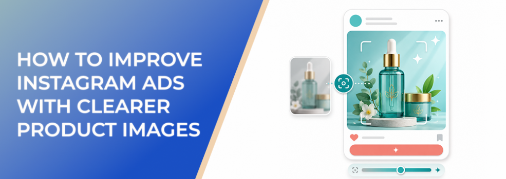
Some Instagram ads get impressions but fail because users never clearly understand the product.
The ad may look attractive. The layout may match the brand. The campaign may even generate engagement. But if the product is too small, too hidden, too abstract, or too hard to inspect, the ad loses commercial intent.
For ecommerce brands, SaaS companies, local businesses, agencies, affiliate marketers, and B2B lead-generation teams, product-image clarity is not just a design concern. It affects CTR, CPC, CPA, ROAS, conversion rate, lead quality, and the quality of campaign learning.
The Problem
The problem is that many Instagram product images are selected for appearance rather than clarity.
A product image may look polished but still fail to answer the user’s basic questions:
- What is the product?
- What does it do?
- Who is it for?
- What makes it useful?
- What result does it create?
- Why should I care now?
If the visual does not answer at least one of those questions quickly, the ad depends too heavily on copy. That is risky in Instagram placements where users process the image first and may never read the caption.
Clear product images do not need to show everything. They need to show the right thing.
Why This Problem Hurts Performance
Unclear product images create a gap between reach and intent.
Meta may deliver the ad. Users may see it. Some may even pause. But if they do not understand the product fast enough, the campaign struggles to turn impressions into qualified action.
This can create several problems:
- CTR drops because users do not see a clear reason to click.
- CPC rises because the ad needs more impressions to earn clicks.
- Conversion rate falls because clicks come from vague curiosity.
- CPA and CAC increase because the ad attracts less qualified traffic.
- ROAS weakens because product interest is not formed before the click.
- Retargeting audiences become less useful because engagement quality is lower.
- Creative tests become noisy because the advertiser cannot tell whether the product, message, or image presentation caused the issue.
For product-led ads, unclear visuals are especially damaging. The image is often the first product demonstration. If it fails, the offer starts behind.
Common Scenarios Where This Happens
Ecommerce Product Launches
A brand launches a new product with lifestyle photos. The images are beautiful, but the product is small in the frame, hidden by props, or unclear on mobile.
Skincare, Beauty, and Wellness Ads
A product is surrounded by decorative objects, textures, and background elements. The ad feels premium, but users cannot quickly identify the bottle, jar, package, or result.
B2B SaaS Ads
A software company uses a screenshot of the platform. The screenshot is real, but it is too zoomed out, too dense, or missing visual guidance. The user sees software but not value.
Local Business Offers
A local service provider uses a generic photo of a happy customer. The image feels positive, but it does not show the service, result, location, or reason to book.
Affiliate Product Promotions
An affiliate ad uses a supplier image that does not show scale, texture, use case, or differentiation. Users may recognize the category but not the reason to choose the product.
Why the Problem Happens
Unclear product images usually happen because marketers confuse product presence with product communication.
Showing the product is not enough. The image must help the user understand why the product matters.
Common root causes include:
- The product is too small on mobile.
- The image prioritizes lifestyle mood over product recognition.
- The crop removes useful context.
- The background competes with the product.
- The product detail that matters most is not visible.
- The image does not show scale.
- The product is shown without use case.
- Too much text or too many badges distract from the product.
- The same image is used across placements without checking readability.
- The visual does not match the campaign objective.
A product image should be chosen based on the buying question it helps answer.
The Solution
The solution is to build product images around clarity, not decoration.
A clear Instagram product image should make the product easy to recognize, evaluate, and connect to a benefit.
1. Make the Product the Visual Anchor
The product should be the main thing users notice.
That does not mean the product must always be centered or isolated on a plain background. But it must be visually dominant enough to understand quickly.
Improve product visibility by:
- Cropping closer.
- Removing unnecessary props.
- Using contrast between product and background.
- Making the product larger in the frame.
- Keeping key details away from edges.
- Avoiding backgrounds with similar colors or textures.
- Reducing competing graphic elements.
The user should not need to search for the product.
2. Show the Product Detail That Drives Interest
Different products need different visual details.
For example:
- A clothing ad may need to show fabric, fit, or styling.
- A skincare ad may need to show texture, packaging, or before-and-after context.
- A food ad may need to show freshness, portion, or use occasion.
- A SaaS ad may need to show the workflow, result, or interface moment.
- A B2B report ad may need to show the insight, template, or outcome.
- A local service ad may need to show the finished result or credible environment.
Do not show a generic product view if the buyer needs a specific reason to care.
3. Use Context Without Creating Clutter
Context helps users understand use case. Clutter makes them work harder.
Use context when it answers a buying question:
- “How big is it?”
- “Where would I use it?”
- “What does it look like in real life?”
- “What result does it create?”
- “Who is it for?”
- “What problem does it solve?”
Remove context when it only adds style.
A clean product image with one meaningful context cue usually beats a crowded lifestyle scene with no visual hierarchy.
4. Make Scale Obvious
Product scale is often overlooked.
If users cannot tell whether a product is large, small, portable, premium, lightweight, compact, or substantial, they may hesitate.
Show scale with:
- Hands.
- Packaging.
- Everyday objects.
- A person using the product.
- A room setting.
- A screen shown inside a device.
- A before-and-after frame where appropriate.
Scale reduces uncertainty, which can improve click intent.
5. Keep Text From Rescuing the Image
Many advertisers try to fix unclear product images by adding more overlay text.
That usually makes the ad harder to process.
Use text to support the image, not rescue it. The product visual should carry the first layer of meaning. Text can then add:
- The key benefit.
- The audience.
- The offer.
- The proof point.
- The CTA.
- The differentiator.
If the image only works after reading the overlay, the product image is probably not clear enough.
6. Preview the Image in the Actual Placement
A product image that works in a square feed ad may fail in Stories or Reels. A wide product image may become too small in a vertical placement. A screenshot may become unreadable after resizing.
Before launching, check:
- Feed crop.
- Story crop.
- Reel safe zones.
- Explore placement.
- Mobile readability.
- Product size.
- Text size.
- Visual focus.
The product should remain understandable wherever the ad appears.
Risks and Considerations
Clearer product images can improve performance, but there are risks.
- A product can be visible but still not desirable.
- A clean product image can feel too plain if it lacks context.
- Lifestyle images can create desire but hide the product.
- Heavy editing can make the product look unrealistic.
- UGC-style photos can build authenticity but still need clear framing.
- A better product image can increase CTR but lower conversion rate if it attracts the wrong curiosity.
- Product clarity does not fix poor pricing, weak offer, slow landing pages, or low audience fit.
Clarity should support purchase intent, not just attention.
Prerequisites and Dependencies
To improve Instagram ads with clearer product images, you need:
- A clear ICP or buyer segment.
- A defined campaign objective.
- A specific product or offer focus.
- A known product benefit.
- Source images with enough resolution.
- Placement-specific crops.
- A mobile-first preview process.
- A landing page that shows the same product clearly.
- Conversion tracking and post-click performance data.
- A testing plan that compares product-image variations fairly.
You also need a decision rule. For example, a product image is not better just because CTR improves. It is better when it improves qualified traffic, conversion rate, CPA, or revenue quality.
Practical Recommendations
Use this product-image review process before your next Instagram ad launch:
- Identify the product’s most important buying question.
- Choose the image that answers that question visually.
- Make the product large enough to recognize on mobile.
- Remove props that compete with the product.
- Show scale where needed.
- Show the use case when it improves understanding.
- Keep text short and supportive.
- Check the image across placements.
- Test product-only, product-in-use, and outcome-led images separately.
- Measure conversion quality, not just click volume.
A clearer product image should help the user understand the offer before they read the caption.
Final Takeaway
Instagram ads improve when product images make the product easier to notice, understand, and trust.
The goal is not simply to make the image look better. The goal is to reduce uncertainty. Make the product visible, show the detail that matters, use context carefully, protect mobile readability, and let the image carry one clear message. When users understand the product faster, they are more likely to click with real intent.
Related LeadEnforce Articles
- Why People Scroll Past Your Instagram Ads Without Noticing the Product — Directly addresses product visibility problems in Instagram ads.
- Why Your Product Images May Be Hurting CTR (and How to Fix Them) — Useful for diagnosing product-image issues that reduce CTR.
- How to Choose Instagram Ad Images That Communicate One Message — Helps align image selection with one clear product message.
- Why Blurry or Low-Quality Instagram Ad Images Increase CPC and Lower Click Intent — Relevant for improving product-image sharpness and confidence.
- Fix Confusing Instagram Ads by Giving Every Visual a Clear Job — Useful for improving visual hierarchy around the product.