A lot of Facebook video ads are not bad. They are just forgettable.
The product is clear. The editing looks professional. The campaign launches correctly. But the ad still disappears in the feed because nothing interrupts the user’s scrolling pattern.
Most users move through Facebook and Instagram quickly. They are not analyzing creative choices. Their brain filters content automatically, and anything familiar gets skipped before the message registers.
For conversion campaigns, that creates a real performance issue. The ad gets delivered, but attention does not hold long enough to support stronger clicks, leads, or sales.
Problem: The Video Looks Too Similar to Everything Else in the Feed
Many Facebook video ads use the same visual habits:
- Clean product shots that look polished but predictable.
- Smooth transitions that feel like standard brand content.
- Founder talking-head clips with no visual contrast.
- Branded captions that are too small to carry the message.
- Lifestyle footage that looks nice but does not create tension.
None of these choices are automatically wrong. The issue is repetition.
Users see the same creative patterns across SaaS, e-commerce, coaching, local services, and B2B lead gen. After a while, the feed starts to feel visually interchangeable.
The result is passive ignoring. Users do not reject the ad. They barely notice it.
Most advertisers first see the damage in campaign behavior. The ad still gets impressions, but fewer people stay engaged long enough to understand the offer. Landing page traffic becomes weaker. Conversion rates soften. Costs climb even though the account structure looks fine.
Why Polished Creative Can Make the Problem Worse
Many advertisers try to fix weak attention by making the video look more polished. That can backfire.
Highly polished creative often looks more like traditional advertising. On Facebook and Instagram, that can make it easier to ignore because users recognize the format too quickly.
A simple customer-style clip can hold attention longer than a studio-produced product sequence because it feels closer to normal feed content.
For example, a skincare brand may spend heavily on cinematic visuals. But a creator-style video showing a real texture issue in bad bathroom lighting may outperform it because the situation feels more believable.
The lesson is practical: better production does not help if the first frame still feels familiar.
Solution: Add Visual Contrast Before the Viewer Scrolls Past
The creative needs one clear interruption early.
Not random effects. Not noisy editing. Something specific that makes the viewer pause long enough to process the message.
Useful ways to create that interruption include:
- Use an unusual crop when the product detail matters. A tight shot of texture, packaging, dashboard data, or product use can stop the eye faster than a wide lifestyle frame.
- Show motion before the explanation starts. Opening a package, refreshing a report, revealing a mistake, or demonstrating a problem gives users something active to follow.
- Make the text carry the situation. Large on-screen text like “Why are your leads ghosting sales?” works harder than a small branded caption because it explains the context without sound.
- Show the problem instead of describing it. A messy dashboard, empty booking calendar, abandoned cart, or unanswered call screen communicates friction faster than a generic intro.
This is where designing scroll-stopping Facebook ads becomes useful. The goal is not to make the ad louder. It is to make the first moment harder to ignore.
Why Visual Hierarchy Matters Once You Have Attention
Getting attention is only the first step.
The viewer still needs to understand where to look.
Some weak video ads lose people because too many elements compete at once. There are moving captions, background motion, logos, product shots, transitions, and buttons all fighting for the same second of attention.
A cleaner frame usually performs better because the viewer can process it faster.
A strong first frame should make three things obvious:
- What the ad is about.
- What the viewer should look at first.
- What problem or situation is being shown.
That is why understanding what people notice first in Facebook ads matters. Users decide whether to keep watching before they evaluate the full offer.
How This Shows Up in Campaign Data
Feed blending is easy to miss because the campaign still looks active.
You are not dealing with a delivery issue. You are dealing with an attention issue.
Common signs include:
- Impressions continue growing, but outbound CTR stays weak.
- Video views look acceptable, but landing page quality is poor.
- CPC rises slowly while targeting and budgets stay unchanged.
- Retargeting pools grow, but those users do not convert well later.
These patterns usually mean the creative is reaching people but not creating enough attention quality.
This is why helping ads stand out in busy feeds matters in competitive campaigns.
Final Takeaway
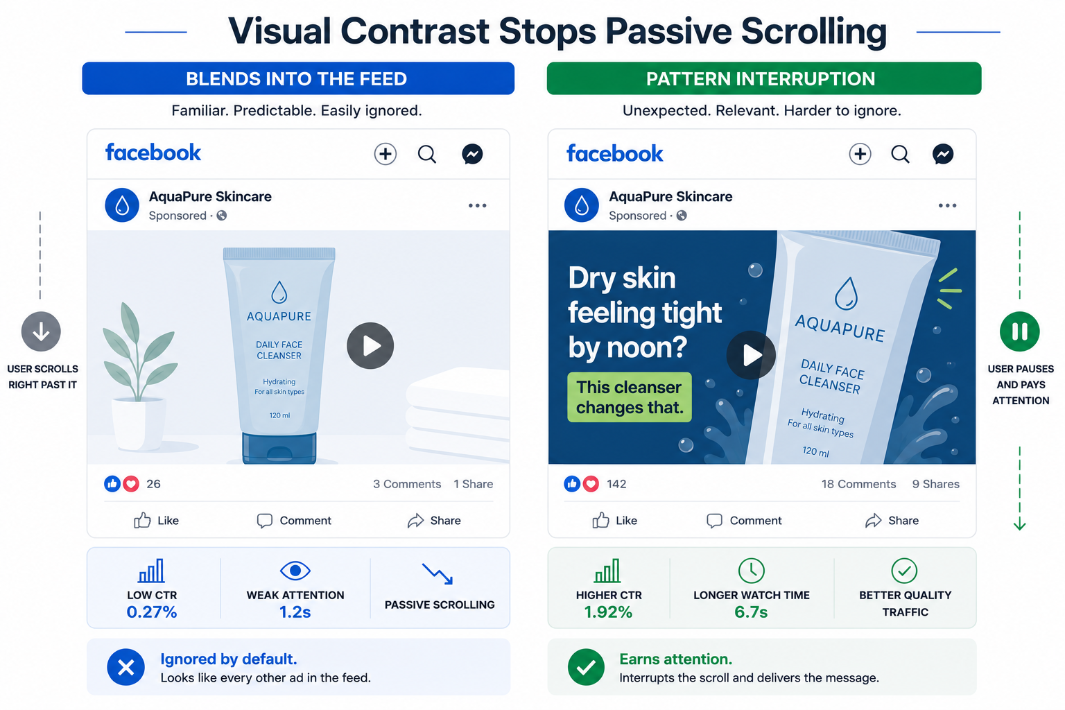
Weak Facebook video ads blend into the feed when the creative feels visually interchangeable with everything around it.
The fix is not more polish. It is sharper visual contrast in the first seconds.
Use one clear interruption, make the focal point obvious, and show the problem faster than the user can scroll past it. That gives the ad a better chance to improve CTR, conversion quality, CPA, and ROAS.