A page that loads successfully but loses users within the first few seconds is not a traffic problem. It’s a first-impression failure.
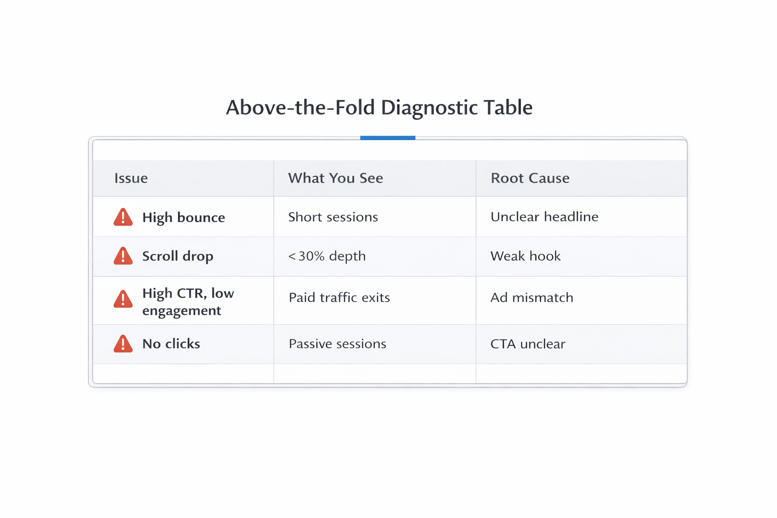
You’ll usually see this pattern in analytics as a sharp drop-off before any meaningful interaction: no scroll depth, no clicks, and session durations clustering under 5–10 seconds. The page technically “works,” but it doesn’t establish enough clarity or trust to keep the user engaged.
This is almost always an above-the-fold issue.
What the Drop-Off Actually Signals
When users exit immediately after load, they’re making a fast binary decision: this is either relevant and clear, or it’s not worth my time.
You can confirm this with behavioral data:
-
High bounce rate paired with low session duration usually means users don’t process the value proposition at all.
-
Scroll depth below 30% indicates the first screen fails to create enough curiosity or intent.
-
Normal page load speed suggests performance is not the issue — structure and messaging are.
Taken together, these signals point to a breakdown before engagement even begins. This is not about optimization later in the funnel — it’s about failing to earn attention at the entry point. The same dynamic is explored in Optimizing for Post-Click Experience: What Happens After.
Why Above-the-Fold Matters More Than You Think
Above-the-fold is not just a design section — it’s the decision point.
Users scan it to answer three critical questions:
-
Relevance: Am I in the right place?
-
Clarity: What is this offering?
-
Effort: How easy is it to engage?
If any of these questions remain unresolved, users don’t continue exploring. They exit. That’s why above-the-fold should not be treated as a branding space — it’s a functional layer that determines whether the rest of the page is ever seen.
The Most Common Above-the-Fold Failures
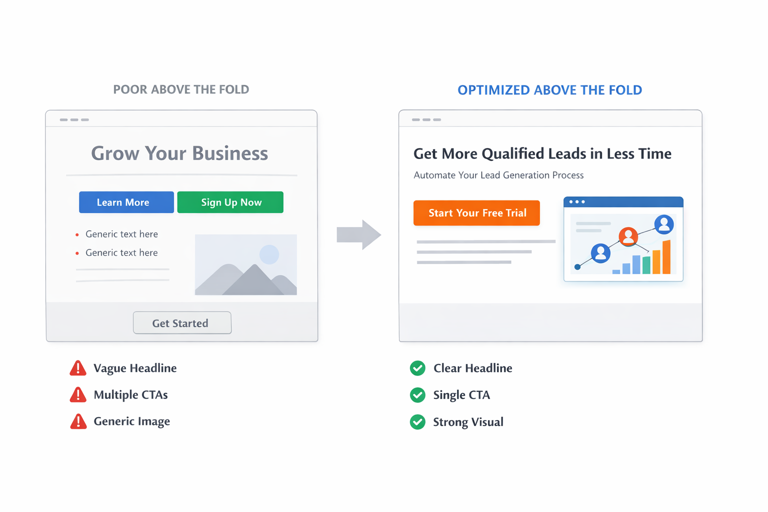
1. Vague or Generic Headlines
Headlines like “Grow Your Business Faster” create ambiguity instead of clarity.
In practice, this leads to:
-
Immediate exits without interaction.
-
No improvement even when traffic quality increases.
These outcomes happen because users are forced to interpret meaning instead of instantly recognizing relevance. A strong headline removes that friction and anchors attention in a specific, recognizable outcome.
2. Ad-to-Page Mismatch
If the promise in the ad doesn’t match the page, users disengage within seconds.
Typical signals include:
-
High CTR but low time on page.
-
Paid traffic underperforming compared to organic.
This mismatch creates a break in expectation. The user clicked with a specific intent, and the page failed to continue that narrative. This is one of the most common early funnel breaks, as explained in Funnel Drop-Off Fixes: How to Improve Each Stage with Facebook Ad Data.
3. Poor Visual Hierarchy
When everything looks important, nothing gets processed.
Common issues include:
-
Multiple competing CTAs with equal visual weight.
-
Dense layouts that lack clear separation between elements.
-
Key messages placed below secondary content.
This creates cognitive overload. Instead of guiding attention, the page forces users to decide what matters — and most won’t. This principle directly mirrors how attention works in ads, as detailed in Visual Hierarchy in Facebook Ads: What People Notice First (and Why It Matters).
4. Delayed Value Explanation
If users need to scroll to understand the offer, you’re already losing them.
This typically shows up as:
-
Small scroll attempts followed by immediate exits.
-
Low engagement even when users reach deeper sections.
Users don’t want to “figure it out.” They expect instant clarity. Any delay introduces friction, and friction at this stage almost always leads to abandonment.
How to Fix Above-the-Fold Drop-Off
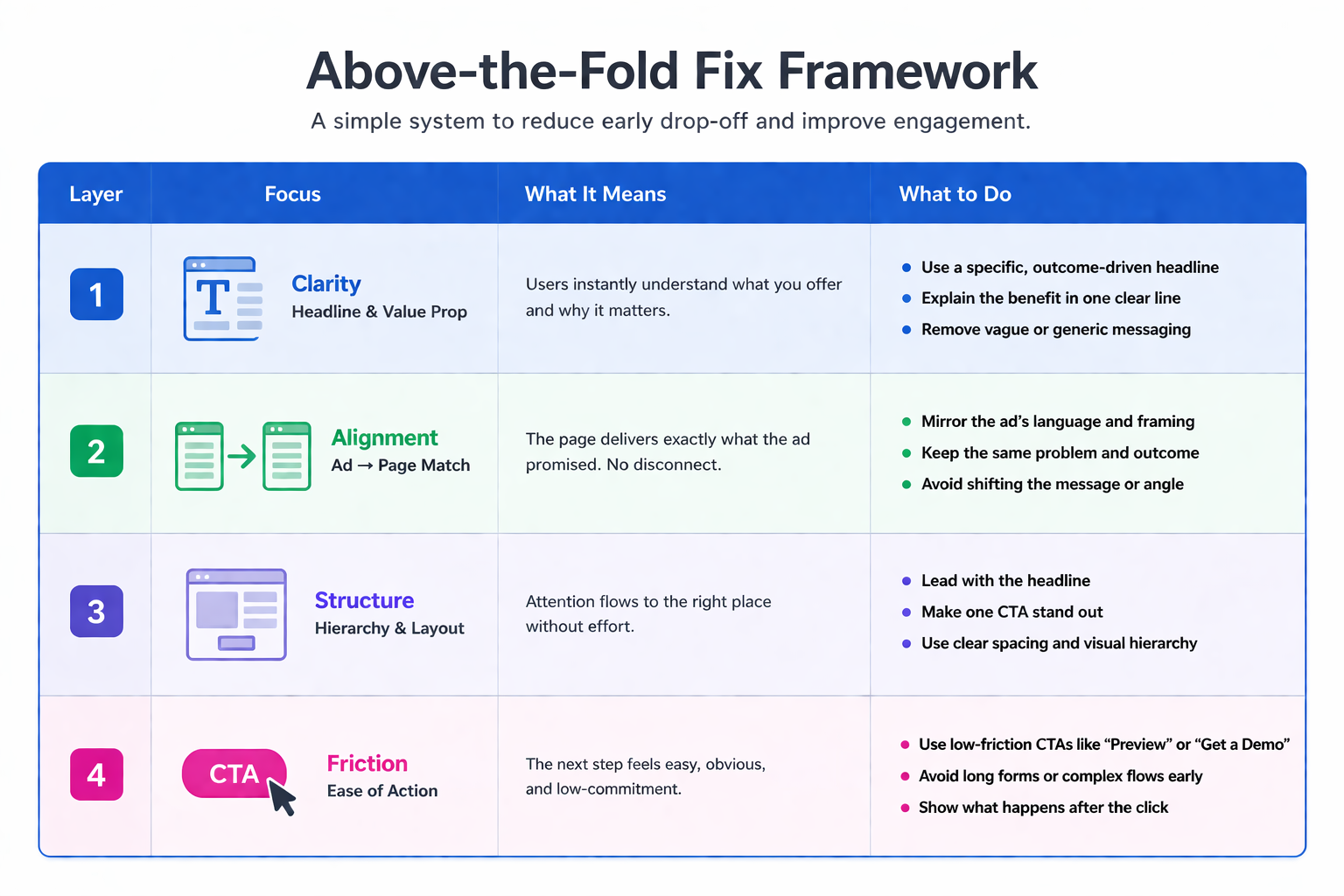
1. Clarify the Outcome Immediately
Your first screen should communicate value in one pass:
-
Headline: A specific outcome tied to a real problem.
-
Subheading: A clear explanation of how the product works.
-
CTA: One primary action, with no competing alternatives.
This structure works because it removes ambiguity and gives users a clear path forward. It aligns attention, understanding, and action into a single interaction.
2. Match the Entry Context Precisely
Align the page with how users arrived:
-
Use the same language as the ad or search query.
-
Keep the same problem framing throughout.
-
Avoid generic introductions that dilute intent.
Consistency reduces friction. When the message continues seamlessly, users don’t need to re-evaluate — they simply move forward.
3. Simplify the Visual Structure
Above-the-fold is not for completeness — it’s for clarity.
Focus on:
-
One dominant message.
-
One primary action.
-
Clear spacing between elements.
This creates a guided experience instead of a chaotic one. Users should immediately understand what matters and where to go next, without needing to scan or interpret the layout.
4. Reduce Perceived Effort
Users continue when the next step feels easy.
You can reinforce this by:
-
Using low-friction CTAs (e.g., preview, audit, demo).
-
Avoiding early high-commitment actions (e.g., long forms, complex flows).
-
Showing what happens after the click.
Reducing perceived effort increases the likelihood of interaction. This principle is a core part of conversion optimization, as discussed in 8 Ways to Improve the Conversion Rate.
A Simple Diagnostic You Can Run
Open your page like a first-time visitor and ask:
-
Can I understand what this product does in under 3 seconds?
-
Is the next step obvious without scanning the full screen?
-
Does this match what I expected after clicking?
If any answer is unclear, that’s your drop-off point. These questions force you to evaluate the page the same way users do — quickly and without context.
Track improvements using:
-
Scroll depth changes after updates.
-
Time on page for new users.
-
Click-through rate on the primary CTA.
These metrics reflect immediate behavioral shifts, making them useful for fast iteration and validation.
The Structural Insight
Above-the-fold is not just a section. It’s a filter.
Users don’t leave because they need more information. They leave because the initial framing doesn’t justify staying.
Fix that, and the rest of the page finally gets a chance to convert.
