Multi-step forms often reduce total submissions even when early engagement looks strong. You’ll see users moving through the first step — sometimes even the second — but final completion drops without a clear failure point.
That makes the issue easy to misread. It doesn’t show up as a broken field or a visible UX error. It shows up as distributed friction across the entire flow.
Drop-Off Is Distributed, Not Localized
When a single-page form underperforms, the issue is usually obvious. A specific field causes hesitation, or the form simply feels too long.
Multi-step flows behave differently. The friction is spread across transitions.
In step-level data, this typically looks like:
-
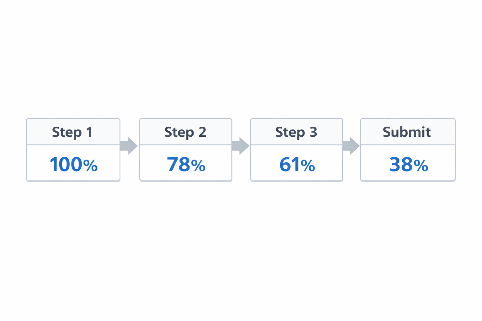
Step 1 → Step 2 drop is noticeable but not alarming.
For example, 100 users start, 78 continue. -
Step 2 → Step 3 shows another controlled decline.
78 becomes 61. -
Final submission rate ends much lower than expected.
100 initial interactions result in 35–40 submissions.
Nothing breaks sharply. But the cumulative loss is significant.
This pattern is closely related to broader funnel inefficiencies — especially where small leaks compound into major performance gaps, as explained in Funnel Drop-Off Fixes: How to Improve Each Stage with Facebook Ad Data.
The Commitment Reset Problem
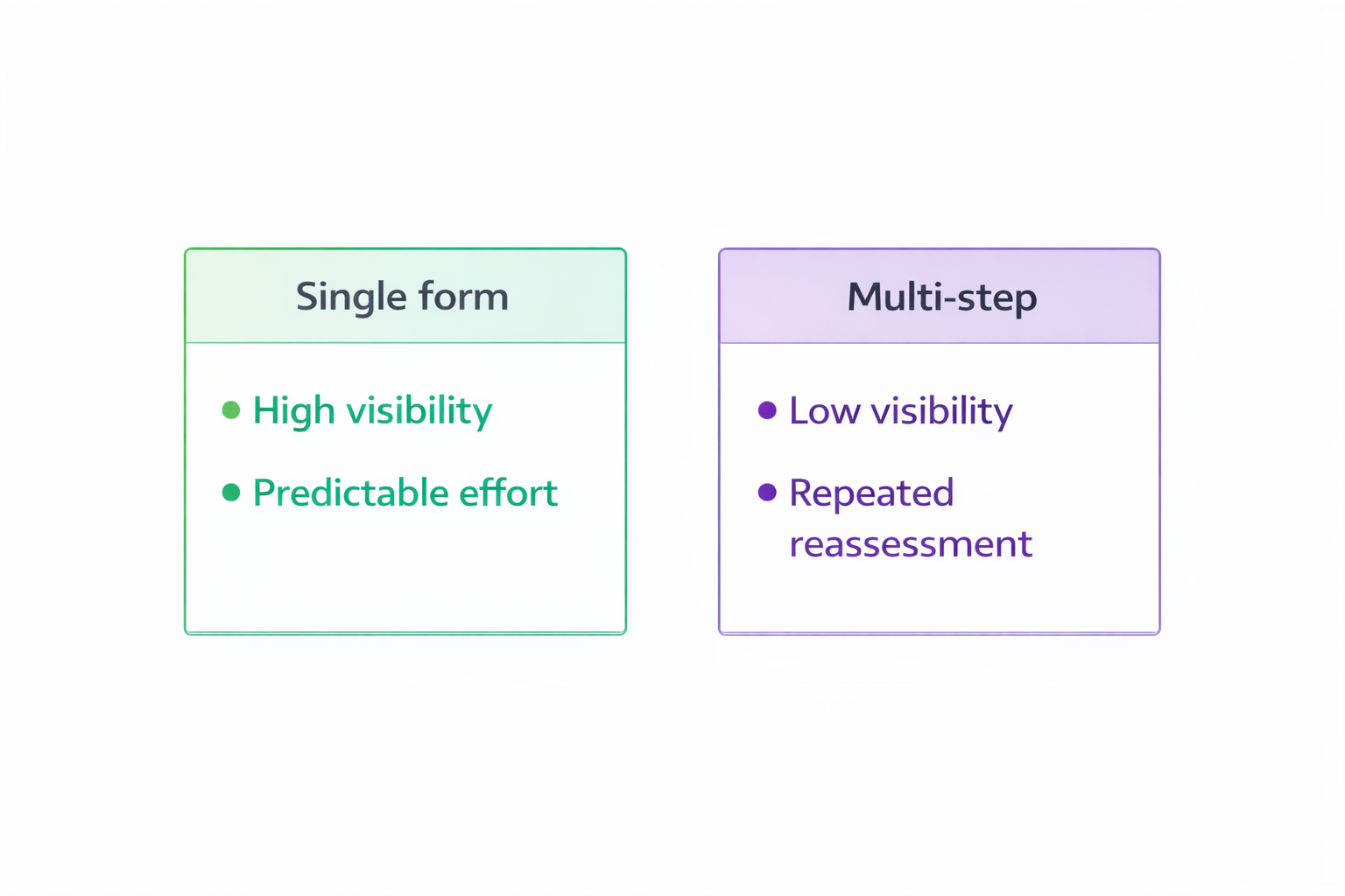
A single-page form asks for one decision — start or not.
Multi-step forms ask for that decision multiple times.
Each transition creates a moment where the user reassesses:
-
“How much is left?”
-
“Is this worth finishing?”
-
“What are they going to ask next?”
If that expectation is unclear, users default to stopping.
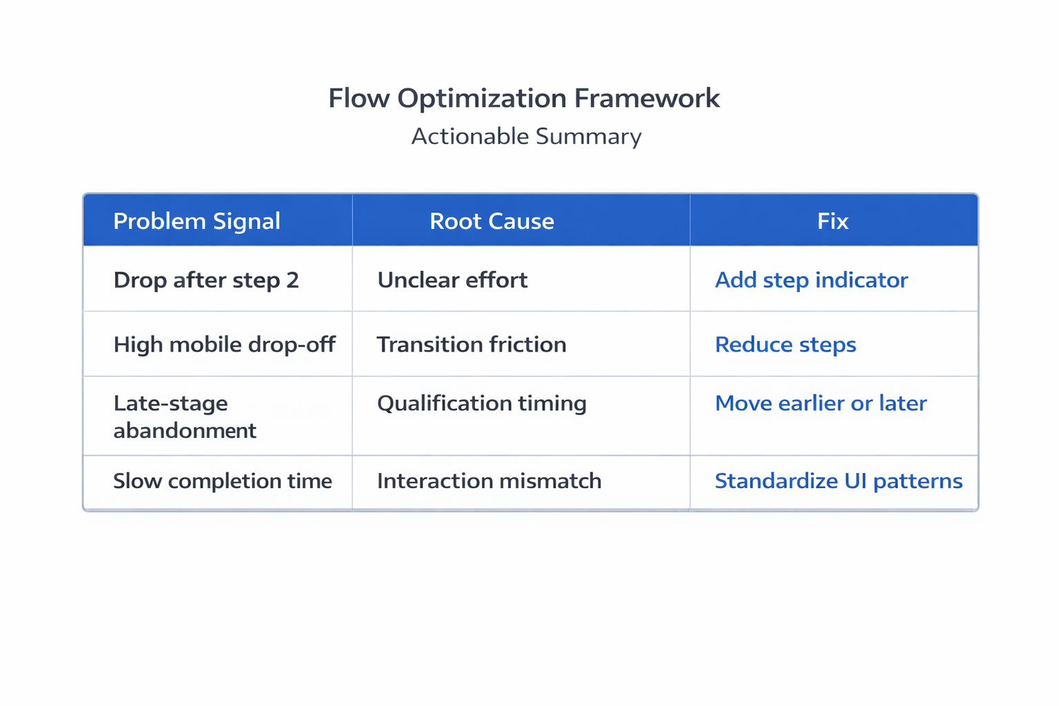
This is why Step 1 completion is often high. There is no perceived cost yet. The drop happens later, when effort becomes visible.
Inside Ads Manager, this usually appears as:
-
Stable CPC and CTR.
-
Lower-than-expected CVR.
-
Gradual reduction in spend allocation.
This is the same pattern behind campaigns where engagement looks strong but results don’t follow, as described in What to Do When Your CPC Is Low But Conversions Are Flat.
Transitions Interrupt Automatic Behavior
Users complete high-performing forms almost automatically. They read, input, and continue without pausing.
Transitions break that behavior.
Even small issues during step changes introduce friction:
-
Latency between steps, especially on mobile.
-
Layout shifts, where the next step feels disconnected.
-
Missing context, when previous inputs disappear.
-
Inconsistent CTA behavior, where labels or placement change.
You won’t see “transition friction” as a metric. You’ll see its effects:
-
Longer completion times.
-
Higher drop-off in later steps.
-
Worse performance on mobile placements.
Many of these issues are tied to mobile interaction constraints, which are covered in Why Your Mobile Landing Page Is Killing Conversions (And How to Fix It).
Qualification Placement Changes Behavior
Multi-step forms are often used to qualify leads progressively. The logic is clear, but sequencing changes user behavior more than the question itself.
Compare two setups:
-
Qualification early:
Low-fit users exit immediately. Volume drops, but flow becomes smoother. -
Qualification late:
Users invest effort first, then face disqualification. Many abandon instead of finishing.
The second case creates a clear pattern:
-
Strong early-step completion.
-
Sharp drop at the qualification step.
-
No proportional improvement in lead quality.
This is the same trade-off explored in How to Qualify Leads Through Facebook Ads Without Adding Friction — the issue is not the filter, but where it appears in the flow.
Why “Fewer Fields Per Step” Doesn’t Fix It
Splitting fields reduces visual density. It does not reduce effort.
Users still complete the same inputs. The difference is how predictable that effort feels.
When all fields are visible:
-
Users scan the form.
-
Estimate effort.
-
Decide upfront.
When fields are hidden behind steps:
-
Users commit without full visibility.
-
Reassess at each transition.
-
Drop off when effort exceeds expectation.
This is why multi-step forms often increase early engagement but reduce total submissions.
Structural Fixes That Improve Completion Rate
Performance improves when you control how the flow behaves — not just how it looks.
Focus on where users hesitate.
-
Make total effort explicit before the first interaction.
Showing “3 steps — ~20 seconds” stabilizes continuation rates. -
Reduce the number of transitions.
Two dense steps often outperform four lighter ones. -
Keep interaction patterns identical.
Consistent buttons, labels, and inputs remove unnecessary friction. -
Move qualification out of the middle.
Place it at the beginning or the end. -
Maintain visible progress and context.
Users should always know where they are and what remains.
These are structural fixes — not cosmetic ones.
How to Diagnose the Real Cause
Before changing anything, identify where momentum breaks.
Look at:
-
Step-to-step conversion rates
Gradual declines indicate cumulative friction. -
Completion time per step
Spikes usually signal hesitation. -
Device-level performance
Larger drop-offs on mobile often point to transition issues. -
Session behavior
Pauses and repeated actions indicate uncertainty.
If you can’t tie the issue to observable behavior, changes tend to be superficial.
The Shift That Fixes Most Multi-Step Forms
Multi-step forms are not a UI preference. They are a flow control system.
The key question is not: “How many fields per step?”
It’s: "Does the flow maintain momentum from start to finish?"
If users repeatedly stop to reassess, the structure is working against you.
When transitions are controlled, expectations are clear, and qualification is placed correctly, multi-step forms can perform well.
Without that control — they usually underperform.
Practical Takeaway
If your form starts strong but finishes weak, don’t begin with design changes.
Map where users slow down.
Those moments — usually at transitions — are where conversion rate is lost.
Fix the flow there, and the rest of the form often stops being the problem.