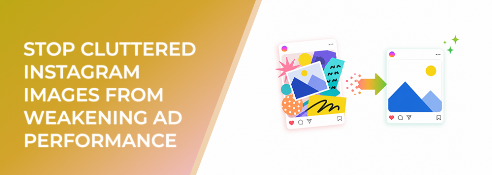
Cluttered Instagram images create a quiet performance problem.
The ad may look complete. It may include the product, headline, benefit, discount, logo, CTA, testimonial badge, and background details. But once the image appears in the feed, all those elements compete for attention.
For performance marketers, this is not just a design issue. It can reduce CTR, increase CPC, weaken conversion quality, and make campaign tests harder to interpret.
When an Instagram image contains too much visual information, users need more effort to understand it. In a fast-scroll environment, that extra effort is often enough to lose the click.
The Problem
The problem is visual overload.
Instead of communicating one clear idea, the image tries to communicate several ideas at once. The product competes with the headline. The headline competes with the badge. The badge competes with the CTA. The background competes with everything.
This weakens the ad because users do not instantly know what matters.
Clutter is especially damaging in promoted Instagram posts. A post that looked engaging organically may not be structured for paid acquisition. Followers may already understand the brand, product, and context. Cold paid audiences usually do not.
When a cluttered post becomes an ad, the missing context becomes obvious. Users see the image, fail to process it quickly, and move on.
Why This Problem Hurts Performance
Cluttered Instagram images hurt performance because they slow down decision-making.
A user does not need to dislike the ad for the campaign to underperform. They only need to take too long to understand it.
That delay can reduce CTR because fewer users reach the point of interest. CPC may rise as the ad receives weaker action signals. CPA can increase because fewer qualified users move through the funnel. ROAS can weaken because the ad spends on impressions that do not become meaningful demand.
Clutter can also attract the wrong type of engagement. A visually busy ad may earn curiosity clicks or passive likes without creating real buying intent. That can mislead marketers into thinking the ad is working when the downstream conversion rate tells a different story.
For lead-generation teams, clutter is especially expensive. If users click without clearly understanding the offer, the campaign may generate lower-quality leads, weaker sales conversations, or more form submissions from people who are not a strong fit.
Common Scenarios Where This Happens
An ecommerce brand runs an image with a product, discount badge, customer quote, “best seller” label, free shipping note, and lifestyle background. Each element makes sense individually, but together they create a noisy ad.
A B2B SaaS company promotes a screenshot with multiple interface panels, arrows, labels, and a long headline. The creative tries to explain the product, but the user cannot identify the core benefit quickly.
A local business adds service areas, phone number, logo, testimonial stars, pricing, and a CTA into one square image. The ad becomes more like a flyer than a mobile-first performance creative.
An agency creates polished graphics for a client, but the design includes too many shapes, icons, gradients, and text blocks. The ad looks designed, but not readable.
A startup promotes a carousel where the first card contains the brand statement, product category, feature list, and CTA. The user never reaches card two because card one feels too heavy.
These examples have the same root problem: too many visual jobs in one frame.
Why the Problem Happens
Clutter usually happens because teams mistake completeness for clarity.
Marketers want to reduce uncertainty, so they add more information. Designers want the ad to feel branded, so they add more visual styling. Business owners want every selling point included, so they ask for more claims. Sales teams want objections handled upfront, so they add proof and urgency.
Each request may be reasonable. But together, they create an ad that is harder to process.
Another cause is designing for internal approval instead of user behavior. Stakeholders review the creative slowly. They zoom in, read every element, and compare it to the brief. Instagram users do the opposite. They scan quickly and decide whether to keep scrolling.
Clutter also happens when advertisers rely too heavily on one ad to do the work of the entire funnel. The first image does not need to explain every feature, proof point, and next step. It only needs to create enough clarity and interest to move the right user forward.
The Solution
The solution is not to make Instagram ads empty or generic. The solution is to simplify the image around one main message.
A clean ad should still be persuasive. It should still communicate value. But it should guide attention in a controlled sequence instead of presenting every element at the same level.
Choose the One Job of the Image
Before redesigning the ad, decide what the image needs to accomplish.
Does it need to show the product clearly?
Does it need to make the offer obvious?
Does it need to highlight a pain point?
Does it need to show proof?
Does it need to create curiosity for a longer video or carousel?
One image can support multiple ideas, but only one idea should lead.
Remove Elements That Do Not Support the First Message
Start by removing decorative elements.
Then remove secondary claims.
Then shorten text overlays.
Then reduce badges, icons, and competing labels.
If an element does not help the user understand the primary message faster, it probably belongs somewhere else: the caption, second carousel card, landing page, email follow-up, retargeting ad, or sales conversation.
Simplification is not deletion for its own sake. It is prioritization.
Use Visual Hierarchy Instead of Visual Volume
A cluttered ad often uses volume to create impact. A stronger ad uses hierarchy.
Make the most important element largest, clearest, or highest contrast. Give it enough space. Place supporting copy where the eye naturally moves next. Keep the CTA visible but not competing with the focal point.
This makes the ad easier to scan and more useful for performance testing.
Build Multiple Ads Instead of One Overloaded Ad
If you have five strong messages, do not force all five into one image.
Create separate variants:
- one product-led ad,
- one problem-led ad,
- one offer-led ad,
- one proof-led ad,
- one urgency-led ad.
This gives you cleaner data. You can see which message drives better CTR, conversion rate, CPA, and lead quality.
Risks and Considerations
Simplifying an ad can go too far.
If you remove too much context, users may notice the image but fail to understand the offer. The goal is clarity, not emptiness.
Be careful with text reduction. Shorter text is usually better, but the remaining words must be specific enough to create intent.
Also consider compliance and brand requirements. Some industries need disclaimers, eligibility notes, or offer conditions. These should be handled clearly without overwhelming the first visual.
Poor audience fit can also make a clean ad underperform. If the audience does not care about the product or problem, better design will not create demand by itself.
Prerequisites and Dependencies
To reduce clutter effectively, you need a specific offer, a clear audience, and a defined campaign objective.
You also need agreement on what the first image should do. Without that, every stakeholder will keep adding elements based on their own priorities.
A useful creative brief should define the primary message, secondary support, audience stage, CTA, placement, and success metric.
Reliable tracking also matters. You should evaluate the simplified version based on business signals, not only surface engagement. CTR, outbound clicks, conversion rate, CPA, lead quality, and post-click behavior should all be reviewed.
Practical Recommendations
Audit your active Instagram ads and identify the image with the most competing elements.
For each element, ask: “Does this help the user understand the main message faster?”
If not, remove it or move it elsewhere.
Create a simplified version where one visual element dominates. Keep the offer and CTA consistent so the test isolates the effect of visual clarity.
Review the creative at mobile size. If the product, offer, or message is hard to identify within one second, continue simplifying.
Use separate creative variants for separate ideas. Do not ask one image to carry the entire funnel.
Final Takeaway
Cluttered Instagram images weaken ad performance because they slow down understanding.
The fix is not less persuasion. The fix is sharper prioritization. Choose one main message, make it visually dominant, and move secondary information into the rest of the funnel. When users understand the ad faster, your campaign has a better chance to earn clicks, conversions, and useful optimization signals.
Related LeadEnforce Articles
- Why Overdesigned Instagram Ads Still Fail To Stop the Scroll — Directly expands on how visual overload reduces comprehension and performance.
- Why People Scroll Past Your Instagram Ads Without Noticing the Product — Explains why product clarity should come before extra design elements.
- How To Fix Poor-Performing Instagram Ads With Small Creative Tests — Shows how to test simpler creative changes without disrupting the whole campaign.
- Fix Low Instagram Ad Clicks by Making the Offer Obvious Fast — Useful for advertisers whose cluttered images hide the core offer.