Ever scrolled past an ad without even realizing it? That’s a design problem — not a targeting one.
In the high-speed world of social feeds, visuals either catch the eye or disappear. The stakes? Split-second attention spans and increasingly saturated ad space. And that’s where two often-overlooked elements start pulling serious weight: color and typography.
Let’s break down how these two design choices, when used intentionally, can drastically improve your social ad performance.
Why Color and Typography Matter in Social Ads
Social media is a visual battleground. Your ad is competing with baby photos, memes, and breaking news — all at once.
You might have the right audience. Even the perfect offer. But if your ad looks generic or hard to read, you're out.
Here’s the thing: humans process visuals up to 60,000 times faster than text. Color triggers emotion before a word is read. Typography shapes how that word is felt. When paired correctly, they nudge people to stop scrolling and pay attention — and eventually, click.
If your ads are still getting attention but not converting, your creative could be visually off-brand or missing psychological cues. This deeper layer of creative strategy is often what separates scroll-stoppers from forgettable ads — especially in a noisy feed.
The Psychology of Color: More Than Just Pretty
Color is emotional. It’s not just about what looks “nice” — it’s about what feels right for your audience, your product, and the action you want them to take.
Some fast facts:
-
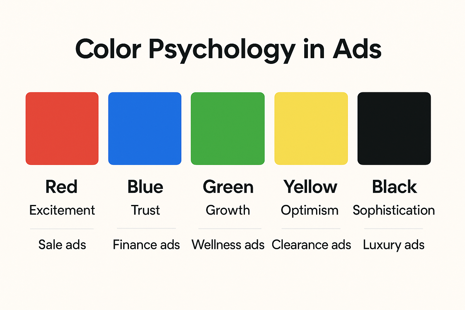
Red creates urgency, grabs attention, and works well for sales or limited-time offers.
-
Blue builds trust and calm — popular in SaaS and finance.
-
Green suggests growth, health, and wealth — think wellness brands or investment tools.
-
Orange and yellow are energetic and youthful, great for playful or disruptive brands.
-
Black = luxury, exclusivity, or bold authority.
But context matters. A bold red might work wonders in an ad for fitness gear, but feel aggressive in an ad for mental wellness coaching.
So, how do you choose the right color?
Pro tips:
-
Start with your brand palette, but adjust tones for each platform.
-
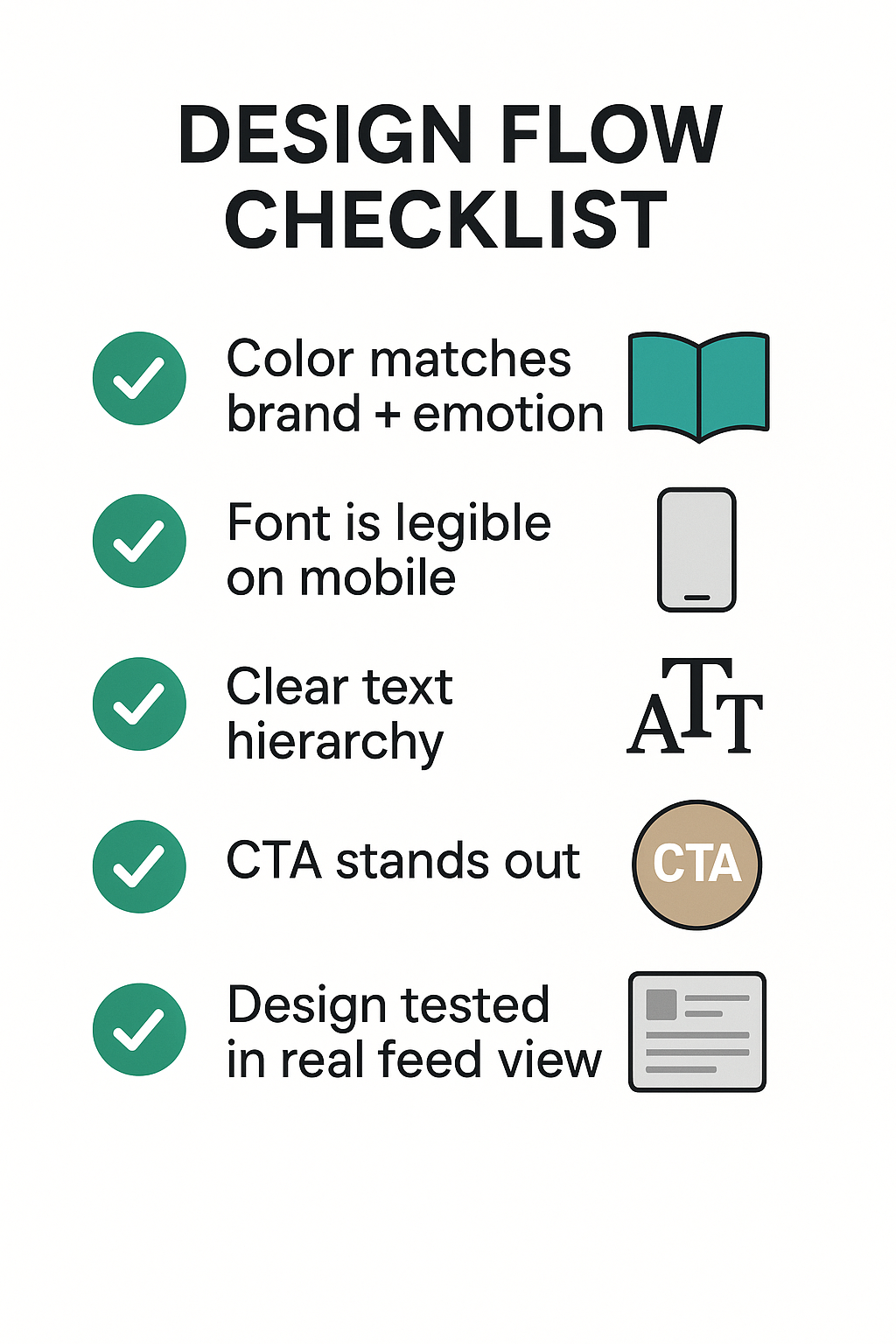
Test contrasting backgrounds behind your CTA buttons — subtle shifts in color can influence click-through rates.
-
Avoid color overload. Pick one dominant and one accent color to guide the eye.
Want a deeper dive into color psychology and practical examples for ad design? Check out this guide on using color psychology in Facebook ads.
Typography: Design's Secret Persuader
Type is often invisible — until it’s bad. Bad typography makes your ad look unprofessional, hard to read, or just plain confusing.
But done right? It can completely change how your message lands.
Would you trust a financial planning app that uses Comic Sans in its ads? Or feel confident in a skincare product whose text is crammed and hard to read?
Typography signals tone. A sleek sans-serif can say “modern, easy, trustworthy.” A playful script can say “fun, creative, unique” — but only if it's still legible.
What to look out for:
-
Legibility first. Stick with clean, readable fonts — especially on mobile.
-
Hierarchy matters. Use font weight, size, and spacing to guide the eye from headline to CTA.
-
Limit your fonts. One or two is enough. Any more and it starts to look chaotic.
Design and messaging work hand in hand. If your copy is strong but the visual delivery is weak, performance suffers. If you're not sure whether your ad copy is helping or hurting, here's a helpful post on how to craft copy that actually converts.
Matching Message, Mood, and Medium
Color and type don’t exist in a vacuum. They should support the message of your ad and the platform it’s on.
A TikTok ad might need bold, fast visuals and punchy text overlays — while a Facebook ad can lean into more polished visuals and smaller text blocks. A story placement benefits from contrast-heavy designs, while feed ads allow for more nuance.
Ask yourself:
-
Is the design consistent with what my audience expects from this platform?
-
Does the typography help or distract from my message?
-
Does the color guide attention toward the CTA or away from it?
Also, be aware that some design issues might trigger algorithmic delivery issues.
Creative Testing: Your Best Friend
Design is subjective. Performance isn’t.
Even with all the theory in the world, you’ll never know what works until you test it. A soft purple headline might outperform a bold red one. A thin font might crush your bold version.
Try A/B testing variations of:
-
Background color vs. CTA color;
-
Font size and line spacing;
-
Serif vs. sans-serif headers;
-
Text-over-image vs. clean blocks.
Not sure where to begin with testing? Start here: What to test first — creative, copy, or audience?
And remember: good creative only works if you're targeting the right people. If you're unsure who those are, use this step-by-step targeting guide to sharpen your audience.
Final Thoughts: Design That Sells
Color and typography aren’t just aesthetic choices. They’re strategic tools in your ad performance arsenal.
They shape perception, build trust, and guide attention — sometimes in under 3 seconds. And when used with intention, they can dramatically lift engagement, click-throughs, and conversions.
If you’re running ads, design isn’t optional. It’s leverage.
So next time you're building creative, don’t just focus on the headline or the hook. Look at the full picture — color, type, layout, and emotional resonance.
That’s where better performance begins.