Most landing pages don’t suffer from bad copy or design. They fail because they don’t match how users actually make decisions.
Clicks and engagement don’t equal intent. And ad traffic doesn’t behave like homepage traffic. Yet most landing pages treat them the same.
This article breaks down why well-designed, well-written pages still lose conversions — and what high-performing marketers structure differently.
The two conversion curves: platform metrics vs business metrics
Online campaigns often look good on the surface. Click-through rates are decent, bounce rates seem under control, and engagement exists.
But when you check the downstream numbers — qualified leads, demo requests, actual sales — they’re nowhere near what you'd expect.
Two curves, one trap
-
Platform metrics (CTR, time on page) often look healthy early on;
-
Business outcomes (leads, sales) lag behind or disappear entirely.
This disconnect hides in plain sight. The campaign looks like it’s working, but only because you’re measuring platform responses — not user decisions.
That creates a dangerous feedback loop. You keep optimizing for what Meta says is working, while ignoring what actually drives revenue. Eventually, spend goes up, but ROAS plateaus or declines.
Fixing this starts at the landing page level. It’s where clicks either escalate into intent — or stall out completely. For a deeper breakdown of why post-click drop-offs happen, see this article on optimizing the post-click experience.
Why most landing pages fail: false assumptions baked into structure
Most pages follow what looks like a logical flow: headline, short pitch, benefit list, testimonials, call to action.
The problem isn’t the format. It’s the underlying assumption: that the visitor is ready to be convinced.
That’s rarely true — especially with paid social traffic, which is fast, diverse, and often cold.
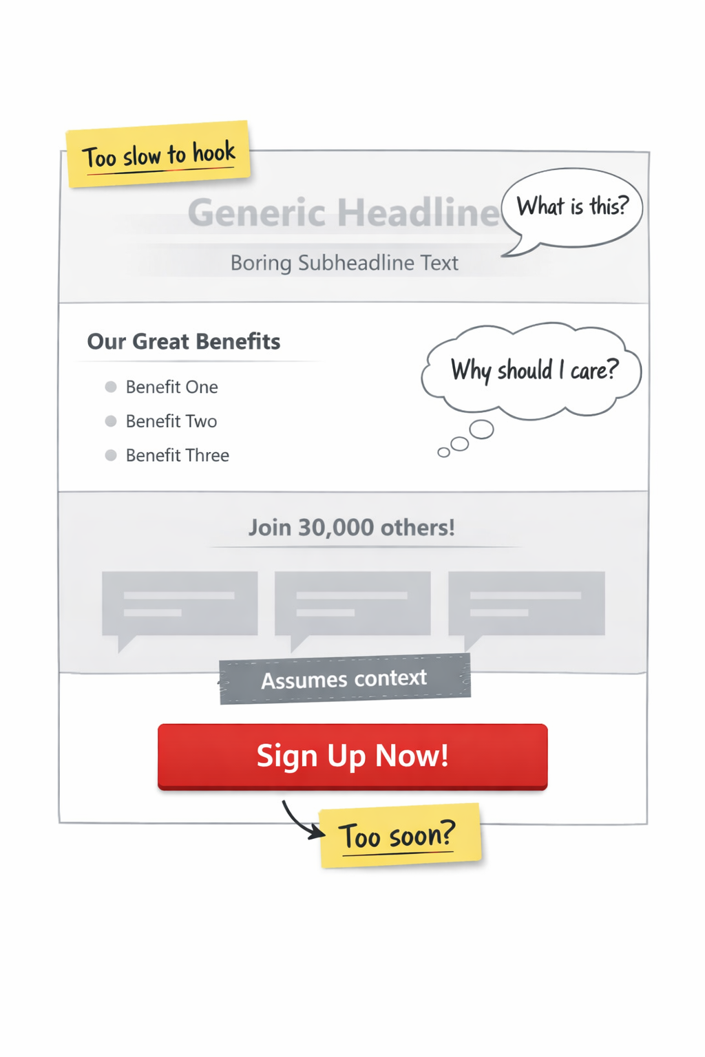
Common structural issues that quietly kill conversions
-
Answering too late: Visitors scan the top 3 lines and decide. If your pitch builds slowly, they leave before it starts.
-
Assuming context: Social proof like “Join 30,000 others” doesn’t land if the user doesn’t yet know what you offer.
-
CTA timing mismatch: Asking for sign-up before showing relevance or proof drives hesitation, not action.
Even visually strong pages underperform if the logic isn’t sequenced to match attention spans and decision stages.
A better model: matching landing page logic to user awareness
Most landing pages try to be convincing. But the best ones are aligned — tailored to the user's current level of understanding.
That’s not just about targeting. It’s about how the page is structured to reflect where the user is mentally.
Think in three stages of awareness
Each awareness level demands a different information architecture, not just different messaging.
1. Problem-unaware (cold traffic)
These users didn’t search for a solution. They clicked because your ad caught their eye.
They aren’t primed for offers, features, or CTAs yet.
Instead, your page needs to do three things fast:
-
Introduce a relatable situation or pain point;
-
Show the problem clearly enough that users recognize it;
-
Hold back the offer until they see themselves in the scenario.
You’re not selling the product — you’re selling the idea that they have a problem worth solving.
2. Problem-aware, solution-curious
These users know the category but haven’t picked a provider.
Your goal isn’t education — it’s differentiation. That means highlighting what sets your offer apart fast, without getting buried in brand backstory.
3. Product-aware, trust-hesitant
These users know who you are. What’s stopping them is doubt or inertia.
The most effective landing pages for this stage focus less on persuasion and more on reducing friction:
-
Clarity about what happens next;
-
Risk-reducers like short trials or instant access;
-
Specific proof instead of generic claims.
For tactics that align your messaging with awareness levels, see this breakdown of funnel-stage messaging.
Where your page logic and ad logic collide
One of the most overlooked causes of landing page failure is misalignment between the ad logic and page structure.
The message might match. But the format often doesn’t.
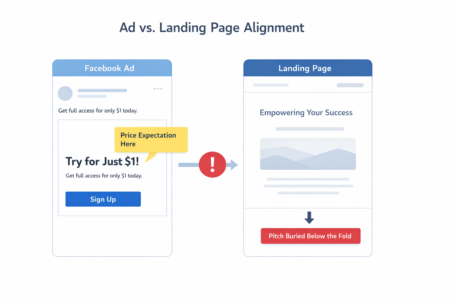
Example: ad leads with price — page buries it
If your ad says “Try for $1,” and your landing page starts with a founder story or brand values, you’re creating friction.
The user came looking for price clarity — but you led with inspiration. They bounce before they scroll.
This is especially damaging on Facebook and Instagram, where ad-to-landing-page continuity affects both user trust and algorithm favorability. For more on how to avoid this, read Why Your Facebook Ads Look Great But Still Don’t Sell.
Layout lessons from pages that convert
Great landing pages don’t just have good content. They arrange it in a way that speeds up decision-making.
Layout controls flow, friction, and cognitive load.
Keep the fold functional — not decorative
Paid social traffic doesn’t have time for build-up. The top of the page should answer:
-
What is this?
-
Is it for me?
-
What happens if I click?
That means replacing vague aspirational copy with short motion-based demos, qualifiers, or interactive toggles.
Use interaction to segment intent
If your product has multiple audiences, let users self-select:
-
Add toggles: “I’m a freelancer” / “I manage a team”;
-
Dynamically shift content blocks based on their choice;
-
Keep all CTA logic aligned to their chosen flow.
What to test instead of just colors and headlines
A/B testing often gets reduced to cosmetic tweaks. But real conversion gains come from structural and behavioral shifts.
Test information hierarchy
Try moving entire blocks up or down. Test versions that lead with trust vs versions that lead with value. For guidance, see this guide to landing page optimization.
Test CTA friction — not just CTA copy
Many CTAs fail not because of bad wording, but because the page didn’t earn the click.
Try adding just-in-time context like:
-
“What happens after I click?”
-
“Is it free? Do I need a card?”
-
“How long does it take?”
If users don’t see that info near the CTA, they may freeze — even if they want to convert.
Metrics that reveal structural problems
Judging landing pages by form submissions alone misses a lot of silent friction.
Track:
-
Scroll depth: Are they dropping off before your actual pitch?
-
Time-to-scroll: How long does it take to reach the CTA?
-
Visibility vs interaction: Do people see your CTA but ignore it?
Also consider attribution windows. Many conversions come days later, especially on iOS. If you optimize too early, you cut off ads that were working. This article on Meta Ads attribution explains why delayed attribution matters.
Summary: conversion comes from clarity — not cleverness
High-converting landing pages don’t try to impress. They sequence ideas based on how people decide.
If your page isn’t converting, start by mapping out:
-
What your ad promises;
-
What the user sees in the first 5 seconds;
-
What objections you haven’t answered yet.
Conversion lives in the space between those steps.
Before rewriting your copy or rebuilding your design, ask yourself: does this page follow user logic — or just follow a best-practice template?