There’s a pattern you start noticing after working on enough campaigns, especially when everything looks right at the top of the funnel but results don’t follow through.
You launch a campaign with solid targeting, the ads get clicks, CPC stays within range, and nothing looks obviously broken. Still, conversions don’t show up at the same pace. That’s usually the moment when teams start adjusting audiences or rewriting creatives, even though the issue often sits further down.
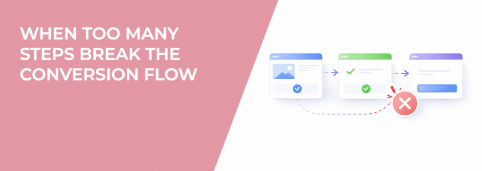
In many cases, the problem is not traffic quality or ad performance. It’s the structure of what happens after the click.
Where Things Actually Start Falling Apart
On paper, the journey looks simple and predictable: someone clicks an ad, lands on a page, fills out a form, and converts.
In practice, the process feels very different from the user’s perspective. Every interaction inside that flow requires a decision, and each decision introduces a small moment of hesitation that can either move the user forward or push them out.
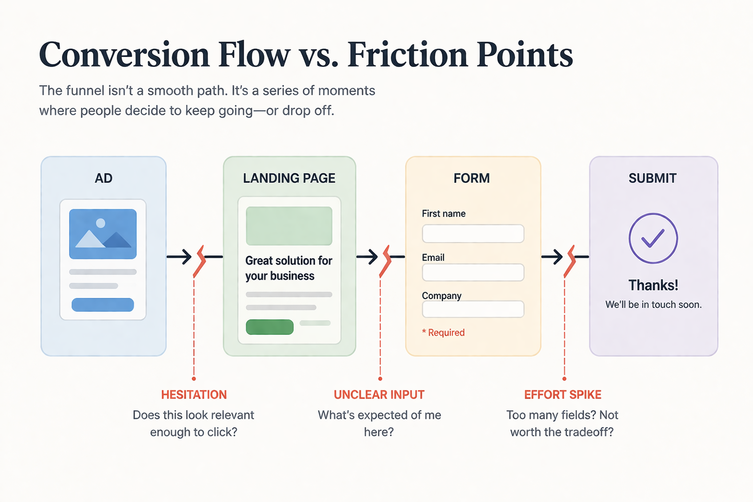
If you look at real session recordings, the pattern becomes clear quite quickly:
-
Users scroll through the page, pause, then go back up because something didn’t fully make sense the first time.
-
They click into a field, hesitate, and then leave without typing, which usually means the effort didn’t feel justified.
-
They slow down significantly on one specific question, which often becomes the point where they drop off entirely.
These are not edge cases. They are consistent signals that the flow is asking for more effort than the user expected.
The “One More Step” Problem
Most broken conversion flows are not designed that way from the beginning. They become inefficient over time as small changes accumulate.
A field gets added because sales needs more context. Another one is introduced for segmentation. Then someone suggests splitting the form into multiple steps to make it “feel easier.”
Each decision makes sense individually, which is why teams rarely question them. The problem only becomes visible once all those small additions start interacting with each other.
What you end up with is a flow where the perceived effort grows gradually:
-
The user clicks because the ad sets a clear expectation.
-
The first interaction feels easy enough to start.
-
Halfway through, the amount of work feels higher than anticipated.
-
The user exits before completing, even though the initial intent was real.
This is exactly the type of situation behind many cases described in What to Do When Your CPC Is Low But Conversions Are Flat, where the issue isn’t traffic but what happens after the click.
Conversion Flow Behaves Like Momentum
It helps to think about conversion as momentum rather than a fixed sequence of steps.
When someone starts interacting with your page, they carry intent forward. As long as the process feels smooth and predictable, that intent continues. The moment something interrupts it, the drop-off risk increases sharply.
Momentum tends to break under specific conditions:
-
When the user has to interpret what a question means instead of answering it instantly.
-
When the form asks for information that feels premature or too demanding.
-
When the difficulty of the process increases suddenly halfway through.
-
When the interface disrupts the interaction, which is especially common on mobile devices.
If you look at form analytics, you will often see stable completion at the beginning followed by a sharp drop at a particular point. That drop is rarely about a single field—it reflects accumulated friction reaching a tipping point, which is also discussed in Funnel Drop-Off Fixes: How to Improve Each Stage with Facebook Ad Data.
Why Multi-Step Forms Often Underperform
Multi-step forms are usually introduced with the intention of simplifying the experience, but they often shift the problem rather than solve it.
One of the main issues is that users cannot see the full scope of the process from the beginning, which makes it harder to estimate the required effort. They start because the first step looks easy, but their perception changes as new requirements appear in later steps.
Progress indicators are often added to address this, but they do not reduce the actual workload. In some cases, they make the experience worse because users become more aware of how much is left, especially when the progress bar moves slowly compared to the effort required.
Another overlooked issue is the transition between steps. Each transition introduces a small interruption, and those interruptions become more noticeable on mobile devices where loading states, keyboard behavior, and layout shifts break the flow. This is closely related to the issues outlined in Why Your Mobile Landing Page Is Killing Conversions (And How to Fix It).
What the Data Usually Tells You
Flow friction does not appear as a single metric, so you have to interpret patterns across multiple signals.
A typical scenario looks like this:
-
CTR is strong, which means the ad is relevant enough to generate clicks.
-
CPC remains stable, which suggests auctions are not the issue.
-
Conversion rate is low, which points to problems after the click.
Additional signals often reinforce this:
-
Mobile conversion rates are significantly lower than desktop.
-
Spend gradually shifts away from certain placements.
-
Lead volume stays low despite consistent traffic.
These situations often create misleading confidence because surface metrics look healthy, which is why they align with the kind of analysis discussed in Ad Metrics That Lie: When Good Numbers Hide Bad Performance.
Where Friction Actually Comes From
Not all steps contribute equally to friction. Some points in the flow create much higher resistance than others.
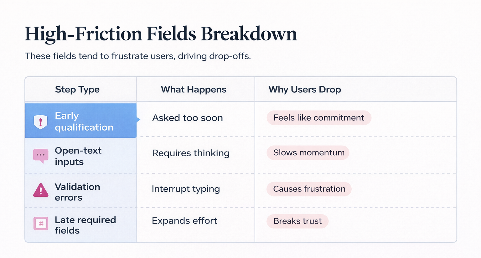
The most common problem areas include:
-
Early qualification questions, such as budget or company size, which force users to commit before they feel ready.
-
Fields that require interpretation instead of simple input, which slows down completion.
-
Strict formatting rules that interrupt typing and create frustration, particularly on mobile.
-
Required fields introduced late in the process, which make users feel the process keeps expanding.
Each of these adds effort at a moment where the user is already evaluating whether to continue.
The Tradeoff Between Qualification and Completion
Reducing the number of steps typically increases conversion rate, while adding more steps improves lead qualification.
Treating this as a binary choice usually leads to poor outcomes because both sides are trying to solve different problems within the same interaction.
A more effective approach is to distribute qualification across the funnel:
-
Use the ad itself to filter out low-intent users.
-
Keep the initial interaction simple so users actually start the process.
-
Move stricter qualification into follow-ups or later stages.
This allows you to maintain flow without sacrificing lead quality.
Simplifying Without Losing Control
Improving conversion flow is less about optimization and more about reducing unnecessary effort.
The most effective changes tend to be structural:
-
Combining related inputs into fewer decisions instead of asking multiple separate questions.
-
Delaying non-essential data collection until after the initial conversion.
-
Using inferred data where possible to reduce manual input.
-
Making inputs easier to complete through formatting and pre-filling.
-
Testing removal of fields instead of trying to improve them.
In many cases, the biggest improvement comes from removing steps rather than refining them.
Why Mobile Makes These Issues Obvious
Mobile environments expose friction much faster because interaction is more constrained.
Limited screen space, keyboard overlap, and touch input all increase the effort required to complete each step. As a result, even small issues become noticeable and impact conversion rates.
This is why you often see:
-
Lower conversion rates on mobile placements.
-
Higher drop-off after the first interaction.
-
Gradual reduction in delivery toward mobile traffic.
The platform responds to performance signals, not design intent.
How to Audit Your Flow Properly
A useful way to evaluate your flow is to experience it as a user rather than reviewing it as a structure.
Pay attention to moments where:
-
You hesitate before answering something.
-
The required effort increases unexpectedly.
-
The next step is unclear.
-
You feel resistance to continuing.
Then validate those observations with data such as step-level drop-off, device segmentation, and session recordings.
The goal is not simply to reduce the number of steps, but to maintain continuity from start to finish.
Final Takeaway
Conversion flow does not usually fail because it is too long. It fails when the experience breaks the user’s momentum.
Each additional step introduces a decision point, and those decision points accumulate quickly. When the perceived effort crosses a certain threshold, even high-intent users exit before completing.
If your campaigns generate engagement but fail to convert, the issue is often not at the ad level.
It is inside the flow.