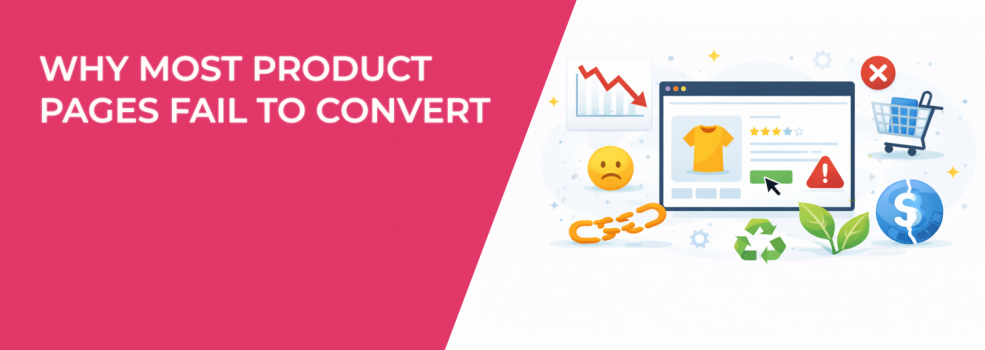
Most product pages fail even when traffic quality is good. The issue is rarely the ad platform or creative quality. The real problem appears after the click, when the page does not support how paid traffic behaves.
Instagram and Facebook users arrive with expectations shaped by the ad they just saw. They want quick confirmation, not a new story. When the page resets the context, friction appears and conversions drop.
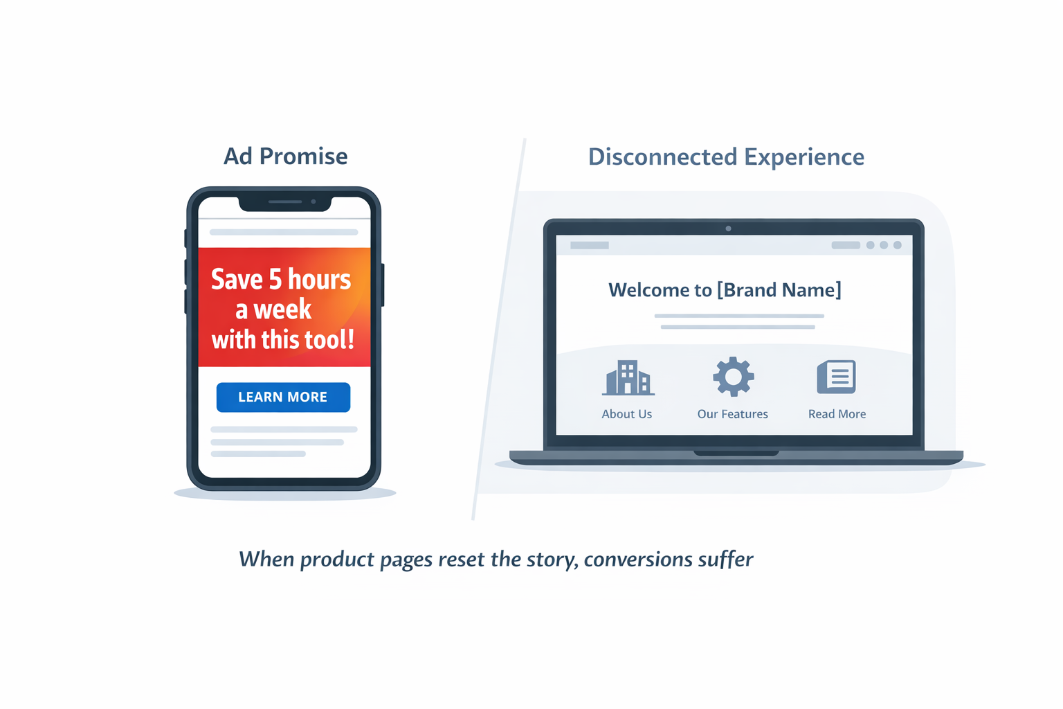
Product pages break the ad narrative
Ads do important work before the click by setting the problem and the promise. Many product pages ignore this setup and try to explain everything again. This forces users to rethink the offer instead of moving forward.
This gap often explains why ads get clicks but no sales, a pattern covered in Why your ads get clicks but no sales: fixing the audience misalignment.
The first screen must confirm the click
Users scan the first screen to decide whether to stay. If the message feels different from the ad, confidence drops because users feel they may have landed in the wrong place.
Common mismatches include:
-
Outcome-driven ads landing on brand stories, which shifts focus away from the promised result and delays value confirmation.
-
Price-focused ads landing on vague value statements, which makes users question whether the offer fits their budget.
-
Use-case ads landing on generic feature lists, which removes the personal relevance that triggered the click.
A simple rule helps here: restate the ad’s main promise in different words and show how it works immediately. This approach aligns with Creating a seamless experience between ads and landing pages.
High-intent clicks need clarity, not hype
High-intent users already want the product. They are checking whether the promise survives closer inspection.
If an ad claims time savings, the page should show exactly which steps are removed or simplified. If an ad claims simplicity, the page should show setup steps and total time required. If an ad claims results, the page should explain who the product works for and where it may not.
When these answers are missing, users pause to fill the gaps themselves. That pause often ends in exit rather than purchase.
Pages show options instead of guiding choices
Most product pages try to stay neutral by showing all options equally. This creates friction because ad traffic does not want to compare everything. Users want help choosing the safest path.
Comparisons without guidance slow decisions
Pricing tables often assume users want to evaluate every option carefully. In reality, paid traffic wants reassurance, not analysis.
High-friction setups include:
-
Three plans with the same visual weight, which forces users to guess which one is best.
-
Bundles without a clear “best choice”, which makes users worry about choosing the wrong combination.
-
Feature lists where everything looks equally important, which hides what actually drives results.
This problem connects to choice overload, explained in The paradox of choice in e-commerce ads.
Defaults make buying easier
Strong product pages quietly guide users toward a safe decision. Defaults reduce mental effort at the exact moment when hesitation is most likely.
Effective defaults usually:
-
Match real customer behavior, so users feel they are choosing what others already trust.
-
Include a short explanation, which removes fear of missing out on a better option.
-
Allow easy switching, which lowers the perceived risk of committing.
Defaults do not remove freedom. They remove uncertainty.
Trust appears after doubt starts
Many product pages include reviews and guarantees. The issue is timing. Trust signals often appear after users start questioning the offer.
Reassurance should appear early
Users start evaluating trust almost immediately. They want to know whether the brand is real, whether the product works, and whether they can reverse the decision.
Early trust signals include:
-
A short testimonial showing a clear outcome, which proves the product works in real situations.
-
A visible return or refund promise, which lowers fear of making a mistake.
-
Simple delivery or access details, which reduce uncertainty around what happens after payment.
This order reflects the ideas in Advertising and trust: how brands can win without manipulation.
Social proof works best when it feels relevant
Large review counts look impressive but feel distant. Users look for proof that applies to their situation.
Effective reviews often:
-
Mention a specific problem, so users can recognize themselves in the story.
-
Explain what changed after buying, which connects the product to real outcomes.
-
Compare the product to an alternative, which helps users justify switching.
General praise builds awareness. Specific experiences reduce risk.
Mobile layouts hide buying signals
Most Instagram and Facebook traffic is mobile. Many product pages still behave like desktop pages, which slows users down.
Important details appear too late
Mobile users scroll less than expected. When basic information appears far down the page, users assume friction ahead.
Key details that should appear early include:
-
Price or starting cost, which sets expectations and prevents sticker shock.
-
Delivery or access timing, which answers “when do I get this.”
-
What happens if the product does not work, which reduces fear of commitment.
These issues often appear in Why your mobile landing page is killing conversions.
Small interactions cause big drop-offs
Mobile users leave over small annoyances because attention is limited. Each extra interaction increases exit risk.
Common issues include:
-
Variant selectors that open full screens, which interrupt flow.
-
Accordions hiding key answers, which force extra effort.
-
Sticky elements blocking content or buttons, which frustrate users.
Simple flow beats visual complexity.
Pages ignore user awareness levels
Paid traffic includes new and returning users. Most product pages treat them the same, which lowers performance.
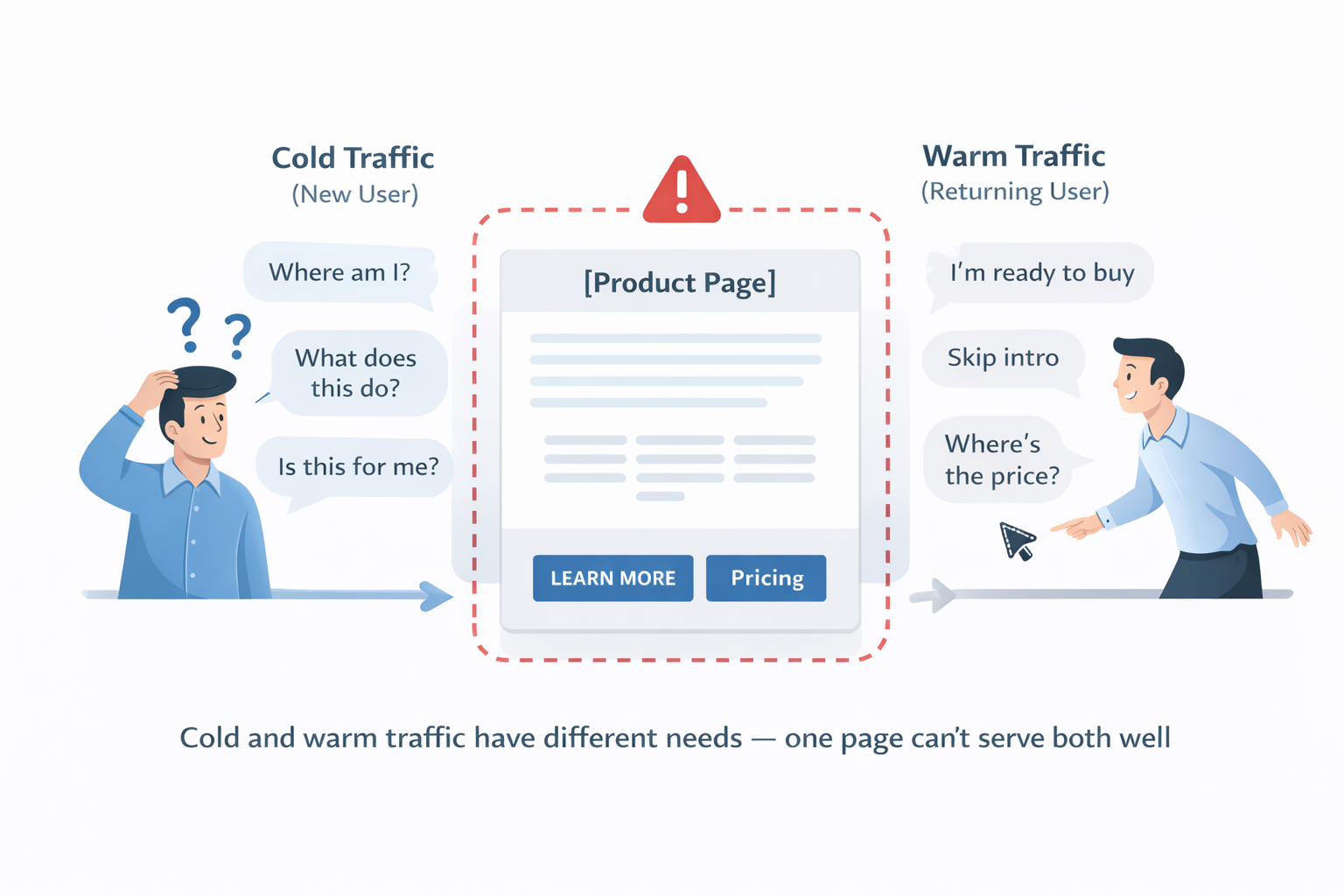
Cold traffic needs context
New users need orientation before buying. They want to understand what the product is, who it is for, and whether it fits their situation.
Cold traffic often drops when:
-
The page assumes prior knowledge, which creates confusion.
-
Language feels too insider, which increases distance.
-
Use cases are unclear, which weakens relevance.
A short section explaining who the product is for and who it is not for helps users self-qualify quickly.
Warm traffic needs speed
Returning users already understand the basics. They want to act without friction.
Warm traffic converts better when pages surface pricing early and skip repeated explanations. One page cannot serve every user equally.
Metrics hide real problems
Many teams rely on overall conversion rate. This hides where users hesitate earlier in the session.
Early actions show friction
Useful signals include:
-
Time to first scroll, which shows whether the first screen works.
-
Interaction with pricing or variants, which reveals hesitation.
-
Clicks on shipping or return details, which signal risk concerns.
These actions show hesitation before checkout, a concept explored in Using micro-conversions to optimize campaign performance.
Ad-to-page alignment is rarely tracked
Ads and pages are often optimized separately. This hides message gaps.
Tracking performance by ad promise shows where alignment breaks. When ads and pages tell the same story, conversion improves.
Why most optimization fails
Most optimization focuses on surface changes like button colors or small copy edits. Structural issues stay untouched.
Product pages convert better when they continue the ad’s promise, guide choices, show trust early, and respect mobile behavior. Better conversion comes from better structure, not more decoration.