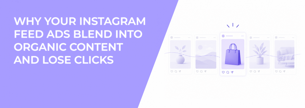
Many advertisers want Instagram ads to feel native. That makes sense. Ads that feel too corporate often get ignored.
But native does not mean invisible.
Some Instagram feed ads blend so well into surrounding content that users never notice them as meaningful. They look like another passive post, not a reason to stop, click, or learn more.
When native creative becomes visual camouflage
Instagram feeds are crowded with creators, brands, memes, product shots, and personal updates. Users move through this content quickly.
If an ad looks too similar to everything around it, it loses contrast. The user does not reject the ad. They simply fail to register it.
This often happens with soft lifestyle images, beige palettes, low-contrast product shots, and overly familiar design trends. The ad feels acceptable, but it has no clear reason to interrupt scrolling.
That creates weak CTR and poor ad recall.
Why blending into the feed increases CPC
Feed blending affects performance because it lowers the probability of action. Meta can deliver the ad, but users do not click often enough to create strong engagement signals.
As CTR drops, CPC usually rises. If the ad also attracts passive likes instead of qualified clicks, the campaign may look healthier than it really is.
This is common with boosted Instagram posts. A post may feel natural and collect engagement organically, but once it becomes an ad, it needs stronger directional intent.
Organic engagement and paid performance are not the same signal.
The difference between native and noticeable
A strong Instagram feed ad should feel like it belongs on the platform while still giving the eye a reason to pause.
That balance usually comes from controlled contrast.
Useful contrast can include:
- A clearer focal point than nearby organic posts. The eye should know where to land immediately.
- A tighter crop that makes the subject easier to process. Close framing can create stronger feed presence.
- One visual pattern break. This can be color, angle, composition, or product placement.
- A cleaner layout than surrounding content. Simplicity can create separation in a cluttered feed.
This is the role of visual friction in busy feeds. It creates enough interruption to earn attention without making the ad feel unnatural.
Why “looking organic” can still hurt performance
Some advertisers remove too much structure because they want the ad to look organic. The result is a creative that feels casual but lacks a clear selling point.
A post can look native and still fail if users do not understand the product, offer, or next step.
This matters for performance campaigns because clicks need intent. If the ad feels like general content, users may like it without moving into the funnel.
That is why making Instagram ads feel native should not mean removing visual hierarchy. It means making the ad fit the platform while still communicating a clear reason to act.
For competitive niches, standing out in crowded Instagram feeds often requires stronger separation than brands expect.
How to fix feed blending without making the ad look loud
Start with one controlled pattern break. Do not redesign everything at once.
For example, keep the native photo style but zoom closer on the product. Keep the organic layout but add stronger contrast around the main object. Keep the casual tone but make the first visual cue more specific.
This approach protects platform fit while improving attention.
For advertisers using LeadEnforce, better audience precision can support this strategy. Audiences built from Instagram followers, engagers, or relevant social profiles can make the same visual cue more meaningful because the user is closer to the category.
Still, creative differentiation must do its job. A relevant audience cannot click an ad it barely notices.
Final takeaway
Instagram feed ads should feel native enough to avoid resistance, but distinct enough to earn attention.
If your ads blend into the feed and lose clicks, add controlled visual friction. The goal is not to look louder than every post. The goal is to make the user understand why this post deserves a pause.