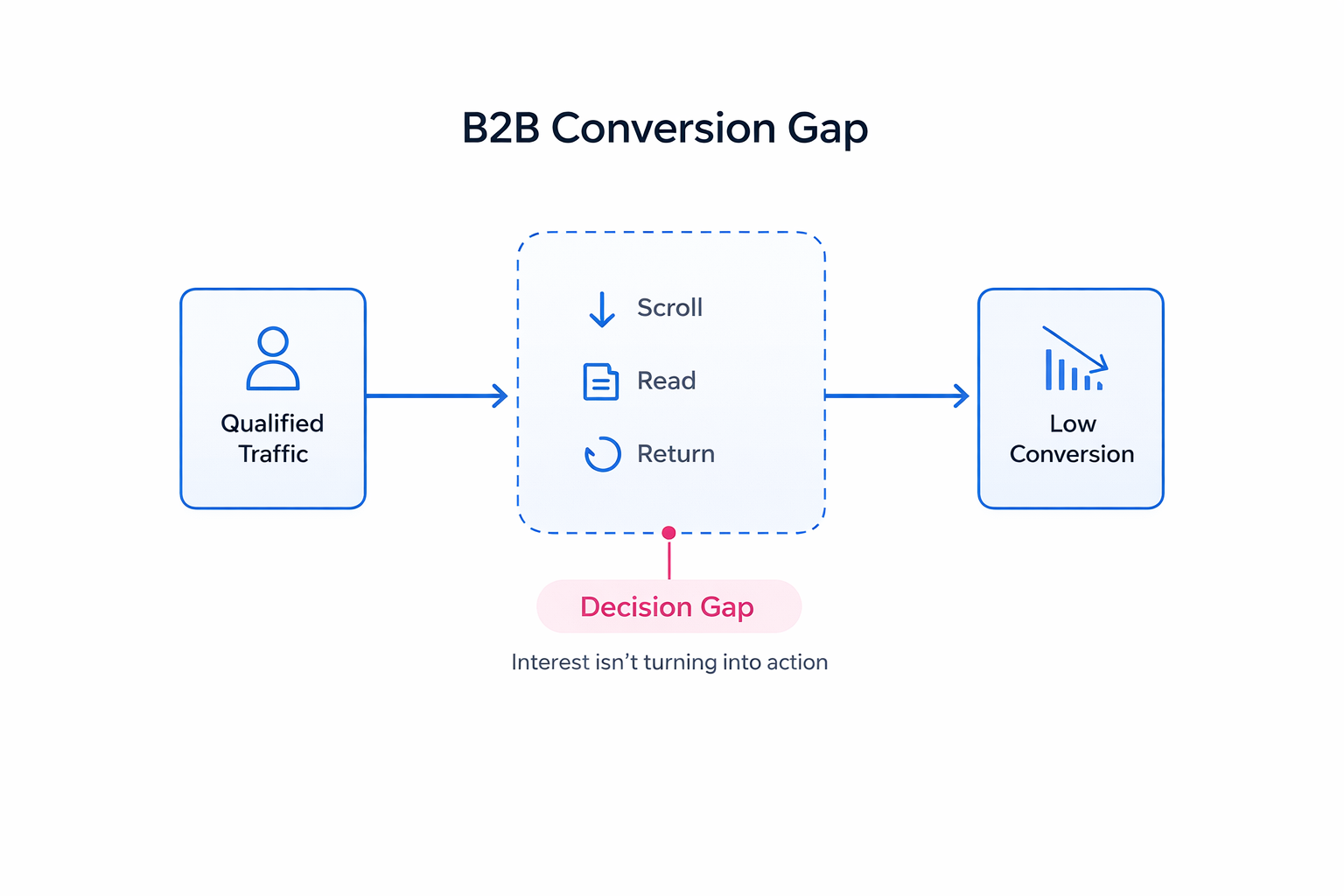
You can drive qualified traffic to a landing page and still see weak results. The drop usually happens after the click, when the page doesn’t give the visitor enough clarity to move forward.
In B2B, this shows up clearly. People read, scroll, sometimes come back later — but don’t convert. That behavior isn’t random. It’s hesitation.
Why B2B Landing Pages Don’t Convert Easily
A typical B2B visitor isn’t ready to act right away. They’re trying to understand whether the solution fits their setup and whether it’s worth the risk.
You can often see this in analytics:
-
Sessions last a few minutes, but conversion stays low.
-
Users return later through direct traffic.
-
Key sections get attention, but forms don’t.
For example, in one SaaS campaign, users consistently reached the pricing section and spent time there, but didn’t convert. The issue wasn’t pricing — the page never made it clear how the product would work in their specific workflow.
That’s the core difference in B2B. The page has to support evaluation, not just interest.
Where Conversion Usually Breaks
One of the most common issues is asking for action too early.
A page opens with a broad headline, a vague value statement, and immediately pushes a demo request. Most users scroll past it because they don’t have enough context yet.
Another issue is how value is explained. When a page says “increase efficiency,” the user has to translate that into their own situation. That extra step creates friction.
You’ll usually see it play out like this:
-
A marketer reads the page but can’t connect it to their campaign structure.
-
A sales lead doesn’t understand how lead quality would actually improve.
-
A founder sees potential but can’t estimate effort or risk.
That’s where conversion slows down.
If you’ve ever seen traffic coming in but no results, the problem often looks similar to Facebook Ads Not Converting: How To Fix It — interest is there, but alignment is missing.
What Needs to Happen Before Someone Converts
Conversion usually happens after a few internal checks, even if the user doesn’t realize it.
First, they need to recognize their situation in the page. This doesn’t come from headlines alone — it comes from details, examples, and how the problem is framed.
Second, they evaluate risk. Not abstract risk, but practical concerns:
-
How hard is this to implement?
-
Will it disrupt existing processes?
-
Has it worked in similar setups?
Finally, they reach a point where action feels justified. Not urgent — justified.
You can often spot this moment in behavior. Users scroll back up, revisit sections, and only then move toward the CTA.
How to Structure the Page Around the Decision
A strong B2B landing page doesn’t push the user forward. It removes the reasons to stop.
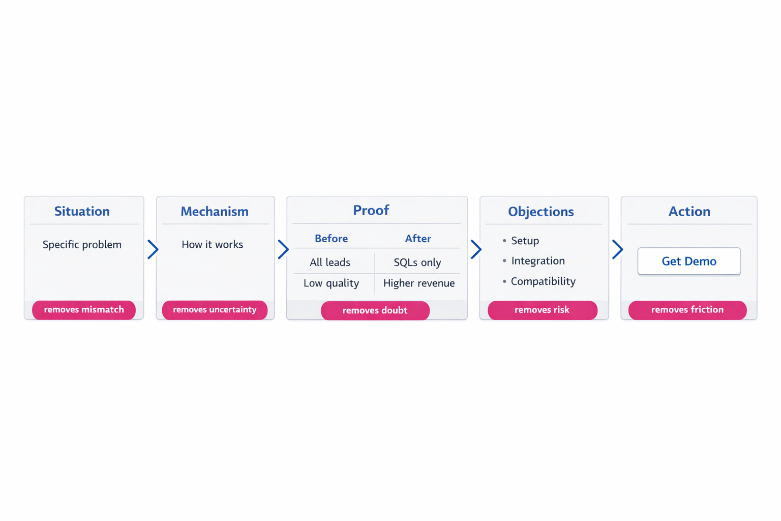
It usually starts with a specific situation. Something like:
-
campaigns generating leads that never close,
-
CRM data not influencing ad delivery,
-
or sales teams filtering out most incoming leads.
This works because it immediately filters the right audience.
From there, the page needs to explain how the solution actually works. Not just what it promises, but what changes inside the system.
For example:
-
CRM stages are synced back into the ad platform;
-
campaigns start optimizing toward qualified leads instead of all conversions;
-
low-quality segments gradually receive less budget.
That level of clarity removes guesswork.
Then comes proof. Not generic testimonials, but cause-and-effect scenarios.
A realistic example looks like this:
-
Before: campaigns optimized on all leads → low CPL, poor close rate.
-
After: optimization shifted to SQLs → CPL increased slightly, but revenue per lead doubled.
Before asking for conversion, the page should also resolve practical concerns:
-
setup time,
-
integration complexity,
-
compatibility with existing tools.
If you want a deeper breakdown of structure, How To Create a High-Converting Landing Page covers the fundamentals well.
What Actually Improves Conversion
Most meaningful improvements don’t come from visual tweaks. They come from clarity.
A small shift in wording can change how users engage with the page. For example, replacing a generic promise with a concrete problem makes the page easier to process.
CTA placement also works differently than most guides suggest. It’s less about visibility and more about timing.
The most effective placements usually happen:
-
right after a clear explanation of how the product works,
-
after a strong example,
-
or immediately after resolving a key concern.
Form design plays into this as well. If the form doesn’t match the user’s intent level, drop-off increases.
A simple adjustment often helps:
-
early-stage traffic → short form;
-
mid-stage → add context fields;
-
high-intent → direct booking.
Even design supports this logic. Clean layouts with controlled contrast guide attention better. According to the visual guidelines , limiting strong accents and maintaining white space improves clarity and focus.
A Practical Way to Improve an Existing Page
Instead of changing random elements, it’s more effective to diagnose where the decision breaks.
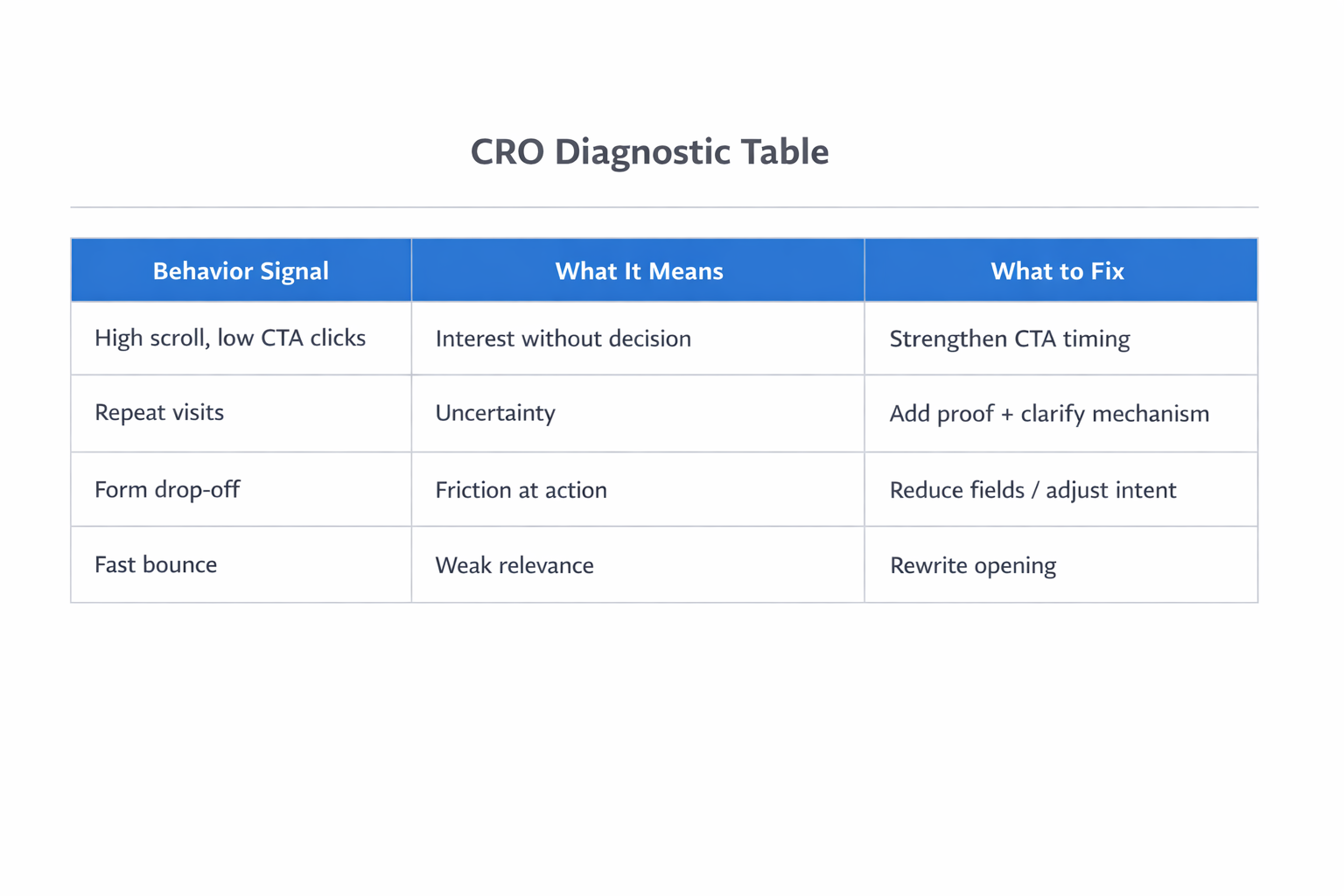
Start by looking at user behavior:
-
High scroll depth but low CTA clicks → the page informs but doesn’t trigger action.
-
Repeat visits → interest exists, but confidence is missing.
-
Form starts without completion → friction at the final step.
Then adjust based on what’s missing.
For example:
-
If users drop early, rewrite the opening with a more specific scenario.
-
If they stall mid-page, clarify the mechanism or add a concrete example.
-
If they abandon the form, simplify it or better match intent.
If you’re analyzing performance deeper, How to Analyze Facebook Ad Performance Beyond CTR and CPC explains how to interpret behavior signals beyond surface metrics.
Strategy: How to Think About CRO in B2B
Instead of treating CRO as isolated tactics, it’s more useful to treat it as a decision system.
A simple framework:
-
Remove interpretation — don’t make users translate your value.
-
Reduce uncertainty — answer practical concerns early.
-
Match timing — place CTAs where decisions naturally happen.
-
Support internal sharing — make the page easy to explain.
A quick test:
Could someone copy part of your page into Slack and clearly explain the product?
If not, the page still requires too much mental effort.
For broader context, 8 Ways to Improve the Conversion Rate gives additional perspectives that complement this approach.
Final Thought
B2B landing pages don’t convert better when you push harder. They convert when you remove hesitation.
When a page works, the shift is subtle. The user understands the problem more clearly, sees how the solution fits, and feels comfortable taking the next step.
At that point, conversion isn’t a leap — it’s just the next logical move.