Getting someone to click your ad is just the start. What happens next decides whether they convert or leave.
Friction is anything that slows down or confuses your customer. It can be a slow page, a form with too many fields, or a message that feels off.
Even small issues can lead to big drop-offs and wasted ad spend.
What Friction Looks Like in Real Campaigns
Friction shows up in different ways. You might have a great ad, but something in the next step turns people away.
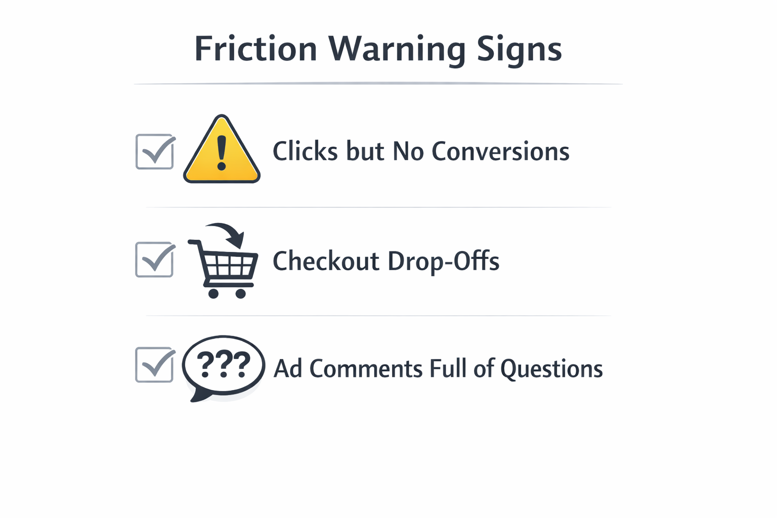
Watch for these signs:
-
Lots of clicks, few conversions: This means your landing page or offer isn't doing its job.
-
People leave during checkout: They may not trust the process, or it's too slow or confusing.
-
Many questions in ad comments: If people ask basic things, your message probably isn’t clear enough.
These are signs that something needs to be fixed — not just in the ad, but in the whole journey.
Related: From Click to Conversion: Where Funnels Usually Break.
Step 1: Match Your Ad and Landing Page
When someone clicks your ad, they should land on a page that feels familiar. If it looks different or confusing, they might lose interest.
To keep the message clear:
-
Use the same headline and visuals. Don’t surprise people with something new — repeat what worked in the ad.
-
Explain your offer fast. Put your value in the first few lines. People won’t scroll if they don’t get it right away.
-
Use the same CTA. If your ad says “Start free trial,” your button on the page should say the same thing.
Keeping things consistent helps people move forward without hesitation.
Read more: Creating a Seamless Experience Between Ads and Landing Pages.
Step 2: Fix Slow Pages and Bad Mobile Design
Most users are on their phones. If your page is slow or hard to use, they won’t wait or try to figure it out.
What to check:
-
Page speed: Compress images and avoid heavy scripts. A fast page keeps people engaged.
-
Mobile layout: Use big buttons, readable text, and easy navigation.
-
Test often: Check how your page works on different phones and networks.
Technical problems cause real drop-offs — and they’re usually easy to fix.
Fix mobile issues: Why Your Mobile Landing Page Is Killing Conversions (And How to Fix It).
Step 3: Get All Teams on the Same Goal
If your content team, media team, and product team all focus on different things, your message won’t line up. That creates confusion for users.
To work better together:
-
Pick one goal — like more conversions or better customer lifetime value — and make sure every team supports it.
-
Use one shared dashboard. Everyone should see how ads, pages, and results connect.
-
Plan together. Involve different teams when building a campaign so the message stays consistent.
When everyone works toward the same outcome, the customer experience feels smoother.
Step 4: Make It Easy to Take Action
People don’t like doing extra work. Even a small hassle can make them give up.
Remove these common blockers:
-
Long forms: Only ask for what you need. Name and email are enough in most cases.
-
No trust signals: Add reviews, guarantees, or “safe checkout” badges to boost confidence.
-
Hidden costs: Be clear about pricing and terms from the start. Surprises create doubt.
Less effort means fewer reasons to leave.
Helpful tips: What Makes a Facebook Lead Form Convert? 5 Key Optimization Tips.
Step 5: Use Clear and Simple CTAs
Your call to action should guide users — not confuse or pressure them. They need to know what happens next and why it matters.
Strong CTA tips:
-
Be specific: Say “Get Instant Access,” not just “Submit.”
-
Make it stand out: Use a bold button and keep it visible as users scroll.
-
Stick to one action per page: Don’t overload users with too many choices.
A good CTA makes people feel ready — and confident — to take the next step.
Step 6: Follow Up With Smart Retargeting
Not everyone will convert right away. That doesn’t mean they’re not interested — they just need a little more time or info.
How to retarget the right way:
-
Segment by behavior. Show different ads to people who visited your site, added to cart, or watched a video.
-
Use new messages. Don’t just repeat the same ad — add urgency, highlight benefits, or offer a reminder.
-
Retarget quickly. Reach users within a few days when interest is still fresh.
Good retargeting picks up where the journey left off — not where it started.
Step 7: Track the Whole Journey — Not Just the Click
Clicks and views matter, but they don’t tell the full story. You need to see what happens after the ad, across the whole funnel.
What to do:
-
Use UTM tags and events. Track how users move from ad to page to conversion.
-
Match metrics to journey stages:
-
Awareness: Video views, ad engagement
-
Consideration: Page scroll depth, button clicks
-
Conversion: Signups, purchases
-
Loyalty: Repeat visits, second purchases
-
-
Look at longer time frames. Some actions happen days later — don’t rely only on last-click data.
Seeing the full path helps you spot where friction really happens and fix it faster.
Final Thoughts: Friction Is About Connection
Most friction comes from disconnects — between the ad and the page, between teams, or between what users want and what they see.
Reducing friction means making every step feel easy, connected, and built for real people.
When the whole journey works together — from creative to conversion — your results improve at every stage.
And when that happens, your ad spend goes further, your customers stay longer, and your brand grows stronger.