If you're running Instagram or Facebook ads, getting the click is only half the job. What happens after that click decides if your campaign makes money — or loses it.
That’s where your landing page comes in.
A high-converting landing page continues the conversation started by your ad. It builds trust fast, handles objections, and makes it easy for people to take action.
Let’s walk through the key elements that high-performing landing pages share — and the hidden mistakes that cause good campaigns to fail.
Why landing pages often fail (even when your ads are working)
You can have a great product and solid ads, but if your landing page doesn’t do its job, you’ll lose the sale.
Here’s where most landing pages go wrong.
The landing page doesn’t match the ad
Imagine clicking on an ad for “50% off your first order” and landing on a page that never mentions the discount.
You’d feel confused — maybe even misled. That’s how visitors feel when there’s a mismatch between ad and page.
To fix this, make sure your landing page:
-
Repeats the ad promise clearly in the headline or top section;
-
Uses similar visuals (same product image, color scheme, or person from the ad);
-
Addresses the same audience intent, whether they’re cold, curious, or ready to buy.
If the ad says “Free 5-day skin detox guide,” the page shouldn’t open with “Welcome to our store.” It should deliver the guide and explain what makes it valuable.
The page is slow or glitchy on mobile
Most Facebook and Instagram traffic is mobile — and people won’t wait more than 3 seconds for a page to load.
Even small delays can kill conversions. A 1-second delay in load time can reduce conversions by 7% or more.
For a deeper breakdown on how to fix mobile-related issues, read Why Your Mobile Landing Page Is Killing Conversions (And How to Fix It).
To speed things up:
-
Compress large images;
-
Use fewer scripts and animations;
-
Test on both Wi-Fi and mobile data;
-
Choose landing page tools that prioritize speed.
You don’t need fancy effects. You need fast, clear, and functional.
What every high-converting page includes
Now let’s look at the structure. A good landing page follows a clear logic: grab attention, build trust, reduce doubt, and make the next step feel easy.
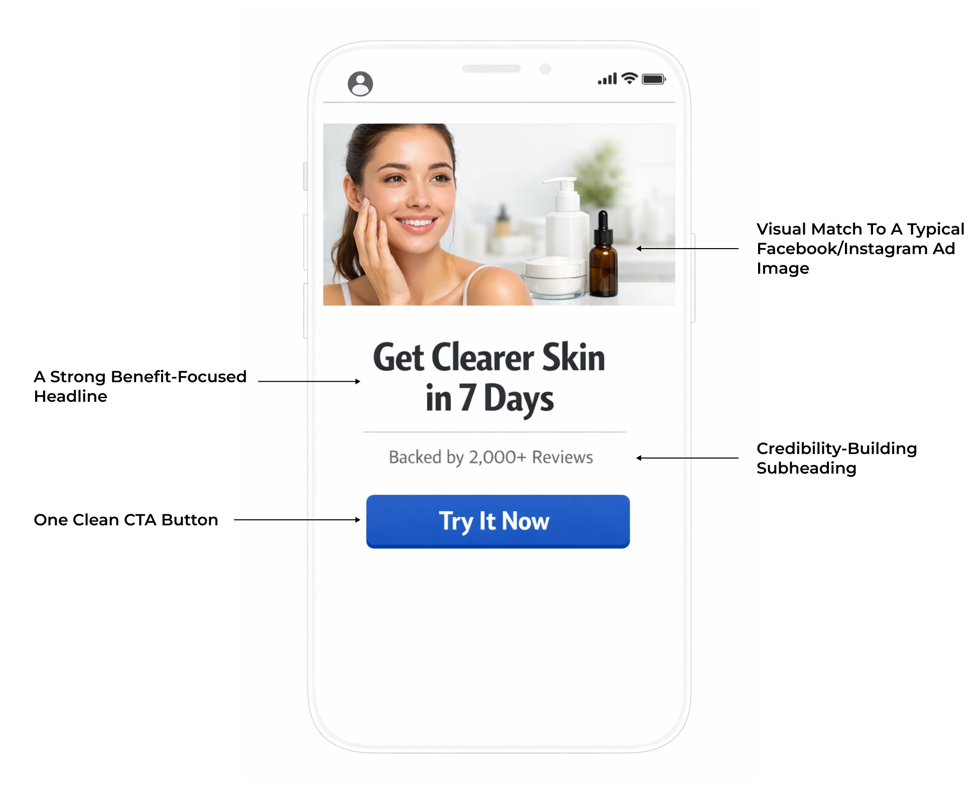
Above the fold: capture interest in 5 seconds
The “above the fold” section is what users see without scrolling. It’s your first (and sometimes only) shot at keeping them.
This section should answer three questions:
-
What is this?
-
Why should I care?
-
What should I do next?
Here’s a simple structure that works:
-
A headline with a clear benefit tied to the ad promise;
-
A subheadline that adds context or credibility;
-
One primary call-to-action (CTA) button that’s easy to see and tap.
Avoid clutter. No menus, carousels, or multiple CTAs. One message, one action.
Mid-page: build credibility and connection
Once you’ve hooked their attention, the next job is to make them trust you.
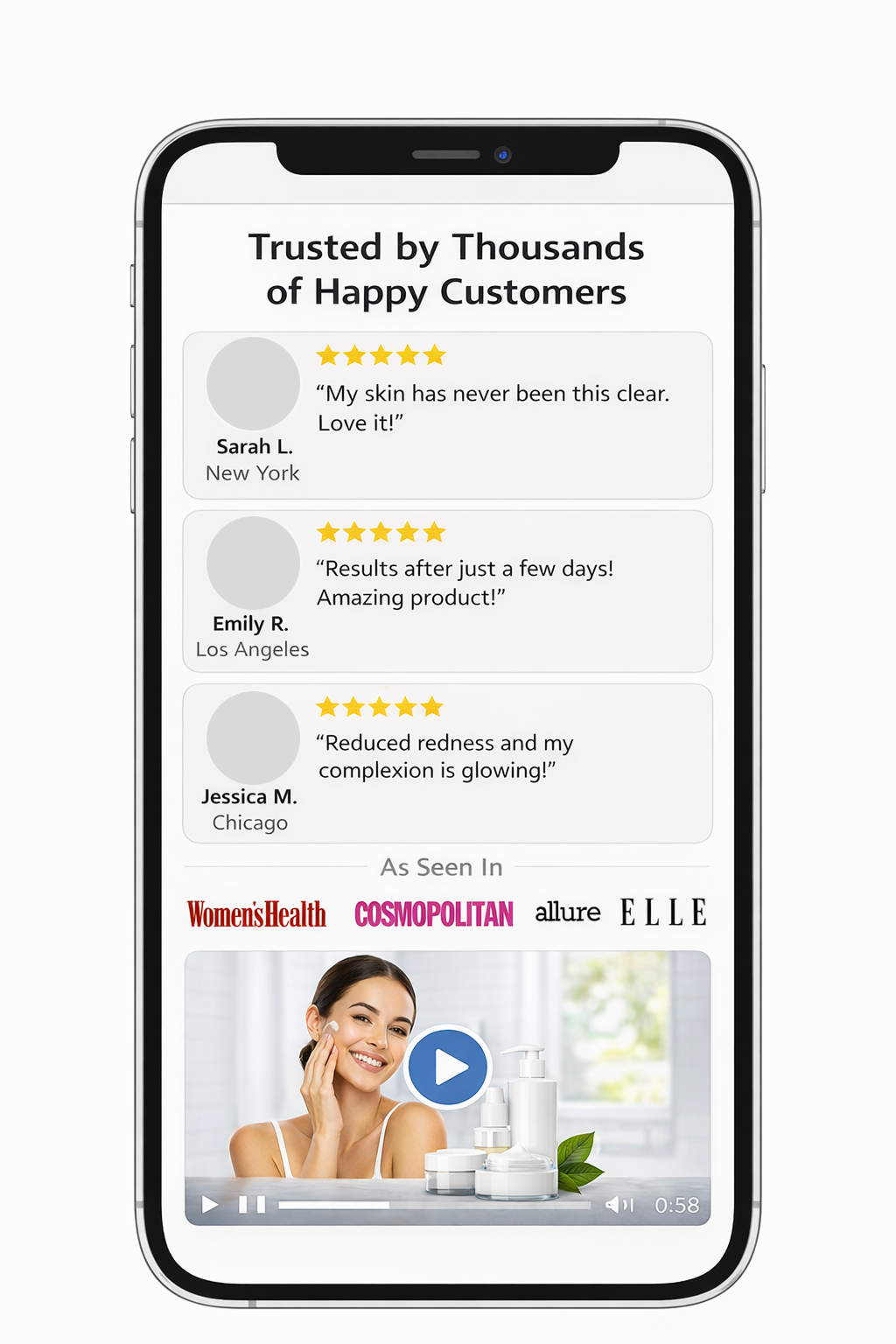
Use social proof and real content, not vague claims. Include:
-
Reviews from actual customers, ideally with names and photos;
-
Logos from media coverage or known clients;
-
Short video demos or product walkthroughs.
This section should feel real, relatable, and reassuring.
Bottom of page: reduce friction and close the sale
As visitors scroll, they may still be unsure. The lower part of your page should handle objections and reinforce your offer.
Helpful elements include:
-
FAQs that address common doubts or concerns;
-
Clear return policies or satisfaction guarantees;
-
A strong final CTA that’s simple and specific.
Don’t assume someone will scroll all the way down. But for those who do, make sure it helps them feel ready to act.
Matching your landing page to the traffic type
Not every visitor is at the same point in the funnel. What works for someone ready to buy may overwhelm someone seeing your brand for the first time.
Here’s how to tailor the experience by funnel stage.
Cold traffic (first-time visitors)
-
Focus on grabbing attention and building curiosity;
-
Use eye-catching creative, problem framing, and a soft CTA;
-
Avoid pushing for a sale too early or overwhelming people with options.
Warm traffic (retargeted users, past visitors)
-
Focus on trust-building and explaining what sets you apart;
-
Include reviews, product benefits, comparison tables, and demos;
-
Avoid repeating basic intro-level content they already know.
Hot traffic (cart abandoners, returning leads)
-
Focus on resolving doubts and encouraging quick action;
-
Use urgency, guarantees, or limited-time discounts;
-
Avoid adding new messaging that distracts or confuses.
Smart tactics that boost conversions (without a full redesign)
Often, small strategic changes can make a big difference. Here are advanced tactics that drive results — without rebuilding your whole page.
Use a quiz or diagnostic to engage cold users
Quizzes are a powerful way to collect leads while personalizing the experience.
Examples include:
-
“Find your perfect product” quizzes;
-
“What’s your savings potential?” calculators;
-
Short assessments that lead to a customized plan or offer.
The more tailored the outcome feels, the more trust and interest it builds. For more ideas, see Lead Magnet Strategy That Will Take Your Instagram Advertising to the Next Level.
Add urgency — but only if it’s real
People are more likely to act when they feel a reason to act now. Real urgency can help, but fake scarcity backfires.
Effective ways to create urgency:
-
A countdown timer for a real promotion;
-
A message about limited stock or limited availability;
-
A seasonal or time-sensitive offer.
Always keep it honest. Trust is more valuable than a short-term bump.
Micro-conversions help warm up hesitant visitors
If someone isn’t ready to buy, give them something smaller to commit to:
-
A free downloadable guide;
-
An email opt-in with a discount;
-
A trial or sample with minimal risk.
Micro-conversions build trust and give you a second chance to re-engage through retargeting.
More traits of high-converting landing pages (often overlooked)
The most successful pages don’t just “look good.” They work because they’re built around real human behavior and decision-making.
Here are other characteristics high-converting pages often share:
Clarity over cleverness
Visitors don’t want to decode your message. They want answers fast.
Use plain language and direct benefits. Say, “Lose weight without a gym,” not “Redefine your wellness journey.”
Many marketers get this wrong. For a deeper breakdown of common copy mistakes, see What Makes a Landing Page Convert (and Why Most Don’t).
One clear goal
Pages with one CTA perform better than pages trying to do it all.
Every section should support a single action — whether it’s “Start free trial,” “Book a demo,” or “Buy now.”
Don’t include social icons, navigation menus, or side links unless they serve the main goal.
Strong visual hierarchy
Your layout should guide the eye. Use bold headlines, logical section breaks, and enough whitespace.
People should never feel overwhelmed or unsure of what to read next.
Emotionally grounded copy
People buy because of how something makes them feel — relieved, empowered, excited, safe.
Show the transformation, not just the features. Speak to real-life outcomes, not just technical specs.
Obvious next step
Your CTA should be clear, actionable, and low-pressure.
Use buttons like “Get My Free Plan” or “See How It Works,” not generic ones like “Submit” or “Click Here.”
Add supportive text like “Takes 30 seconds” or “No credit card needed” to lower resistance.
Mobile-first design
Most Meta ad clicks happen on phones. If your page isn’t built for mobile, you’re losing people before they even read your copy.
Use readable fonts, big buttons, short paragraphs, and mobile-friendly layouts.
Local or personal relevance
When possible, make your message feel like it’s meant for them.
Examples include:
-
Showing region-specific testimonials;
-
Displaying currency in local formats;
-
Mentioning local delivery or availability.
Even small touches like these help build trust faster.
Summary: what top-performing landing pages really do
The best landing pages aren’t just well-designed. They’re intentional — built around what your audience wants, what they need to feel, and what helps them take the next step.
Here’s what high-converting pages consistently get right:
-
They use clear, benefit-focused language that tells visitors exactly what they’ll get;
-
They focus on a single goal, with one consistent call-to-action throughout;
-
They structure content visually so it’s easy to scan, especially on mobile;
-
They address emotional triggers — solving real problems, not just listing features;
-
They make the next step feel safe, fast, and worth it;
-
They add signs of relevance — whether geographic, social, or behavioral.
Each one of these traits may feel small on its own. But together, they build momentum. They remove friction. And they turn clicks into real results.
So before spending more on ads, ask: does your landing page finish the job your ad started?
Because that’s where real growth happens — not in the ad, but in what comes after the click.